Best Fonts for Banners
Table of contents
- 1. Helvetica
- 2. Franklin Gothic
- 3. Montserrat
- 4. Proxima Nova
- 5. Futura
- 6. Gill Sans
- 7. Open Sans
- 8. Arial
- 9. Bebas
- 10. Bodoni
- 11. Garamond
- 12. Luckiest Guy
- 13. Playfair Display
- 14. Source Serif Pro
- 15. Advent Pro
- 16. Myriad
- 17. Optima
- 18. Poiret One
- 19. Rock Salt
- 20. Times New Roman
- 21. Verdana
- 22. Allura
- 23. Avenir
- 24. Avant Garde
- 25. Manrope
- 26. Inter
- Characteristics of Good Banner Fonts
- What to Consider When Choosing the Best Font for Your Banner Designs?
- Tips for Designing Effective Banner Fonts
- Common Mistakes to Avoid in Banner Font Design
- Conclusion
Creating eye-catching banners is fundamental to effective marketing. Fortunately, there are proven strategies for crafting engaging banners.
A successful banner design for your company or target audience requires a combination of essential elements: a balanced layout, color contrast and hierarchy, and high-quality graphics. A key component that brings them all together is a readable and engaging font.
Here are some of the best fonts you can implement in your banner design. But don't stop now because the font you might be looking for could be completely different. Stick around, and by the end of this article, you'll have everything you need to choose the right font for your banner design.
1. Helvetica
- Brands: Jeep, LG, Subway, Panasonic, Lufthansa
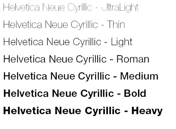
- Helvetica, created in 1957 by Swiss typeface designer Max Miedinger with input from Eduard Hoffmann, is a widely used sans-serif typeface known for its clean, modern, and highly legible design.
- Download Helvetica from MyFonts
2. Franklin Gothic
- Brands: BBC, New York Times (headlines)
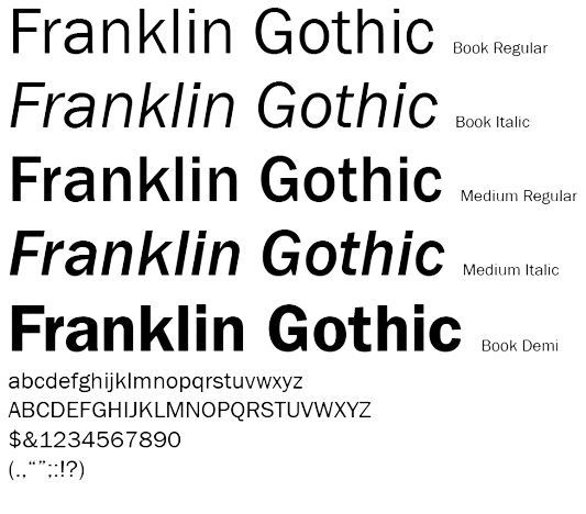
- Franklin Gothic, designed by Morris Fuller Benton in 1902, is a versatile sans-serif typeface that has been widely used in advertising and headlines.
- Download Franklin Gothic from Myfonts.
3. Montserrat
- Brands: Domino's Pizza (partially), Canva templates
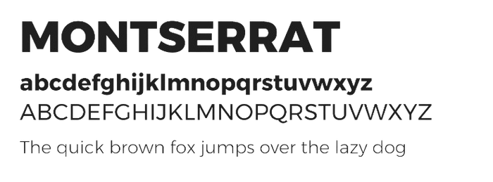
- Montserrat, designed by Julieta Ulanovsky in 2010, is a modern sans-serif typeface inspired by the urban typography of the Montserrat neighborhood in Buenos Aires
- You can download Montserrat from Goole Fonts for free.
4. Proxima Nova
- Brands: BuzzFeed, NBC News, Mashable
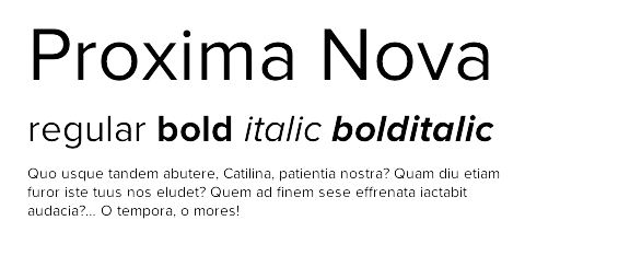
- Proxima Nova, designed by Mark Simonson in 2005, is a highly popular sans-serif typeface that bridges the gap between traditional typefaces like Futura and modern ones like Akzidenz Grotesk.
- You can download Proxima Nova from Adobe Fonts.
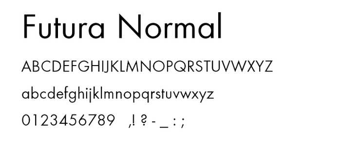
5. Futura
- Brands: FedEx, Gillette, Volkswagen
- Futura, designed by Paul Renner in 1927, is a geometric sans-serif typeface that embodies the modernist design principles of the Bauhaus movement. The font is known for its clean, precise lines and simple shapes.
- You can download Futura from MyFonts.
6. Gill Sans
- Brands: BBC, Tommy Hilfiger, Tag Heuer
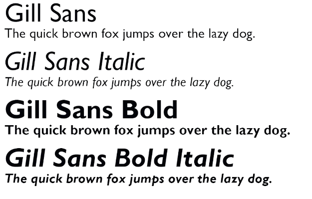
- Gill Sans, designed by Eric Gill in 1928, is a humanist sans-serif typeface known for its elegant, readable design.
- You can download Gill Sans from MyFonts.
7. Open Sans
- Brands: Mozilla, Chase, Spotify
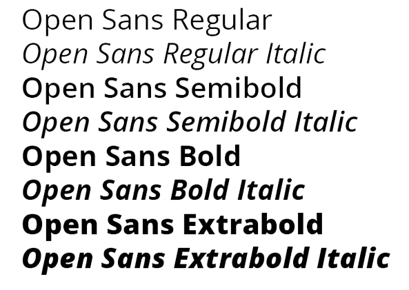
- Open Sans, designed by Steve Matteson and released in 2011. The font has been widely used in web design because of its modern and approachable aesthetic.
- You can download Open Sans from Google Fonts for free.
8. Arial
- Brands: IBM, Microsoft (default system font), Toyota
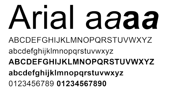
- Arial, designed by Robin Nicholas and Patricia Saunders in 1982 for Monotype, is a widely used sans-serif typeface known for its versatility and clarity.
- You can download Arial from Myfonts.
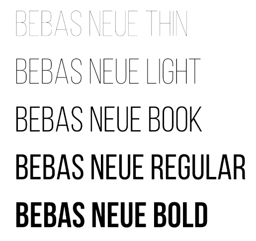
9. Bebas
- Brands: Commonly used in digital media for its bold and clean look.
- Bebas, designed by Ryoichi Tsunekawa in 2010, is a sans-serif typeface known for its bold, all-caps design and clean, modern look.
- You can download Bebas from Dafont or Fontfabric.
10. Bodoni
- Brands: Vogue, Calvin Klein, Nirvana (album covers)
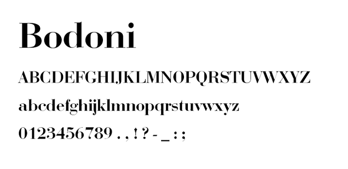
- Bodoni, designed by Giambattista Bodoni in the late 18th century, is a serif typeface known for its high contrast between thick and thin strokes, geometric shapes, and elegant, refined appearance.
- You can download Bodoni from MyFonts.
11. Garamond
- Brands: Apple (early advertisements), Abercrombie & Fitch
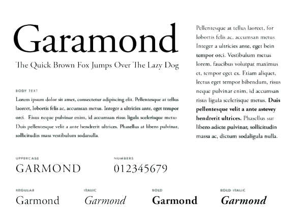
- Garamond, named after the 16th-century French type designer Claude Garamond, is a classic serif typeface known for its elegant, readable design and fine details.
- You can download Garamond from Google Fonts or Adobe Fonts.
12. Luckiest Guy
- Luckiest Guy, designed by Brian J. Bonislawsky in 2011, is a bold, playful display typeface inspired by vintage advertisements and signage. Known for its fun and friendly appearance, it is often used in casual design projects like; posters, children's books, and informal branding.
- You can download Luckiest Guy font from Google Fonts for free.

13. Playfair Display
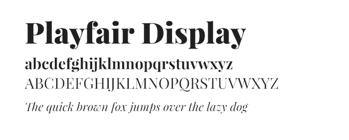
- Playfair Display, designed by Claus Eggers Sørensen in 2011, is a serif typeface inspired by the late 18th-century European Enlightenment. Known for its high contrast between thick and thin strokes, elegant curves, and classic design.
- You can download Playfair Display from Google Fonts for free.
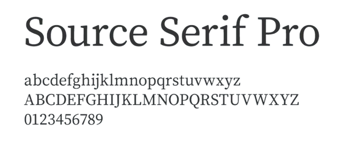
14. Source Serif Pro
- Brands: Used in many digital media publications.
- Source Serif, designed by Frank Grießhammer and released by Adobe in 2014, is a contemporary serif typeface inspired by the classic forms of transitional typefaces. The font is known for its readability and versatility.
- You can download Source Serif Pro from Google Fonts.
15. Advent Pro
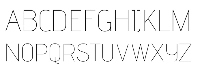
- Advent Pro, designed by Andreas Kalpakidis in 2007, is a modern sans-serif typeface characterized by its rounded, clean lines and versatile design.
- You can download Advent Pro from Google Fonts.
16. Myriad
- Brands: Apple (pre-2015), Rolls-Royce
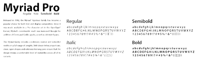
- Myriad, designed by Robert Slimbach and Carol Twombly in 1992 for Adobe, is a versatile sans-serif typeface known for its clean, humanist design.
- You can download Myriad from MyFonts.
17. Optima
- Brands: Estee Lauder, Macy’s
- Optima, designed by Hermann Zapf and released in 1958, is a humanist sans-serif typeface that uniquely blends the qualities of both serif and sans-serif fonts.
- You can download Optima from MyFonts.

18. Poiret One
- Poiret One, designed by Denis Masharov, is a decorative sans-serif typeface inspired by the Art Deco movement of the early 20th century. Known for its geometric forms, elegant curves.
- You can download Poiret One from Google Fonts.

19. Rock Salt
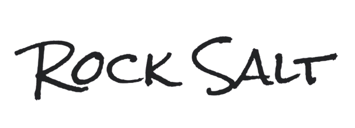
- Rock Salt, designed by Michael Doret in 2010, is a handwritten typeface that mimics the look of natural, casual brush lettering.
- You can download Rock salt from Google Fonts.
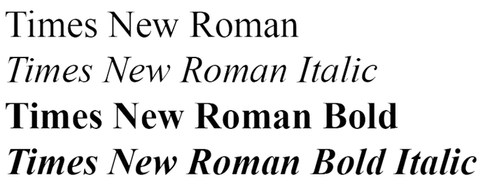
20. Times New Roman
- Brands: The Times (UK newspaper), academic publications.
- Times New Roman, designed by Stanley Morison and Victor Lardent in 1931 for The Times newspaper of London. The font is a widely used serif typeface known for its readability and classic elegance. Times New Roman has become a standard typeface for both print and digital media, especially in formal and academic contexts.
- You can download Times New Roman from MyFonts.
21. Verdana
- Brands: Microsoft (designed for screen readability).
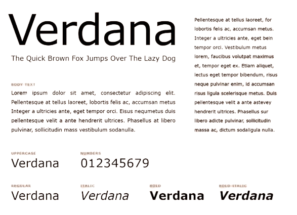
- Verdana, designed by Matthew Carter for Microsoft and released in 1996, is a sans-serif typeface specifically created for on-screen readability. Known for its wide spacing and large x-height.
- You can download Verdana from MyFonts.
22. Allura
- Allura, designed by Rob Leuschke, is an elegant script typeface known for its fluid, cursive style and sophisticated look. Often used in invitations, greeting cards, and branding.
- You can download Allura from Google Fonts.
23. Avenir
- Brands: Disney (branding), Apple Maps.
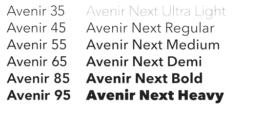
- Avenir, designed by Adrian Frutiger in 1988, is a geometric sans-serif typeface that combines the structural clarity of early 20th-century sans-serifs with a more human touch.
- You can download Avenir from MyFonts.
24. Avant Garde
- Brands: Adidas, Calvin Klein, Nutella.
- ITC Avant Garde Gothic, designed by Herb Lubalin and Tom Carnase in 1970, is a geometric sans-serif typeface inspired by the logo of the avant-garde magazine.
- You can download Avant Garde from MyFonts.
25. Manrope
- Manrope is a modern, geometric sans-serif typeface that combines readability with a contemporary aesthetic. It is well-suited for both digital and print media, including banners.
- You can download Manrope from Google Fonts for free.

26. Inter
- Brands: Inter is used by Figma, Notion, and Tabular.
- Inter, designed by Rasmus Andersson and released in 2016, is a highly readable sans-serif typeface optimized for screen usage. Known for its clean lines and excellent legibility at small sizes, Inter is widely used in user interfaces, websites, and digital applications.
- You can download Inter from Google Fonts.

As highlighted, choosing the right font is crucial because it ties everything together in your designs. Believe it or not, simple font choices can significantly reflect your company, design preferences, and brand identity.
Additionally, your banner must be immediately eye-catching and as legible as possible.
Characteristics of Good Banner Fonts
Fonts are more than just aesthetically pleasing choices; they communicate a great deal about your brand, often subconsciously. Before we delve into different font types, it's essential to understand the characteristics of a good banner font.
Readability and Legibility
The first impression matters in brand marketing. Banners typically have just a few seconds to capture attention, so it's crucial to ensure your target audience is interested at first glance. If the content is not easily legible, readers are likely to walk on before completely comprehending your message. This is why using highly legible typefaces is essential, especially for headlines. Also, remember that simplifying cognitive processing helps viewers connect more readily with your campaign or slogan. Thus, getting familiar with techniques such as spacing, kerning, or achieving textual harmony represents a valuable investment in marketing.
The medium where your banner will be displayed also plays a significant role in font selection. Linearity research indicates that sans-serif fonts are popular in digital media because of their clarity and readability on screens. Hence, they appear often in banner designs and user interfaces. Consider these factors while designing your banner in order to successfully reach your target audience.
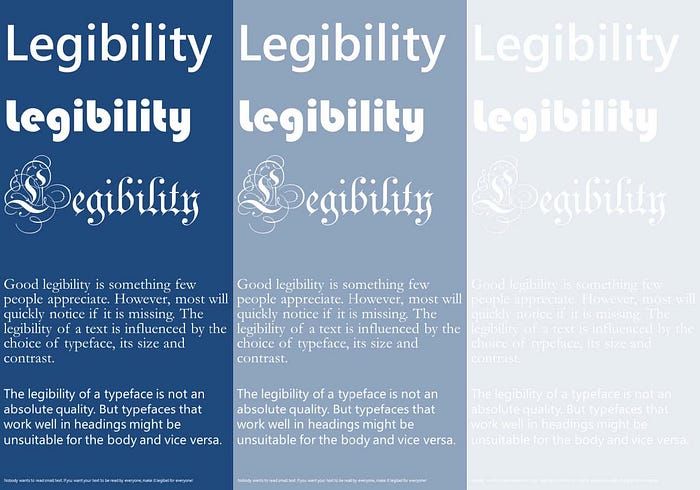
Additionally, your font choice must maintain a balance between professionalism and credibility.
Your banner should visually match the quality of advertising, capturing the viewer's attention and ensuring it is considered seriously. But note that your brand must stand out from a mass of competing advertisements. Therefore, you need to choose a banner font that is both distinctive and trustworthy, one that sticks out.
The Impact of Font Styles in Banner Design
Whether you're designing your banner on your own or with a graphic designer, recognizing the various font types can make the process easier. Each banner font style has its own characteristics and emotional impacts on viewers, which helps get the message across.
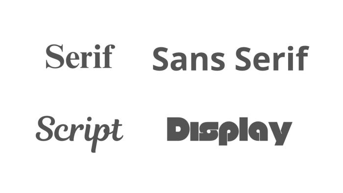
Here, you'll find a selection of commonly used and well-known font styles. We've showcased the timeless elegance of Serif fonts with the classic Times New Roman, which is ideal for conveying solid facts and information or addressing serious topics. For a more contemporary and easily readable option, we've displayed the sleek appearance of sans-serif fonts using Open Sans.
Additionally, we've included Magnolia Script. Magnolia Script's usage have seen a remarkable 25% increase in usage over the past two years. These fonts bring a sense of elegance and creativity to banners, capturing attention and adding a personalized touch to the message.
Lastly, we've featured Null to demonstrate the impact of Display typefaces, which are perfect for making bold statements in banners (no pun intended).
Good banner fonts are representative of the band and should be used in consistency.
According to Linearity's findings, aligning with brand-consistent fonts has the potential to increase consumer engagement by up to 30%. For instance, if your target audience is Gen Z high school students, choose an engaging font that resonates with their interests and attention span. In contrast, if your target audience is academics in a scientific field, use a classic and elegant serif font that they are familiar with.
Once you've identified the best representative fonts for your slogans and campaigns, maintain consistency to strengthen your brand identity.
What to Consider When Choosing the Best Font for Your Banner Designs?
Serif Fonts
Serif fonts are distinguished by the small decorative strokes at the ends of each letter, imparting a sense of tradition, sophistication, and credibility. This versatility makes them appropriate for diverse design applications. The main uses of serif fonts for banners include resembling seriousness, professionalism and authority, enhancing the overall impact of the message.

You've likely encountered serif fonts in various contexts, such as printed materials, newspapers, and school assignments. Research says serif fonts are less prevalent in digital banners; they retain their popularity for their traditional and formal aesthetics, especially in print materials.
For example, you may be familiar with well-known serif fonts like EB Garamond and Hoefler Text.
What distinguishes these fonts is their ability to combine elegance with readability, making them accessible to a broad audience. Both fonts feature balanced proportions and unique letterforms that enhance their visual appeal.
Sans-Serif Fonts
If you are looking for a more modern take on choosing the best banner fonts to represent your brand, sans-serif fonts might be the perfect option for you. Renowned for their clean and minimalist design, they ensure legibility even at smaller sizes.
Sans Serif fonts are ideal for digital advertisements, where they account for over 75% of usage. Popular options like Neue Helvetica, Arial, and Google Fonts such as; Roboto and Open Sans are favoured for their modern appeal, as confirmed by Typewolf's statistical findings.
Neue Helvetica stands out as one of the most timeless and adaptable fonts in graphic design. Its widespread usage underscores its effectiveness in captivating and retaining viewer attention, thereby contributing to the success of digital advertising campaigns.
Display Fonts
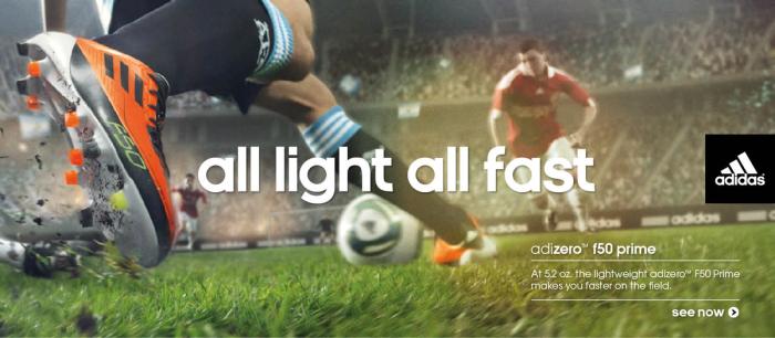
Display fonts, also known as screen fonts, are designed to capture attention and create visually striking designs. They are commonly used for headlines, titles, and other text that requires emphasis. With a variety of styles ranging from decorative to modern, display fonts add personality and style to designs, enhancing their visual appeal. However, they should be complemented with more conventional fonts for body text to maintain balance and readability.
In addition to making text stand out, display fonts serve several purposes. They are ideal for marketing materials since they offer decorative and expressive options to create unique designs. Hence, they are considered to be eye-catching fonts for banners. They help establish a visual hierarchy by emphasizing certain elements and guiding the viewer's eye. Display fonts also convey specific messages or tones, adding visual interest and impact to designs and making them more memorable and engaging.

Tips for Designing Effective Banner Fonts
Having introduced various font types, we can now discuss how to select them effectively. You might already be envisioning your banner design based on the examples and explanations provided, but it's also important to address the key design elements to consider.
Contrast and Color
When designing an effective and engaging banner, it is essential to consider color and contrast to ensure readability and visual impact. For instance, variations in color and contrast can significantly affect legibility. By carefully choosing the best banner fonts and optimizing color contrast, you can enhance the overall effectiveness of your banner.
Moreover, the colors chosen must complement the typography and background, taking into account cultural contexts, as different cultures may interpret colors differently. For example, while white symbolizes purity in Western cultures, it represents mourning in some Eastern societies, like China. Paying attention to these details shows your appreciation for your target audience.
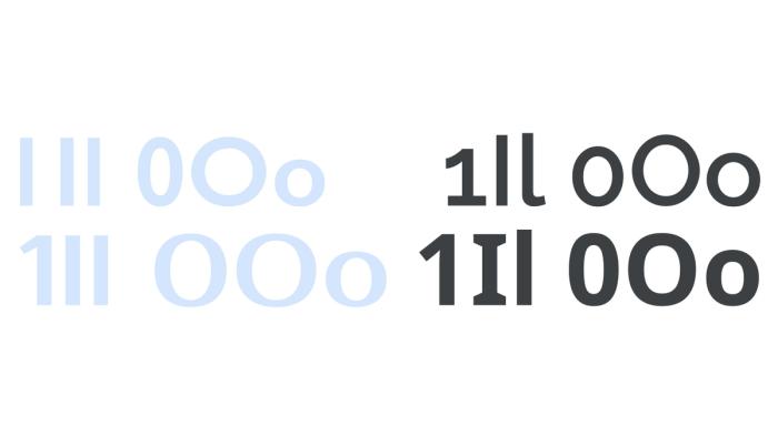
Additionally, consistency with your brand's color scheme reinforces brand identity and fosters familiarity among your audience. By thoughtfully applying contrast and color, considering cultural context, and maintaining brand consistency, especially when using fonts for banners, you can create a visually appealing and effective banner.
Size and Spacing
One of the most crucial aspects of readability is the size and spacing of the font and other design elements. Good banner fonts must be chosen thoughtfully to create visual harmony. Research indicates that headlines should be bold and large to immediately catch the viewer's attention, while body text should be smaller and less prominent to maintain a clear visual hierarchy.
Another key consideration is the kerning and spacing between letters and lines. Without proper spacing, the text can be difficult to read from a distance.
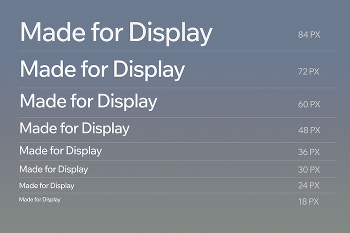
Above, you can see the pixel ratio of various fonts and compare their legibility across different devices. This way, you can compare them and decide on the best fonts for banners.
For digital banners, consider the device your audience will use to view the banner. On a desktop monitor, there's more room, so fonts can and should be larger. On mobile devices with smaller screens, the font size should be reduced to ensure all text fits and remains legiblle.
Common Mistakes to Avoid in Banner Font Design
Now that we understand the criteria for selecting a good font, we can discuss poor examples and avoid them.
Overly Complex Fonts
As previously noted, maintaining harmony and consistency is crucial in selecting a banner font. Thus, one of the primary errors to avoid is employing overly intricate fonts in banners, as they can undermine effectiveness and engagement. Despite being used for decorative purposes, it's important to recognize that banners are typically glanced at briefly. Therefore, the elaborate details of complex fonts may distract viewers' attention from the message and potentially induce confusion.

Choosing overly complex fonts for banners can alienate the audience and reduce the effectiveness of the message. Therefore, prioritising readability and clarity is essential to ensure effective communication with the target audience. Additionally, it's crucial to minimize the file size of banner ads to ensure fast load times.
According to Google's recommendations, banner ad files should be kept under 150 KB to prevent performance issues. Thus, by selecting the best banner fonts that prioritize readability and clarity and optimizing file sizes, designers can maximize the impact of their banners while ensuring optimal performance for viewers.
Poor Color Choices
Above we have already explained that color and contrast are essential for reflecting the best characteristics of good banner fonts. Now, we will see how poor color choices can have a detrimental effect on banner ads in several ways.
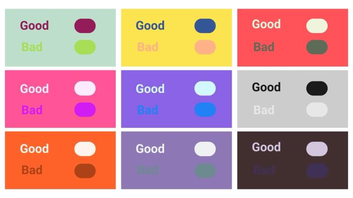
As illustrated in the example, the text at the bottom of each box is difficult to read or even notice due to low contrast. High contrast between the font and background not only enhances legibility but also draws the viewer's attention. Therefore, when selecting your main color fonts for banners, opt for contrasting shades rather than similar hues to improve readability.
Furthermore, colors are known to evoke particular emotions and associations. Therefore, choosing colors that do not correspond with the intended message or brand identity may lead to audience confusion or dissonance. This is evident in the prevalence of red, orange, and yellow hues in fast food ads, as well as the use of blue and purple tones in meditation apps.
Conclusion
It is time to wrap everything up. Throughout this article, we highlighted the significance of readability, style, and accurate design requirements. By using the best fonts for banners that are legible, clear, and aesthetically appropriate, designers may improve the effectiveness of their banners and ensure that their messages are effectively delivered to the target audience. It is crucial to avoid overly complex typefaces and instead prioritize harmony and uniformity in typography choices. Color, size, and spacing are other important variables to consider while designing a banner.
Finally, well-chosen typefaces have an important role in grabbing attention, communicating the desired message, and increasing interaction with banner advertisements. As a result, we urge you to use these strategies and approaches to increase the success of your own banner designs.