What Is Champagne Color, How It Differs From Gold, and What Goes Well With It
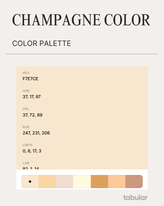
The color champagne looks like a very pale tint of yellowish-orange that closely resembles beige. It's named after the sparkling wine and evokes similar feelings.
Think of champagne color as a softer, more muted, and often more sophisticated version of gold or beige.
Champagne is considered a borderline neutral color, elegant and subtle, often used in design and fashion to evoke sophistication, luxury, and celebration.
Color champagne gold and beige are often confused because they both fall into the neutral, light-colored palette and can appear similar in certain lights or materials, especially in textiles or decor. However, they have distinct differences in undertone, finish, and usage.
Because champagne is often associated with elegance and subtle luxury, it’s a popular choice in branding, fashion, and digital design. In email design specifically, using champagne tones in backgrounds, buttons, or accents can create a refined and modern aesthetic. With an email builder, you can experiment with soft neutral palettes like champagne while maintaining readability and brand consistency.
Champagne vs. Gold vs. Beige: A Color Comparison
The main difference between god and champagne color comes from their meanings. Gold symbolizes wealth, success, prestige, and opulence. It is widely used in luxury branding, jewelry, high-end fashion, and glamorous decor while champagne color symbolizes celebration, refinement, elegance, and festivity. It is often chosen for weddings, anniversaries, and sophisticated events where a subtle, classy color is preferred
In fabric or lighting, beige can look similar to champagne, but champagne has a reflective, luminous quality, while beige is flat and muted.
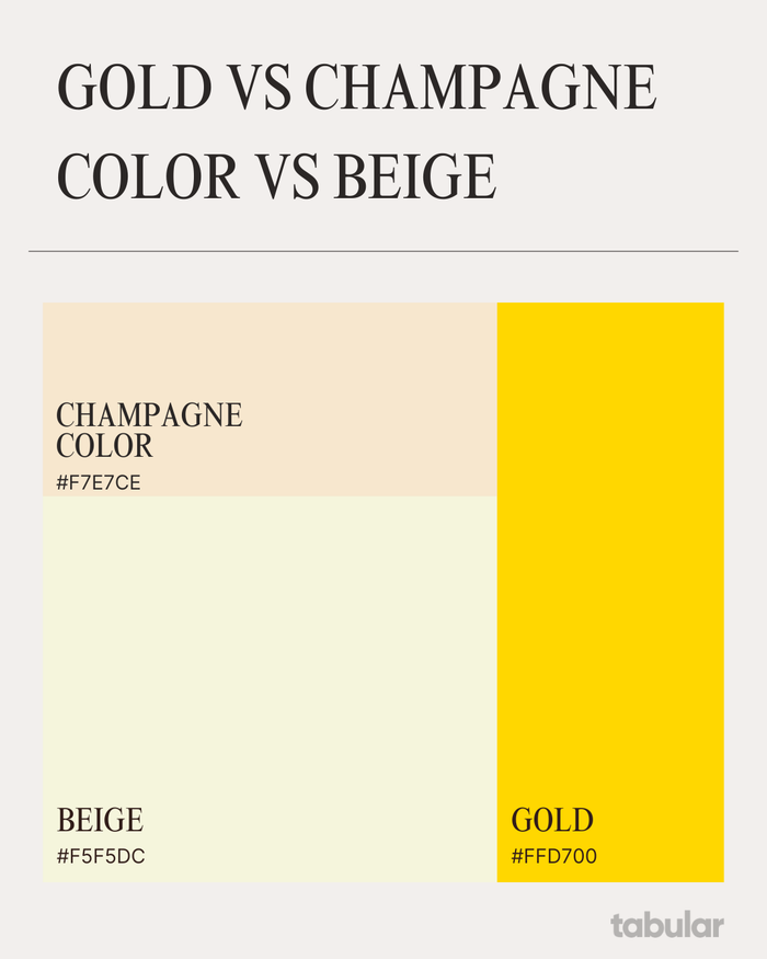
- Beige is a neutral, light brown color with warm undertones, often used as a soft background or base color.
- Gold is a rich, warm, and vibrant yellow tone with strong orange undertones. It closely resembles the lustrous precious metal and often has a metallic, shiny quality. Gold is bold and intense in saturation which makes it stand out as a luxurious and opulent color.
- Champagne is a much softer, lighter, and more muted color. It is a pale, desaturated yellow-beige with subtle pinkish or peachy undertones, resembling the pale golden hue of sparkling champagne wine. Champagne is non-metallic with a gentle, refined elegance rather than boldness compared to gold.
| Color | HEX Code | RGB Values | Description |
|---|---|---|---|
| Beige | #F5F5DC | (245, 245, 220) | Classic beige, a pale yellowish-brown neutral tone |
| Gold | #FFD700 | (255, 215, 0) | Bright, vibrant metallic gold tone (classic gold) |
| Champagne | #F7E7CE | (247, 231, 206) | Pale, soft yellow-beige with peachy undertones, elegant and muted |
What Color Goes Well with Champagne
The color combinations that include champagne leverage often seen as elegant, soft, and versatile.
| Combination | Effect / Style | Usage Examples |
|---|---|---|
| Champagne + Neutrals | Soft, elegant, understated | Weddings, interiors, table settings |
| Champagne + Pastels | Romantic, whimsical, gentle | Weddings, feminine designs |
| Champagne + Plum | Romantic, vintage, classy | Wedding color schemes |
| Champagne + Metallics | Luxurious, sparkling, rich | Decor accents, fashion accessories |
Champagne pairs well with a variety of colors ranging from neutrals to bold hues, creating sophisticated and romantic palettes for events, fashion, or interior design.
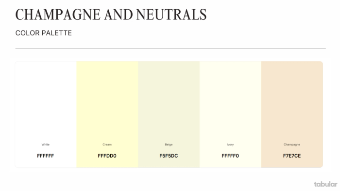
Champagne and Neutrals
White, cream, beige, ivory, and gray complement champagne beautifully, creating a harmonious, understated, and sophisticated look. These combinations are ideal for weddings, table settings, and elegant interiors where a soft, warm ambiance is desired.
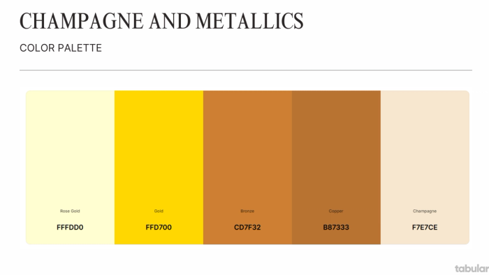
Champagne and Metallics
Warm metallics like gold, bronze, rose gold, brass, and copper enhance champagne’s subtle sparkle and luxury feel. Gold accents especially elevate the palette, making it perfect for décor and fashion that aims for richness and glamour.
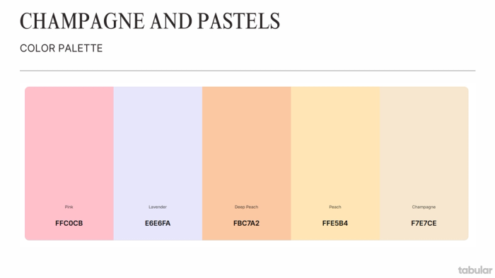
Champagne and Pastels
Soft pastels like pink, peach, lavender, and peach tones blend with champagne to create romantic, whimsical, and gentle aesthetics. These combinations are popular for weddings and feminine designs, adding subtle color without overpowering champagne’s warmth.
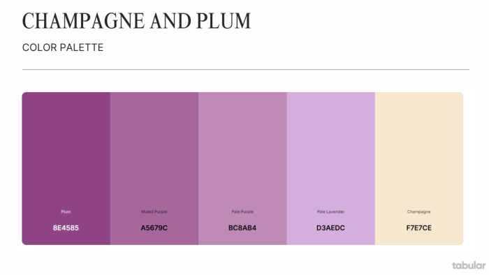
Champagne and Plum
Plum paired with champagne offers a romantic, vintage feel with sophistication and class. This combination evokes vineyard elegance and is favored in wedding themes for its richness and airy outdoor vibe.
Creative Uses of Champagne in Wedding Invitation Email Templates
Before we move further into the uses of champagne in design, did you know that you can create beautiful and romantic wedding invitation emails in seconds using Tabular’s drag-and-drop email builder? You can also explore hundreds of premade templates in Tabular’s email template gallery.
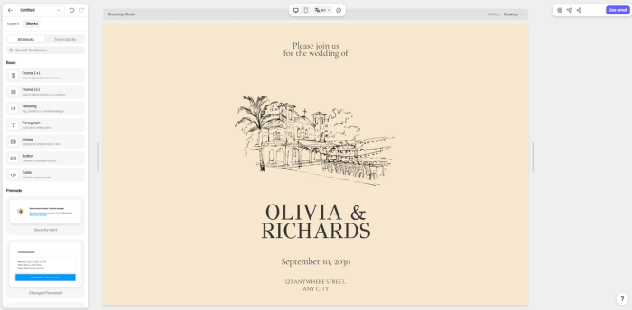
- Elegant Champagne Backgrounds and Borders: Use champagne as a soft, neutral background or as delicate borders around the invitation content to create a romantic and ethereal feel. This subtle use of champagne adds sophistication without overpowering the design.
- Champagne-Themed Motifs and Illustrations: Incorporate champagne bottle or bubbly glass illustrations, sometimes accented with gold glitter or foil effects, to evoke celebration and luxury. These motifs can set a playful yet classy tone for the wedding invitation.
- Customizable Fonts and Colors: Pair champagne backgrounds with fonts in complementary colors such as gold, blush, or deep greens. Choose font styles that match the wedding’s vibe-classic cursive for traditional weddings or clean, modern fonts for contemporary themes. Adjust font color to coordinate with other wedding elements like floral centerpieces or venue decor.
- Personalized Envelope Liners and Stamps: For emailed invitations that mimic physical mail, include digital envelope liners or custom stamps in champagne tones or complementary palettes to create a cohesive, polished look.
- Color Palette Coordination: Use champagne as the base color and combine it with other trendy wedding palette colors such as blush, dusty blue, sage, or navy in the invitation design. This approach previews the wedding’s overall color scheme and sets guest expectations.
- Minimalist and Modern Layouts: Employ champagne as a neutral canvas in minimalist invitation templates with clean lines and ample white space, making the text and details easy to read while maintaining elegance.
- Interactive and Shareable Formats: Use champagne-themed invitations in digital formats that can be sent via email, text, or shareable links, allowing for easy RSVP tracking and guest management while keeping the design luxe and inviting.
What does the color champagne mean?
- Sophistication & Elegance: It's understated luxury.
- Celebration & Special Occasions: Due to its namesake.
- Warmth & Comfort: It's less stark than white, less flashy than gold.
- Modernity & Timelessness: It often feels contemporary yet classic.
- Quality & Subtlety: It suggests premium without being overly ostentatious.
How and Where to Use Champagne in Design
- Luxury Goods & High-End Fashion: Brands selling jewelry (especially alternative metals like platinum or rose gold pairings), watches, designer clothing, accessories, and cosmetics. It conveys premium quality and sophisticated taste without the potential "bling" factor of bright gold.
- Beauty & Wellness: Spas, high-end salons, skincare brands, and perfumeries. The color suggests pampering, calm, natural elegance, and premium ingredients/services.
- Hospitality (Premium Segment): Boutique hotels, fine dining restaurants, upscale bars, and event venues (especially wedding-related). It creates a warm, inviting, elegant, and celebratory atmosphere.
- Wedding Industry: Invitations, stationery, décor, bridal boutiques, event planners. It's a natural fit for romance, celebration, and elegance.
- Home Decor & Interior Design: High-end furniture brands, textiles, paint colors, and accessories. It adds warmth, sophistication, and a modern neutral feel to spaces.
- Premium Food & Beverage: Gourmet chocolates, specialty teas/coffees, artisanal bakeries, and, of course, sparkling wine brands. It suggests quality ingredients and an indulgent experience.
- Tech (Lifestyle/Premium Focus): Sometimes used for high-end electronics or accessories (like phone cases, laptops) aiming for a sophisticated, less "techy" aesthetic.
- Corporate Branding (Specific Niches): Certain financial services catering to high-net-worth individuals or consulting firms wanting to project quiet confidence and sophistication might use it subtly.
Final Words
The champagne color is a soft, elegant blend of gold and beige, evoking luxury and sophistication. Perfect for weddings, fashion, and décor, it pairs beautifully with neutrals, metallics, and pastels, offering timeless versatility. Whether compared to bold gold or muted beige, champagne stands out as a refined, luminous neutral for stylish, high-end designs.