Email Template Size Guide: Widths, Heights and File Limits (2026)
Getting email template size right is one of the most consequential decisions you'll make before a single line of content is written. Choose the wrong standard email size and you risk broken layouts, clipped HTML, or a design that falls apart the moment it lands on a phone.
This guide covers everything — email template size width and height, file weight, component dimensions, and client-specific quirks — so you have one definitive reference instead of a dozen conflicting forum answers.
Email dimensions aren't just a technical checkbox. They shape how your message is experienced: whether your hero image loads crisp on a retina screen, whether your CTA sits above the fold, whether Outlook renders your layout or destroys it. Even something as specific as email header dimensions has a measurable impact on engagement — a header that's too tall pushes your offer below the fold before the reader has a reason to scroll.
Good email design size decisions are invisible to your reader. Bad ones aren't. Here's how to get them right.
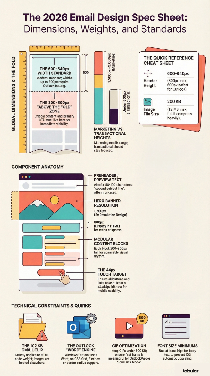
Industry standard:
- 600px width
- 75kb HTML size
- 1500px height
2026 Email Template Sizes
Email Template Size Guide
Everything you need to know about widths, heights, weights, and component dimensions — for every element in a marketing or transactional email.
01. Quick Reference
Use this table when you need a fast answer. Everything else in this guide expands on the why behind each number.
| Element | Ideal | Max | |
|---|---|---|---|
| Template width (desktop) | 600–640px | 800px | 600px is the classic standard; 640px is where modern templates land |
| Template width (mobile) | 320px | 480px | 480px forces landscape; hurts engagement |
| Template height | 1500px | 3000px | Keep critical content in the top 300–500px ("above the fold") |
| Header height | 100–150px | 200px | Includes logo, navigation bar |
| Banner / Hero | 600px × 90–200px | 700×1,730px | Width matches template; height depends on content |
| Content blocks (total) | 800px | 1200px | |
| Footer height | 100px | 300px | Unsubscribe, contact, legal |
| CTA button | 200–300 × 50–75px | — | Full-width on mobile |
| Image file size | 200 KB | 1 MB | Use CDN or Compress before embedding |
| GIF file size | 500 KB | 1 MB | Heavier = longer load time |
| HTML file size | 75 KB | 102 KB | Gmail clips at 102 KB — content gets hidden |
| Preheader text | 50–100 chars | ~140 chars | Preview is truncated further on mobile |
| Transactional email height | ≤800px | 1500px | Short, focused, information-first |
| Each content block | 200–300px tall | — | Combined total: 800–1,200px |
| Image asset resolution | 2× (retina) | Design images at 1,200px wide, display at 600px |
02. Width
The width question answered definitively
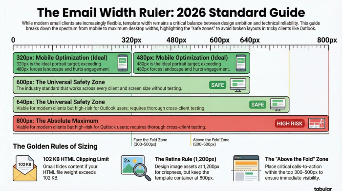
Width is the most debated dimension in email design. The short answer: 600–640px is still the industry standard, and it's not outdated — it's battle-tested.
Common widths compared:
| Width | Context | Status |
|---|---|---|
| 320px | Mobile portrait | Ideal |
| 480px | Mobile landscape | Maximum |
| 600px | Desktop | Classic standard |
| 640px | Desktop | Modern standard |
| 800px | Desktop | Maximum — test thoroughly |
Why 600px became the standard
In the early days of email clients, display resolutions were lower and clients like Outlook rendered emails in a pane that was often around 600–640px wide. Setting the template to 600px ensured nothing got clipped. That constraint no longer exists technically, but the standard has proven remarkably durable because it works universally across every client and screen size without testing.
Can you go wider?
Yes — with caveats. Modern email clients (Gmail, Apple Mail, Yahoo) dynamically resize content and won't horizontally scroll at 700–800px. Practitioners building for large streaming companies regularly use 800px without issues. However, Outlook on Windows remains the biggest risk — it uses the Word rendering engine and can behave unpredictably at non-standard widths. If your audience skews heavy Outlook, stay at 600–640px.
The practitioner consensus: 600–640px is safe for all audiences. 700–800px is viable if you test thoroughly across clients, especially Outlook. Going wider is a risk vs. reward decision — for most teams, the testing overhead isn't worth the extra 160px.
The "design at 1,200px" rule
Some practitioners mention designing at 1,200px — this applies to image assets only, not the template itself. When you design a hero image at 1,200px wide and export it, then constrain it to 600px in the email, it renders at 2× resolution — crisp on retina screens. The template container should still be 600–640px.
Do ✓
- Set template container to 600–640px
- Design image assets at 1,200px for retina
- Test at 700–800px if you want to push wider
- Use max-width in CSS for fluid layouts
- Stay at 600px if heavy Outlook audience
Don't ✗
- Set the template itself to 1,200px
- Assume modern clients = safe to go wide
- Go over 800px regardless of client share
- Use percentage widths without a max-width cap
- Skip cross-client testing if going above 640px
03. Height
Height is more flexible than you think
Unlike width, there's no hard technical limit on email height — but there are engagement limits. The longer the email, the fewer readers make it to the end.
| Dimension | Value | Notes |
|---|---|---|
| Ideal height | 1,500px | Sufficient for most marketing emails |
| Maximum | 3,000px | Technically fine, expect drop-off |
| Above the fold | 300–500px | Where critical content must live |
| Transactional | ≤1,500px | Short and focused is best |
The fold principle
The "above the fold" region — roughly the top 300–500 pixels of the email — is what recipients see before they scroll. Your most important message, offer, or call to action should live here. Everything below the fold depends on the reader choosing to continue.
Managing long emails
If you have a lot of content, structure helps readers navigate rather than abandon. Use clear visual headers between sections, keep paragraph text short, use images to break up text walls, and consider linking to a web version for especially dense content.
Content strategy tip: Very long emails aren't inherently bad — some content-heavy brands regularly send emails nearing 4,000px with strong engagement — but they achieve this through clear visual rhythm and modular block structure. Length works when the structure is excellent.
04. File Weight
The limit most designers miss
File weight is the dimension that causes the most surprise failures. Gmail clips emails at 102 KB of HTML — and everything after that point simply disappears.
| Spec | Value | Notes |
|---|---|---|
| HTML ideal | 75 KB | Comfortable headroom |
| HTML maximum | 102 KB | Gmail clips above this |
| Image ideal | 200 KB | Per image file |
| Image max | 1 MB | Absolute ceiling |
| GIF ideal | 500 KB | For fast loading |
| GIF max | 1 MB | Heavier = slower |
HTML weight vs. image weight: they're separate
This is a critical distinction: the 102 KB limit applies only to your HTML code, not to the images referenced within it. Images are fetched separately and don't count toward the HTML clipping threshold. Compressing your images won't reduce your HTML weight — you need to cut HTML content itself.
What inflates HTML weight?
Inline CSS (especially repeated across elements), deeply nested table structures (common in Outlook-compatible templates), redundant attributes, long base64-encoded images embedded directly in HTML, and excessive tracking parameters in links all add to HTML weight. Use an email sending platform's code minifyer if available, and audit your markup for bloat.
Spam considerations: Image-to-text ratio matters for deliverability. Emails composed entirely of images are more likely to be flagged as spam. Aim for a healthy mix of live text and images. Good text-to-image ratio also protects readers whose image loading is disabled by default.
05. Component Dimensions
Every part of your email, sized
A detailed breakdown of every structural element — from preheader to footer — with ideal dimensions, max dimensions, and design notes.
| Section | Recommended Dimensions / Notes |
|---|---|
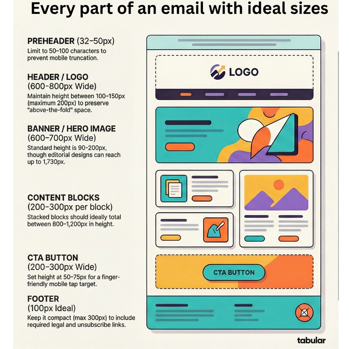
| Preheader | Height: 32–50px · 50–100 characters |
| Header / Logo | Width: 600–800px · Height: 100–150px (max 200px) |
| Banner / Hero | Width: 600–700px · Height: 90–200px (max 700×1,730px) |
| Content Block 1 | Height: 200–300px per block |
| Content Block 2 | Total content blocks height: 800–1,200px |
| CTA Button | Width: 200–300px · Height: 50–75px |
| Footer | Height: 100px ideal · max 300px |
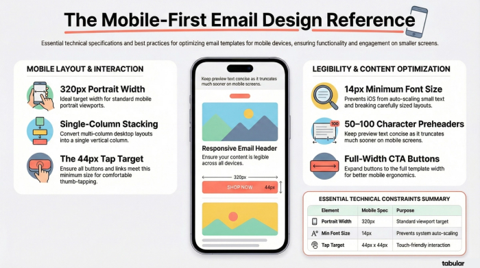
Preheader / Preview text — 50–100 chars
The preheader is the snippet of text that appears alongside your subject line in the inbox list view. It's one of the most valuable — and most ignored — elements in email design. Treat it as a second subject line rather than a summary of the email.
Some templates also include a visible preheader at the very top of the email body (before the header), sometimes used for "View in browser" links. Keep this to 50–65px in height.
- Ideal: 50–100 characters
- Max visible: ~140 chars (truncated)
- Mobile: shorter truncation
Header — 100–150px tall
The header typically contains your logo and optionally a navigation bar. The key rule: don't let your header eat too much vertical space before the reader sees real content. A header that's 200px+ pushes everything below the fold.
- Width: Full template width
- Height ideal: 100–150px
- Height max: 200px
Banner / Hero image — 600–700px wide
The banner is the visual centerpiece of most marketing emails. Width matches your template (600–700px on desktop, 320–385px on mobile). Height is more flexible — 90–200px for a contained banner, or it can take up most of the email body for editorial or product launches.
- Desktop width: 600–700px
- Mobile width: 320–385px
- Height: 90–200px typical
- Max: 700×1,730px
Content blocks — 200–300px each
Content blocks are the modular body sections of your email. Each individual block should be around 200–300px tall — long enough to be substantive, short enough to feel digestible. The total height of all content blocks combined (excluding padding) should sit between 800–1,200px for a comfortable reading experience.
Use clear visual separation between blocks — background colour changes, divider lines, or ample whitespace. Readers scan rather than read, so scannable block structure is essential.
- Per block: 200–300px
- Total: 800–1,200px
CTA Button — 50–75px tall
Your call-to-action button should be large enough to tap comfortably on mobile (minimum 44px tall per Apple's HIG) and visually distinct from surrounding content. On mobile, extend the button to full template width so it's easy to tap with a thumb.
- Width: 200–300px
- Height: 50–75px
- Mobile: Full width
- Min tap target: 44×44px
Footer — 100px ideal
The footer contains the essentials: unsubscribe link (legally required in most countries), physical mailing address (required by CAN-SPAM and GDPR), social media links, and any legal disclaimers. Keep it compact — a bloated footer makes the email feel bureaucratic and pushes it over file size limits.
- Ideal height: 100px
- Max height: 300px
06. Images & GIFs
Visual assets: size & resolution
Images are where email design gets technical. You're balancing visual quality, load speed, file size, and cross-client rendering simultaneously.
Images
The sweet spot for email images is 600–800px wide at display size. For retina/HD screens, design assets at 2× that width — so 1,200px for a full-width image — then constrain the rendered width in your HTML/CSS to 600px. This gives you crisp rendering on high-density screens without changing your template width.
Compress all images before embedding. JPEG works well for photos at 70–80% quality. PNG is better for logos, illustrations, and anything with transparency. WebP is excellent but not universally supported in email clients — test before using.
- Ideal file size: 200 KB
- Maximum: 1 MB
Animated GIFs
GIFs are widely supported in email and add motion without requiring video. The heavier the GIF, the longer it takes to load — and if a reader has a slow connection, they may see a still frame of the first image only. Keep your most important frame first.
Apple Mail and Outlook 2007–2019 on Windows will only show the first frame of an animated GIF. Always design your first frame to work as a static image that makes sense on its own.
- GIF ideal: 500 KB
- GIF maximum: 1 MB
Image blocking
Many email clients block images by default, particularly in B2B environments. Design emails so that they communicate core information even with images turned off. Use descriptive alt text on every image, ensure CTA buttons use live HTML text (not text in an image), and maintain a healthy text-to-image ratio.
Spam filter note: Emails composed entirely of images — no live text — are significantly more likely to be caught by spam filters, because filters can't read the content and assume you're hiding something. Even a minimal block of live body text helps deliverability considerably.
07. Mobile
Mobile is now the primary canvas
More than half of all email opens happen on mobile devices. Responsive design isn't optional — it's the baseline expectation.
Dimension Value Notes Portrait width 320px Standard portrait — ideal target Landscape width 480px Requires phone rotation — avoid if possible Min font size 14px iOS auto-increases smaller text Min tap target 44px Apple HIG minimum for touch
Responsive approaches
Most email service platforms support media queries for responsive design. The common approach is to design for desktop width first (600–640px), then use @media (max-width: 600px) to override widths, stack columns, increase font sizes, and expand CTA buttons to full width.
Fluid vs. responsive: A "fluid" layout uses percentage widths so the email naturally scales to any container width. A "responsive" layout uses media queries to apply different rules at different breakpoints. Many modern templates combine both — fluid within each section, with responsive breakpoints for layout changes like stacking columns.
Modern client rendering
Gmail, Yahoo, and AOL now dynamically scale email content to fit their viewer pane, so technically even a very wide email won't cause horizontal scrolling in those clients. However, this scaling shrinks text to unreadable sizes and breaks pixel-perfect layouts. The 600–640px standard isn't just a technical constraint — it's a legibility and design constraint.
Mobile best practices ✓
- Stack multi-column layouts to single column
- Expand CTA buttons to full width
- Minimum 14px body font size
- 44×44px minimum touch targets
- Large, finger-friendly link areas
Common mobile mistakes ✗
- Tiny text that requires pinching to zoom
- Side-by-side columns at mobile size
- Small CTA buttons hard to tap accurately
- Links too close together
- Images wider than the viewport
08. Transactional Emails
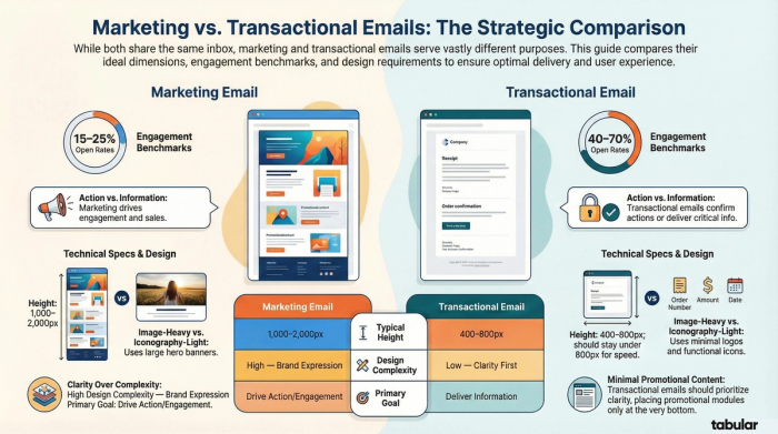
Transactional emails play by different rules
Order confirmations, password resets, shipping notifications — these emails carry functional information. The design principles differ significantly from marketing emails.
- Ideal height: ≤800px — short and scannable
- Max height: 1,500px — don't pad with marketing content
Design principles
Transactional emails should be read and understood in seconds. Lead with the most critical information — order number, confirmation status, tracking link — above anything else. Use clear hierarchy: one primary action (e.g. "Track your order"), supporting details below.
While it's acceptable to include a small promotional module at the bottom of a transactional email, the primary purpose must be information delivery. Transactional emails have some of the highest open rates of any email type precisely because they're trusted and relevant — don't erode that trust with heavy promotion.
Marketing vs. Transactional: Key Differences
| Attribute | Marketing Email | Transactional Email |
|---|---|---|
| Primary goal | Drive action / engagement | Deliver information / confirm action |
| Typical height | 1,000–2,000px | 400–800px |
| Image use | Heavy — heroes, product shots | Light — logo, minimal iconography |
| Open rate | 15–25% typical | 40–70% typical |
| Promotional content | Core purpose | Secondary, at bottom only |
| Design complexity | High — brand expression | Low — clarity first |
09. Email Client Differences
Where templates behave differently
Every major email client renders HTML slightly differently. Understanding the biggest differences saves hours of debugging.
Outlook (Windows) — Highest risk
Outlook 2007–2019 on Windows uses the Microsoft Word rendering engine — not a web browser. This means many modern CSS properties don't work: CSS grid, flexbox, background images in divs, border-radius in certain contexts, and more. Most email developers use VML (Vector Markup Language) for things like background images and rounded buttons in Outlook, wrapped in conditional comments (<!--[if mso]>).
Outlook also has its own interpretation of widths — always test Outlook specifically when going above 600px.
Gmail — Clip at 102 KB
Gmail clips email HTML at 102 KB and shows a "View entire message" link. Everything below the clip point is hidden until the reader clicks that link — which most won't. Gmail also strips <style> tags from the <head> in some contexts, requiring inline styles for reliable rendering. Media queries are supported in modern Gmail.
Apple Mail — GIF: first frame only
Apple Mail has strong CSS support and generally renders modern email well. The main quirk: on iOS, Apple Mail will automatically increase font sizes smaller than roughly 13px to improve legibility — which can break carefully sized layouts. Use -webkit-text-size-adjust: none to prevent this, or simply design with 14px+ body text. Apple Mail also shows only the first frame of animated GIFs when image loading is on Low Data Mode.
Yahoo & AOL — Generally permissive
Yahoo and AOL have improved their rendering engines significantly. Modern widths (up to 800px) render without horizontal scroll. They support most standard CSS. The main consideration is that they may not support the full range of web fonts — always include robust fallback font stacks.
Testing recommendation: Use a service like Litmus or Email on Acid to preview your email across 50+ clients before sending. The visual differences between Outlook on Windows and Gmail on iPhone can be dramatic — pixel-perfect on one, broken on another, without a live test.
10. Pre-Send Email Template Size Checklist
Before you hit send, Run through this checklist for every email.
- [ ] Template width set to 600–640px — Not 800px or 1,200px — those are for images, not the container
- [ ] HTML file weight under 75 KB (max 102 KB) — Measure the rendered HTML, not just the source file
- [ ] All images compressed to ≤200 KB each — Use TinyPNG, Squoosh, or your ESP's built-in optimizer
- [ ] GIFs under 500 KB and first frame works as static image — Outlook and some clients show only the first frame
- [ ] Alt text on every image — Describe the image meaningfully — not just "image" or "banner"
- [ ] Email renders with images turned off — Core message and CTA must be readable without images
- [ ] Preheader text is set and meaningful — 50–100 characters; treated as a second subject line
- [ ] Critical content is in the top 300–500px — Don't bury your main offer or CTA below the fold
- [ ] Tested on mobile at 320px width — Single-column layout, full-width CTAs, 14px+ font size
- [ ] Tested in Outlook on Windows — The most unpredictable client — test specifically, not just "desktop"
- [ ] Tested in Gmail (web and mobile app) — Different rendering in each; Gmail app on Android differs from web
- [ ] Footer includes unsubscribe link and physical address — Required by CAN-SPAM (US) and GDPR (EU)
- [ ] Text-to-image ratio is balanced — Avoid all-image emails — they trigger spam filters
- [ ] All links tested and working — Including unsubscribe, tracking, and social links