This is the most technically demanding chapter. In web design, you use display: flex; gap: 20px;. In html email, we must build a spreadsheet. We will create the "Product Row" where two items sit side-by-side with a gap in the middle.
Fixed-width layouts ensure consistent rendering across devices. Rather than wrestling with email code, use one of Tabular's html email templates, they handle layout optimization automatically, with columns that adapt seamlessly to any device.
1.1 The Fixed-Width Math
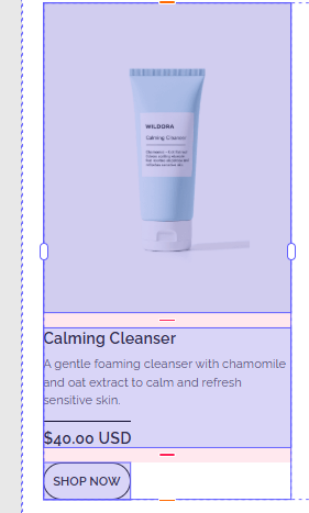
This html uses a "Hybrid" grid. It is fluid on mobile, but rigidly fixed on desktop.
HTML
<table class="t141" role="presentation" cellpadding="0" cellspacing="0" align="left" valign="top">
  <tr class="t140">
    <td class="t100" width="307" valign="top">
       </td>

    <td class="t97" width="24"></td>

    <td class="t139" width="283" valign="top">
       </td>
  </tr>
</table>
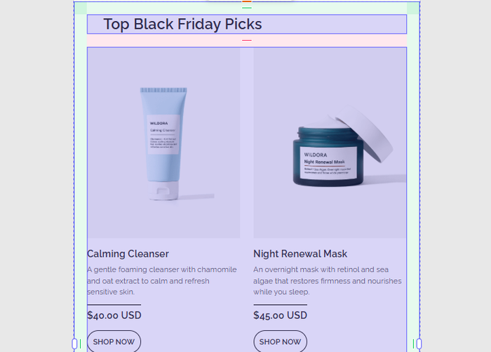
The Equation: 307px (Left) + 24px (Gutter) + 283px (Right) = 614px.
- Wait, why 614px? Earlier we said the card was 640px.
- Padding: The container holding this table likely has
padding: 13pxon the left and right sides. - Rule: You must calculate every single pixel. If the sum of your columns (614) exceeds the container width, Outlook will "break" the table, often dropping the right column onto a new line or forcing a horizontal scrollbar.
1.2 The Gutter (The Empty Cell)
In web design, we use gap. In email, gaps do not exist. We must create a physical cell to push the content apart.
HTML
<td class="t97" width="24"></td>
- Why not
margin-right? If we addedmargin-right: 24pxto the first product, Outlook would likely ignore it. - Why not
padding-right? If we addedpadding-right: 24pxto the first product, it would work, but it would shrink the available space for the text inside that cell. - The Empty Cell: Using a dedicated
<td>is the safest way to ensure the gap is rendered identically across all 50+ email clients.
1.3 The Button Fallback (Graceful Degradation)
Look at the "Shop Now" button inside the product column.
HTML
<td class="t92" style="border:1px solid #2B2B2B; border-radius:100px; text-align:center; padding:10px...">
  <span class="t90" style="display:block;">Shop Now</span>
</td>
- The CSS:
border-radius: 100pxcreates a pill-shaped button on iPhone, Gmail, and Apple Mail. - The Outlook Reality: Outlook for Windows does not support border-radius on table cells. It will ignore that line of code.
- The Result: On Outlook, the user will see a square rectangle with sharp corners.
- The Strategy: This is called "Graceful Degradation." We accept that Outlook users get a slightly less "round" experience to keep the code simple. If round corners were strictly required for branding, we would have to use VML (Vector Markup Language) to draw a round button, which adds significant code bloat.
1.4 Alignments (valign)
Notice the attribute valign="top" on the product cells (td).
Textbook Analysis:
- The Problem: By default, table cells align vertically to the
middle. If the "Calming Cleanser" description is 2 lines long, and the "Night Renewal Mask" description is 4 lines long, the shorter one would float in the middle of the whitespace. - The Fix:
valign="top"forces the content to anchor to the top of the row, ensuring the images and headlines line up perfectly regardless of how much text is below them.
Tabular is an online email builder that lets you design and download email templates as production ready HTML files.
Final Words
You have built the Grid.
- Math: Ensure Column A + Gutter + Column B <= Container Width.
- Gutters: Use an empty
<td>, not margins. - Buttons: Use standard CSS borders, but expect them to be square in Outlook.
- Alignment: Always explicitly set
valign="top"on columns.
Ready for Chapter 5? Now we perform the magic trick: Taking this rigid, fixed-width table and forcing it to stack vertically on a mobile phone. This is Responsive Design for HTML Emails.