Color Theory in Marketing: What It Means and How to Use It
Table of contents
- What Is Color Theory?
- The Origins of Color Theory
- How Does Color Theory Work?
- The Color Wheel and Its Components
- Color Harmony and Color Schemes
- Key Concepts in Color Theory
- Warm and Cool Colors
- Applications of Color Theory
- Practical Tips for Using Color Theory
- Common Mistakes to Avoid in Color Usage
- Conclusion:
Whether you approach it from an ontological or psychological perspective, colors play a significant role in human life. Their meanings, associations, and motivations can vary depending on personal, cultural, or social contexts. However, the impact of color theory on our lives, helping us to understand the world around us better, is undeniable.
So, what is color theory? It lies at the intersection of art and science, demonstrating how colors influence our psychology and generate new ideas based on the colors in our environment. If you’re looking to establish a visual identity for your brand, color theory is a reliable tool that can enhance your brand’s value.
In this article, we will explore color theory in marketing and how to apply it to your brand. From historical insights to contemporary visual examples, this guide aims to assist you in selecting the ideal colors to represent your brand.
What Is Color Theory?
Color theory is the study of how colors interact, evoke emotions, and influence perceptions, often used in art, design, and marketing to create visual harmony and convey messages effectively.
This leads to the question: Why is color theory important? In reality, there is no such thing as a purely monochromatic object, where a surface is uniformly one color. Every color exists in relation to another. We perceive aspects like depth, contrast, hierarchy, and visual organization through the use of color.
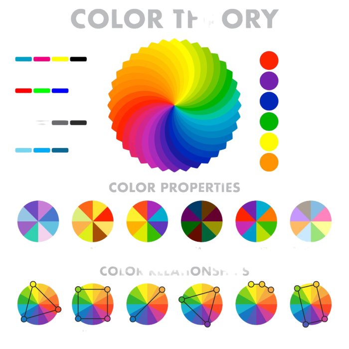
Therefore, whether you’re developing a brand identity, choosing a color for your logo, or even selecting a shade of blue that complements your skin tone, you are applying color theory. It enables us to make an impression on others and influence how they perceive a campaign, product, service, or advertisement.
The Origins of Color Theory
Throughout the history of art and science, we have observed psychological data showing how color perceptions influence our emotions and perceptions. To better explain these theories, the color theory wheel was created to represent various hues, shades, and tones, each capable of altering emotional responses.
Early Philosophical Thoughts on Color
Aristotle's Contributions: The Greek philosopher Aristotle also used physical objects and colors to express his views on the natural world. He explained that because living beings are part of the natural world, we need features like colors to identify them.
According to Aristotle, from wild animals to the complex human brain, all living beings have a perception of color. This is because colors possess the power to be observed. He argued that colors have the ability to make themselves visible.
While this idea may seem outdated and complex, in a time when the impact of time on our emotions was not yet understood, these early steps were crucial for human development.
The First Writings on Color Theory
Leone Battista Alberti's "Della Pittura" (~1435): Alberti was a key figure of the Renaissance era, known for his contributions as an architect, poet, philosopher, and linguist. Through his work across these fields, he was able to analyze a wide range of subjects, including art, mathematics, and literature.
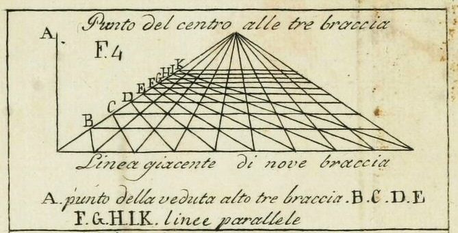
In the 1430s, he began his influential work Della Pittura, where he explored concepts such as perspective, composition, and color. As one of the first to analyze color in such a way, his writings became a foundational part of color theory and hold significant importance in art history. Through his work, art began to intersect with science, inspiring both artists and scientists to further explore this field.
How Does Color Theory Work?
Having explored the early steps of color theory, let's now move on to how color theory works.
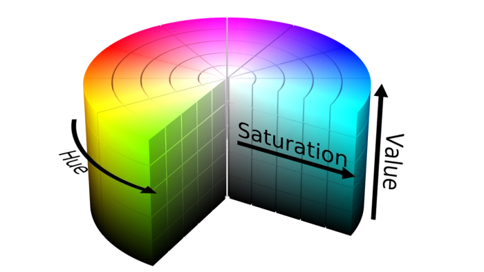
Color theory enables you to work with three key elements of color: hue, value, and saturation. Hue refers to the color itself, which can be identified by a specific code. Value is the shading or lightness/darkness of the color, while saturation indicates the intensity or purity of the color. By adjusting these three elements, you can create an infinite variety of colors, which can be analyzed using tools like a color theory calculator.
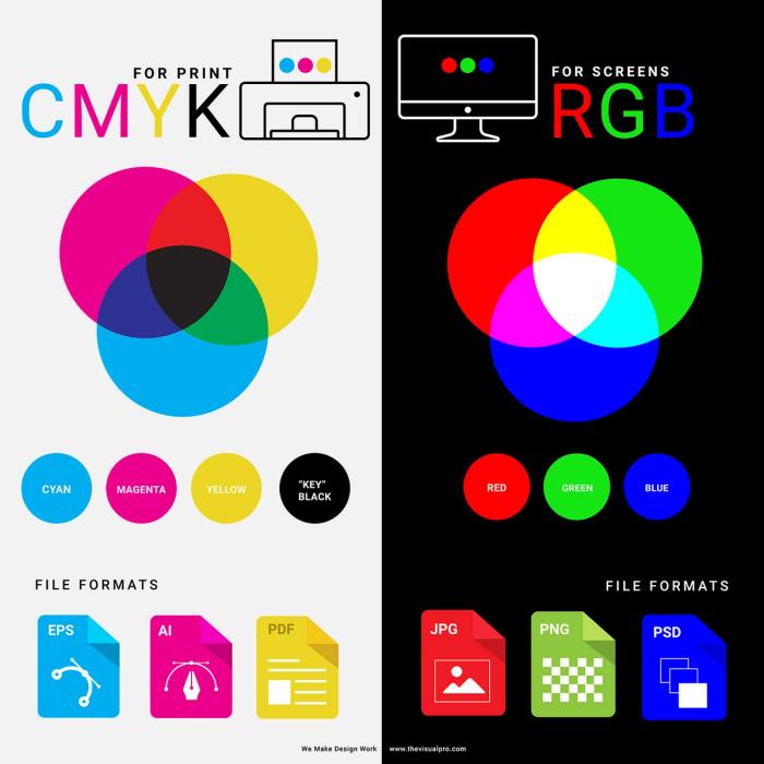
Contrary to common belief, color theory is not only used by artists. Even in your own home, when printing documents with a printer, you are applying color theory. To replicate the colors in your mind, it's essential to understand additive and subtractive color models.
Additive colors are used in devices like cameras, phones, computers, and televisions. In this model, colors are created by adding different amounts of red, green, and blue (RGB). These primary colors combine in various ways to form a wide spectrum of colors. By layering these colors, screens create sub-pixels that determine the saturation and value of the colors displayed.
In contrast, subtractive colors involve reflected light and are used in mediums like silk-screening, printing, and painting, where pigments are added to a substrate. The primary subtractive colors are cyan, yellow, magenta, and black (CMYK). Through overlapping tints of these colors, often in dot patterns, the illusion of a fully colored image is created.
The Color Wheel and Its Components
Primary Colors
Now it's time to discuss the basics of the color theory wheel. You may have encountered this in kindergarten, but as information tends to fade over time, we’d like to refresh your memory with the fundamental color theory chart.
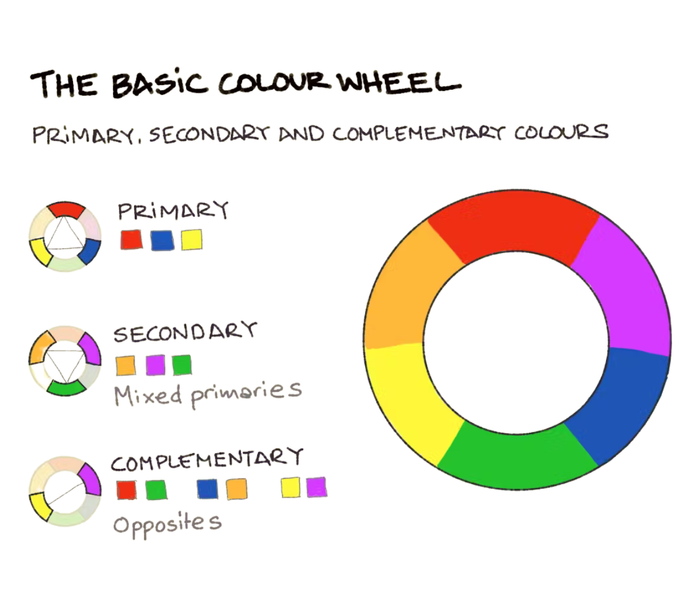
In painting, there are colors that cannot be created by mixing two other colors. These are considered the primary colors, the foundation for creating all other colors through specific mixing ratios. The primary colors are red, yellow, and blue.
Secondary Colors
By mixing primary colors in various ratios, you can create any hue (except black and white). However, when you mix the primary colors in equal parts (1:1 ratio), you get the secondary colors: orange, purple, and green. To adjust their value and saturation, you can add more of the primary colors or incorporate black and white.
Tertiary Colors
Taking it a step further, by mixing secondary and primary colors in a 1:1 ratio, you will create tertiary colors. By continuing this process with equal sections of each color, you can generate any hue you desire.
Color Harmony and Color Schemes
What Is Color Harmony?
In color theory, artists focus on color harmony and how different colors work together. For example, think about a well-designed shop window that feels balanced and visually pleasing. A big reason for this is the thoughtful use of color harmony. Similarly, on magazines, you often see pages that immediately grab attention, thanks to effective color combinations.
In this section of the blog, we will explore the pleasing arrangements you can create with colors. By the end of this passage, you'll be equipped to create color combinations that suit your specific goals.
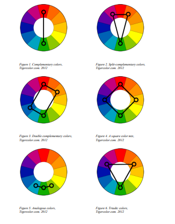
Monochromatic Color Scheme
One way to achieve color harmony is by choosing a single color and using different tones of it. You can think of the colors as individual spots and experiment with shapes and textures. This approach is often seen in fashion collaborations, such as the use of monochrome beige tones in autumn or varying shades of blue in wintertime interior design.
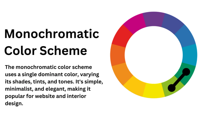
Analogous Colors
An easy way to find harmony is by selecting a color on the color theory wheel and then adding the colors that are adjacent to it. This creates natural-looking combinations, like the red, orange, and yellow hues seen in fall leaves. If you're working with a gradient, using analogous colors—those next to each other on the wheel—is a great approach.
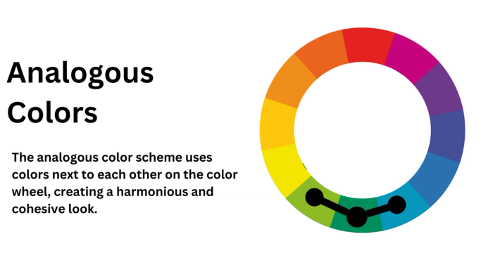
Complementary Colors
Imagine a color theory wheel and use a rope to connect the opposite sides. The colors at each end of this rope are called complementary colors. These combinations are striking and attention-grabbing, like the red apples on a green-leaved tree. On the other hand, using analogous colors can help establish hierarchy in a design by creating a smooth flow between elements.
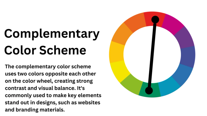
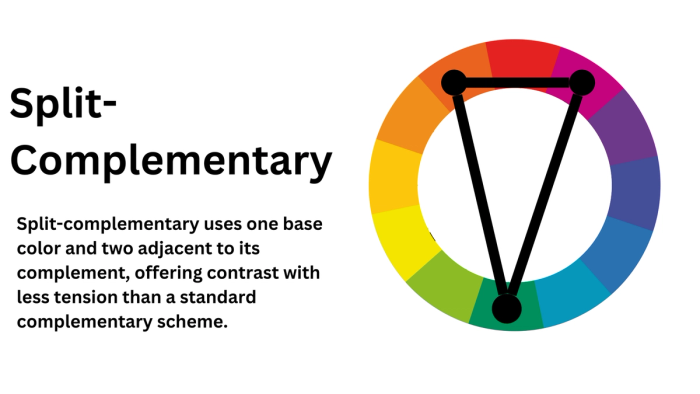
Split-Complementary
Now that we've discussed complementary colors with a rope, imagine this as an acute triangle. By splitting a color with low tension into two parts and then adding the color opposite them, you create a strong contrast. This technique works well in presentations, where you can use a single color for the background and the shapes or elements in split complementary colors to enhance visual appeal.
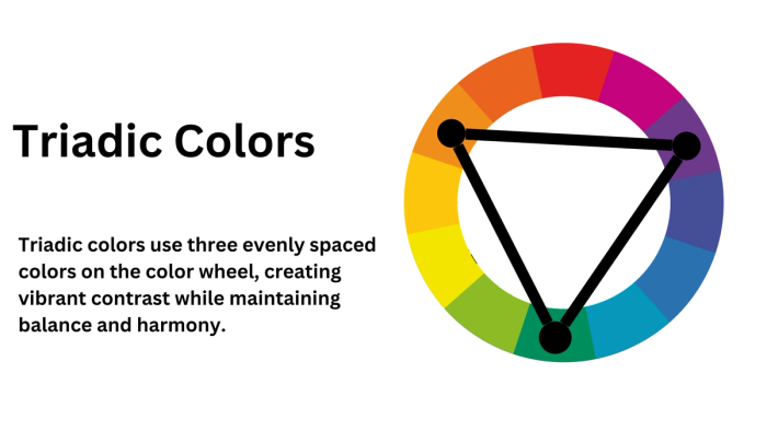
Triadic Colors
Building on the concept of triangles, you can use an equilateral triangle to demonstrate this. Place a perfect triangle on the color wheel, ensuring that the points of the triangle are spaced equally apart. The colors at each point of the triangle should be equidistant from one another, creating a balanced and harmonious combination.
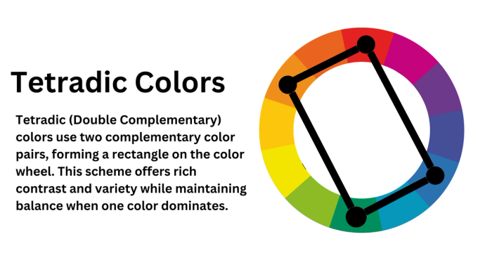
Tetradic (Double Complementary) Colors
Now, let's add a new spot to the triangle, turning it into a double complementary color rectangle. If your design contains numerous elements and you need to maintain harmony with similar tones, this is the perfect approach. The double complementary scheme ensures balance while introducing more variety through the use of two pairs of complementary colors.
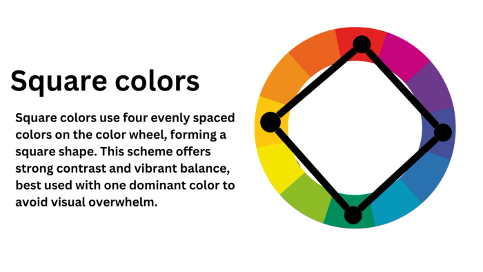
Square Colors
If you want to use different colors with no direct connection to each other, you can opt for square colors. To do this, draw a square and place it on the color wheel chart. The colors at the corners of the square will be evenly spaced and complementary, creating a balanced yet diverse color palette.
Key Concepts in Color Theory
We’ve discussed what color theory is and explored details like who invented color theory. Now, it's time to dive into the key concepts surrounding color theory to provide a solid foundation for our argument.
Hue, Saturation, and Value
- Hue: Hue refers to the most dominant wavelength of light, and it's the first element we consider when mixing primary colors. It represents the purest form of a color, making it the most saturated. In the CMYK color model, hue is 100% pure, as it lacks any white, black, or gray. In the RGB model, saturation is at its highest, and the hue ratio is dominant in the wavelength of the color.
- Saturation: Saturation refers to the brilliance and intensity of a color. For example, when a color is "toned," white and black (or gray) are added, which reduces the saturation. In the additive light color model, saturation is based on how much or how little of other hues are present in the color. Essentially, it represents the purity of the color.
- Value (Brightness): Value refers to the lightness or darkness of a color. In the context of pigments, darker hues are called "shades," while lighter hues (created by adding white) are called "tints."
Warm and Cool Colors
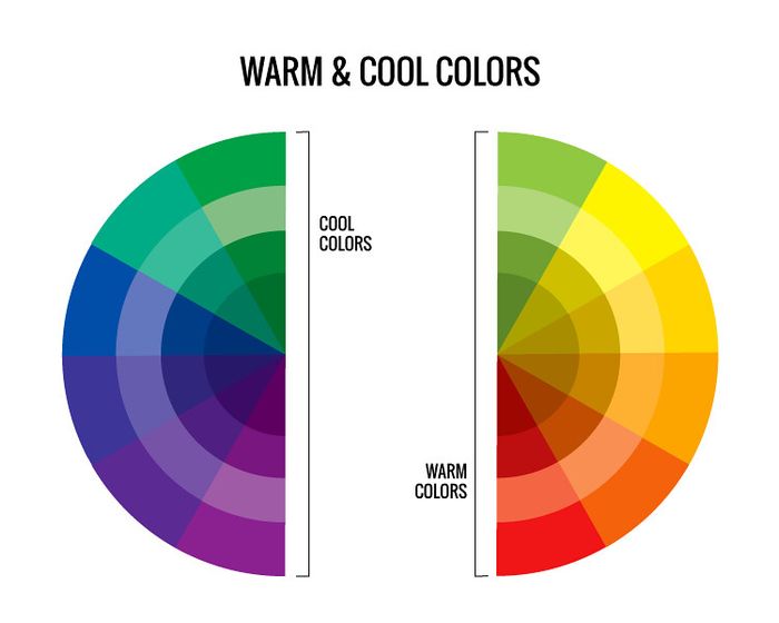
In color theory and psychology, the distinction between cool and warm colors plays a crucial role. If you divide the color wheel from bottom to top, you can clearly see the separation of warm and cool colors.
Warm colors; such as red, orange, yellow, and the shades in between—are typically associated with energy, positivity, and warmth, often bringing a sense of sunshine to a space. These colors are commonly seen in magazines, fast food chains, and the design of fast cars.
Cool colors, on the other hand, include blue, green, purple, and the hues between them. These colors are linked to relaxation, calmness, and concepts like fitness and health. You'll often encounter cool colors in meditative spaces or in advertisements for healthy food.
How Colors Affect Human Emotion and Behavior
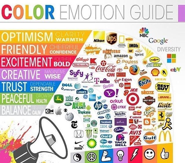
This section addresses the question: Why is color theory important? Using color theory in psychology-related areas can significantly simplify your work. Different colors carry distinct meanings, connotations, and psychological effects, which can vary depending on location and culture. Therefore, it’s essential to consider these factors when applying color theory. For example, warm colors are often associated with emotions like passion, anger, and power, while cool colors such as purple, blue, and green tend to have a calming effect.
Applications of Color Theory
Color Theory in Art and Design
Designers and artists in the visual arts use color much like an alphabet, making it essential for anyone aspiring to be a successful designer or visual artist to understand color theory and the psychological effects of colors. Creative fields such as architecture, design, and fashion rely on colors to shape people’s experiences and connect with them directly. This is particularly evident in areas like product design, fashion design, and interior design.
Visual artists, on the other hand, work with both the CMYK and RGB color models, depending on whether their medium is physical or digital. Regardless of the medium, they use elements like harmony, contrast, and balance to bring the art in their minds to life. For example, in the famous painting The Kiss by Gustav Klimt, you can see the harmonious use of colors. The warm tones of yellow, red, and orange evoke a sense of genuineness and happiness, which aligns with the emotions the painting seeks to convey.
Color Theory in Marketing and Branding
From email marketing banners to large billboards on highways, the examples of color theory in use vary greatly. Colors are often employed to evoke specific emotions and associations, and this technique has been a staple in marketing for a long time.
For example, green is commonly associated with eco-friendly products or those related to fitness and well-being, thanks to its connection to natural tones.
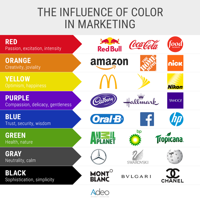
On the other hand, when promoting a limited-time sale or an urgent opportunity, warm colors are often used to emphasize the excitement and urgency of the offer.
Color theory is also evident in product packaging. Take a stroll through chocolate aisles in any store, and you'll notice how brands carefully choose colors to convey their intended message. Analyzing the colors used on these packages can be an interesting challenge.
Color Theory in Digital Media
We rely heavily on devices to complete most of our work nowadays, so it's essential to consider UI/UX design and the impact of social media, which are crucial areas in modern design. For example, social media platforms now offer dark and light themes, allowing users to choose the one that suits them best.

As attention spans continue to shorten, it's crucial to capture attention quickly and effectively. To do this, you can use color harmony and contrasting colors to draw focus. By understanding the psychological effects of the emotions that colors evoke, you can leverage this knowledge to promote your product or content in the most impactful and representative way possible.
Practical Tips for Using Color Theory
Creating Effective Color Combinations: After discussing all of this, it may seem a bit overwhelming, but don’t worry. With the help of online tools like color palette generators or color theory calculators, you can easily create designs that represent your brand effectively.
If you're aiming for a design that incorporates a variety of colors, we suggest using triadic, analogous, or square harmony choices. These options involve multiple hues, offering plenty of flexibility. Take some time to experiment with them and observe how each color affects the overall feel. Then, reflect on your findings to build your own brand color palette.
Considering Accessibility: Having colors that look good together is just the first step. The legibility and accessibility of your design also matter. Certain colors, especially complementary ones, can be dominant and may create a complex visual experience. When addressing readability or vision impairments, it's important to avoid stacking highly dominant colors on top of each other. By adjusting elements like value and saturation, you can soften these contrasts and make your design more accessible to a wider audience.
Common Mistakes to Avoid in Color Usage
Using Too Many Vibrant Colors: Overloading a design with vibrant colors can be overwhelming for the viewer. In graphic design, when something is overused, it becomes the focal point, and if it seems like a mistake, it can cause visual fatigue. To avoid this, it's important to balance vibrant colors with more subdued tones by adjusting saturation and value. This helps maintain visual interest without exhausting the viewer.
Ignoring Cultural Connotations of Colors: Colors hold different meanings across various cultures, so context is crucial when designing. Whether you're creating art or marketing materials, understanding the audience's cultural perception of certain colors will help you avoid misunderstandings or unintentionally offending someone. Being mindful of these associations ensures your design resonates positively and appropriately with diverse audiences.
Poor Contrast Leading to Readability Issues: A design that is hard to read is a poor design. This is especially true in UI/UX design, where readability is essential for user experience. If color contrasts are not properly used, it can make text or important elements difficult to distinguish, leading to confusion. Ensuring adequate contrast between background and foreground colors is key to making content easily legible and improving usability.
Relying Solely on Personal Preference Without Considering the Audience: While personal taste plays a role in design, it's important to prioritize the needs and preferences of your audience. The entire color theory framework was developed to understand and organize color relationships, and these principles should guide your design choices. By using these established color combinations appropriately, you can create designs that are not only aesthetically pleasing to you but also functional and appealing to your target audience.
Conclusion:
We have seen how important it is to understand color theory. We use it in all sorts of visual arts, marketing, digital media content creation, design-related jobs and more. Thus, understanding how colors influence emotions and perceptions enhances creativity and effectiveness in any project. By using color theory in your designs, you can make informed decisions to evoke specific feelings and convey clear messages in your work.
Apply color theory in your next project to experiment with different combinations and see how they impact your design. Use tools like color palette generators to refine your choices and improve engagement. Whether you're new to the topic or refining your skills, color theory is a powerful tool to elevate your work and enhance communication.
We hope that through this blog we were able to cover the topics of color psychology and its uses. Happy emailing and designing!