Designing Emails with Color Psychology: Templates for Success
Table of contents
- Understanding Color Psychology
- Key Colors and Their Psychological Effects
- Choosing the Right Colors for Your Brand
- Examples of Successful Brands and Their Color Choices
- Maximizing Click-Through Rates (CTR) with Colors
- Creating Visual Hierarchy with Colors in Email Templates
- Designing for Different Audiences
- Tools for Designing Emails with The Right Colors
- Conclusion
Have you ever seen a fast food chain with only blue and green colors? Or come across a mental health app using solely red monochrome tones? It's hard to imagine, isn't it? That's because successful businesses and well known brands use marketing color psychology techniques.
If you want to be a well-known brand or at least create a brand image that aligns with your goals, building emails with consistent and professional designs is the key. In this article, you'll learn all about color psychology and how to drive your email marketing campaigns to greater success.
According to an article on techreport, up to 90% of an initial impression is influenced by colors alone. This significant percentage cannot be ignored by designers. The choice of colors in logos, websites, emails, and other brand identity tools helps elicit specific emotions in the target audience. As mentioned, warm colors frequently seen in fast food chains make customers feel more energetic and hungry. Conversely, cool and calming colors like purple or blue help users of meditation apps relax.
These simple examples demonstrate the importance of understanding and using color psychology in email marketing. Now, we will dive into the specific data and numerous examples of how to effectively employ marketing color psychology like a professional designer.
Understanding Color Psychology
Through color psychology, we can gain valuable insights into our target audience. Different colors, tones, or hues evoke various associations and influence mood and decision-making. While color psychology in marketing examples also considers cultural effects, we can begin by focusing on the psychological aspects.
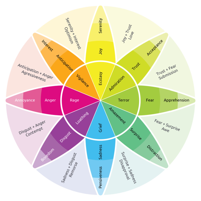
One way to understand color psychology is by referring to actual psychological research. By analyzing the color wheel, we can see how these principles apply to color psychology in marketing.
The wheel, based on Robert Plutchik's theory, includes eight primary emotions: anger, anticipation, joy, trust, fear, surprise, sadness, and disgust. Each primary emotion has an opposite, such as joy versus sadness or fear versus anger, which influences how colors are perceived. For example, red, associated with anger, can also signify passion and energy, whereas blue, associated with trust, can signify tranquility and reliability.
Combinations of primary emotions create secondary feelings. For instance, joy and trust blend to form love, while anticipation and joy combine into optimism. Recognizing these combinations is crucial for marketers. Brands aiming to evoke optimism might use colors like yellow and green together, as yellow symbolizes joy and green suggests growth and freshness.
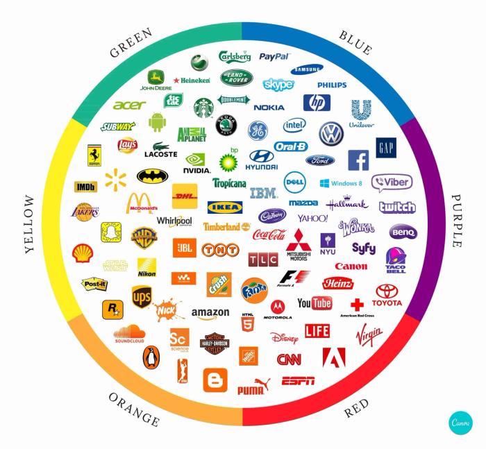
Intensity is another key aspect of color psychology. The darker the color, the more intense the emotion it evokes. For example, light blue might convey a sense of calm, while a darker blue could suggest deeper trust or even sadness. By applying these principles of color psychology in marketing, businesses can create powerful emotional connections with their target audience, enhancing brand perception and consumer loyalty.
Key Colors and Their Psychological Effects
We have talked about how using marketing color psychology can be effective in affecting human behavior. Under this subtopic, we will discuss and go deeper into the key colors and their psychological effects with examples. We will include statistical data from the article about 2023 statics and facts about key color psychology.

The Use of Red in Designs
Red is a powerful color in marketing, often linked to dominance, urgency, and excitement. It is commonly used for call-to-action buttons like "Buy Now" or "Click Here" because it draws attention and prompts immediate action. Approximately 76% of people associate red with danger and speed, making it an effective color for creating a sense of urgency and prompting quick decisions.

One other main color, blue, is associated with calmness, trust, and reliability, making it a popular choice for brands that want to instil a sense of reassurance. It is frequently used by financial institutions and tech companies to create a sense of security and professionalism. Blue creates a trusting atmosphere, making it ideal for building long-term customer relationships. This is why we can see banks use the blue color in their website and email marketing.

The Use of Green in Designs
Green represents tranquility, health, and growth. It is often used by brands that want to convey a sense of nature, relaxation, and freshness. Health-related and eco-friendly products frequently use green to highlight their connection to wellness and the environment. Additionally, green's association with money and financial growth makes it a popular choice in financial marketing. Green can uplift moods and create positive associations, making it a versatile color for various marketing strategies.

The Use of Yellow in Designs
Having transitioned to accent colors, we can begin with the color of hope. Yellow is linked to joy, playfulness, and creativity. It is an excellent choice for capturing attention and evoking positive emotions. Approximately 26% of people think yellow symbolizes happiness and fun, making it effective for promoting cheerful messages, offers, or products. Brands targeting younger audiences often use yellow to create a vibrant and engaging experience.

The Use of Purple in Designs
Now is the time for the color of beauty, luxury and royalty: purple. Historically associated with nobility, purple brings an element of prestige and sophistication to marketing. It is effective in creating a sense of exclusivity and high quality. About 29% of people believe purple is a brave color, making it suitable for brands that want to convey boldness and creativity. Purple can be used to highlight key offers or to add an elegant touch to marketing materials.

The Use of Orange in Designs
Orange, though less popular, combines the energy of red and the happiness of yellow. It is often associated with enthusiasm and creativity. However, because it is the least favorite color among people, it should be used strategically. Orange can be effective in creating a sense of excitement and warmth but should be balanced with other colors to avoid overwhelming the audience.
Choosing the Right Colors for Your Brand
Brand consistency is key to creating a cohesive identity that resonates with your audience. Representing a brand identity includes fonts, visual appearance, cooperation priorities or design choices. Choosing the right colors for your brand is crucial for maintaining brand consistency and enhancing brand identity.
Colors play a significant role in how consumers perceive and recognize brands, influencing their purchasing decisions and emotional responses. Let's explore the importance of brand consistency and highlight successful brands that have effectively used colors in their marketing strategies.
When selecting colors for your brand, it's essential to choose hues that align with your brand's values, personality, and target audience. Consistency across all marketing channels, including email marketing, reinforces brand recognition and strengthens consumer trust. Now, we can see the best colors for email marketing with successful brand examples.
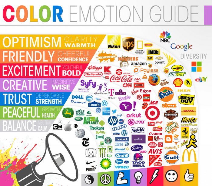
Examples of Successful Brands and Their Color Choices
Coca-Cola: The iconic red and white colors of Coca-Cola evoke energy, excitement, and joy, making it instantly recognizable worldwide.
Facebook: The use of blue in Facebook's branding signifies trust, reliability, and professionalism, aligning with its mission to connect people globally. The various shades of blue in the Facebook logo illustrate how consistency has contributed to its iconic status.
McDonald's: The vibrant yellow and red of McDonald's are associated with happiness, energy, and fast service, appealing to families and young children.
Apple: Apple's sleek and minimalist approach uses white and silver to convey simplicity, sophistication, and innovation. We can see the minimalistic color tones in the products themselves.
Nike: The bold use of black and white in Nike's branding exudes power, athleticism, and excellence, appealing to athletes and fitness enthusiasts.
Starbucks: Starbucks incorporates green to symbolize freshness, growth, and sustainability, aligning with its commitment to quality coffee and ethical sourcing.
Google: The playful use of primary colors in Google's logo emphasizes creativity, variety, and innovation, which resonates with the company's worldwide audience.
Tiffany & Co.: Tiffany's signature robin's egg blue is synonymous with luxury, elegance, and timeless style in the jewelry industry.
Amazon: The combination of orange and black in the Amazon logo represents friendliness, dependability, and a wide variety of products. You can see these examples in the email colors of Amazing advertisement.
UPS: UPS uses brown to convey reliability, trustworthiness, and efficiency in its global shipping services.
By strategically choosing colors that reflect your brand's personality and values, you can enhance brand recognition, increase engagement, and drive consumer action in email marketing campaigns. Colors not only influence purchasing decisions but also play a crucial role in creating memorable brand experiences that resonate with your target audience.
Maximizing Click-Through Rates (CTR) with Colors
In email marketing, the call-to-action buttons are crucial for generating revenue. Therefore, by implementing color psychology to influence click-through rates (CTR) in email marketing is crucial for optimizing engagement. The choice of color for your call-to-action (CTA) buttons can significantly impact whether users click through or not.
According to an article about CTA statistics, red CTAs are commonly used for their association with urgency and importance, often outperforming green CTAs in conversion rates despite potentially evoking caution. Integrating red CTAs effectively into your email design maintains visual harmony and reinforces your brand's message.
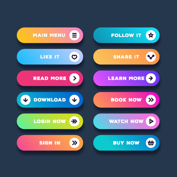
Conversely, brands can leverage colors that grab attention, such as green and blue, which convey trustworthiness and calmness. Financial services may opt for blue CTAs to instil a sense of security, while green CTAs can appeal to eco-conscious consumers, enhancing email color strategies. In summary, applying color psychology effectively in email marketing involves selecting email colors that grab attention, resonate with your audience, and align with your brand identity.
Creating Visual Hierarchy with Colors in Email Templates
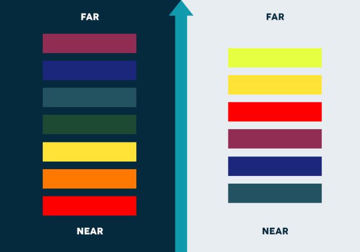
Visual hierarchy in email marketing can be a game changer when it comes to creating eye catching and efficient designs.
Additionally, one way to establish a visual hierarchy is by using the best colors for email marketing when designing the layouts. Visual hierarchy organizes content by prioritizing elements through color choice.
If you can achieve effective use of color in the body text of an email, background and headers, you can direct the reader's attention and boost engagement. Or example, vibrant colors in headers instantly draw attention to key messages or calls-to-action (CTAs), while softer backgrounds maintain readability and flow.
By applying principles of marketing color psychology, email designers can strategically enhance readability and encourage desired actions. Building emails with color psychology convey emotions and strengthen brand impact.
Designing for Different Audiences
Some design choices may not be appropriate for every target group. Hence, designing for different audiences involves understanding how demographics respond to colors. Research indicates significant variations in color preferences across age groups, genders, and cultural backgrounds.
What colors grab attention on social media can vary by audience, with Gen Z often preferring bright and vibrant tones. In contrast, older age groups often prefer more understated tones that convey sophistication and trustworthiness in advertising color psychology.
Gender differences also influence color preferences, with men favoring bold colors and women often preferring softer hues and pastels. Cultural backgrounds further shape color perceptions; for example, colors may carry different meanings across cultures, influencing consumer behavior and brand perception. For instance, while blue commonly signifies trust and security in the United States, it can represent mourning or sadness in certain Asian cultures.
Therefore, effective marketing adapts color palettes to fit audience preferences and cultural contexts, using color psychology to boost engagement and brand affinity across diverse consumer segments.
Tools for Designing Emails with The Right Colors
We've discussed the significance of employing color psychology marketing strategies backed by statistical data and real-world illustrations. Now, we can explore how these techniques can be applied using appropriate tools. Getting help from diverse tools like color pickers and online resources is essential for effectively choosing and testing colors in email design.
If you want to build an email template but not sure about color design, how to use harmonious colors, you can use online tools.
For example, Coolors’ Palette Generator provides a robust palette generator that allows designers to create cohesive color schemes tailored to specific brand identities or campaign themes.
This tool enables users to explore various color combinations and ensure visual harmony across different elements of their emails. Additionally,
Coolors' contrast checker is invaluable for assessing the readability and accessibility of chosen colors, particularly important for texts used in banner design for enhanced readability and web accessibility standards.
Conclusion
We have talked about how color psychology marketing may influence the target audience’s thoughts, feelings and habits. Therefore, by strategically selecting email colors and creating a visual hierarchy, you can effectively direct your readers to engagement.
There is still a lot to talk about how each color might affect the reader’s behavior. However, we believe that it is best if you see it for yourself. Using online color palettes, target audience researches’ and marketing data to test colors, provide coherence and effectiveness in email design.
Understanding these principles not only improves visual appeal but also strengthens brand recognition and fosters deeper connections with recipients.
In conclusion, integrating color psychology marketing into email marketing strategies is essential for optimizing campaign effectiveness and achieving desired outcomes in engagement and conversion rates. Therefore, we encourage you to experiment with colors that represent your brand identity through well-coordinated color choices.
Marketing is all about emotion, and what your brand evokes depends on your design choices. Knowing how to choose the right typography, what fonts to use in banner design, and how colors will be distributed in different parts of the email template all serve the purpose of evoking emotions in users. Tabular email builder allows you to create HTML email templates without writing a single line of code, and it's free to try!