What is Type Anatomy?
If you've read our article on the best fonts for banner design, you might have come across many unique fonts. Fonts are the building blocks of digital design, each with its unique characteristics. Using the right font in your digital publications is an elegant part of your branding. Building your emails, newsletters, and website with a consistent design that aligns with your brand is key to professionalism.
Understanding typography goes beyond merely selecting different fonts. The process is similar to entering a kitchen of letterforms and conducting creative experiments with them. This craft, known as typography anatomy, focuses on complex details that experienced eyes can appreciate, ultimately creating a cohesive and harmonious design. The parts of typography, such as the spines, stems, and strokes, are the key elements to consider.
Knowing how to properly use type anatomy is essential for anyone who is using graphic designs in any form. Each letter may refer to a variety of meanings, emotions, and styles, and understanding how to work with these elements can have a major impact on the effectiveness of your designs. Hence, this takes some serious calculations and analysis in the crafting process. A designer must grasp the anatomy of type to create visually appealing and readable text.
In this blog, we will examine various components that make up letters, their real-life counterparts, and how these elements can be adjusted to achieve balance and harmony in design. The information presented here is compiled from a variety of sources, including typographic terminology, anatomy archives, and explanatory infographics. If you're ready to see letterforms in a new light, we can start.
Key Components of Type Anatomy
When discussing type anatomy, we'll use terminology similar to the anatomical references of the human body. Just as each part of our body plays a crucial role, these key elements contribute to creating harmoniously designed letterforms.
Just like building email templates, fonts have their own parts. Now it is time to start to countdown: head, shoulder, knees and toes.
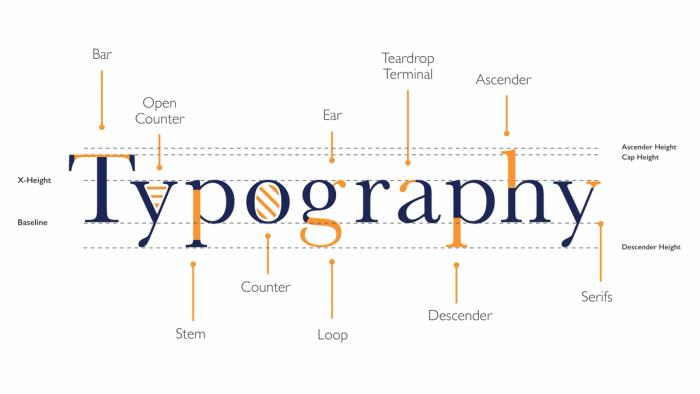
Stems and Strokes
Stem and stroke in typography create the main vertical structure of letters. Understanding these elements helps designers achieve legibility and harmony in their letterforms.
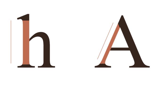
The stem is the primary vertical full-length stroke in upright letters. It is most evident in lowercase letters such as "k", "h", and "p". In letters without verticals, like the capitals "Z", "A", and "W", the first diagonal stroke is considered the stem.
The stroke, on the other hand, refers to the main vertical or diagonal line in a letter. It can be a diagonal line with a vertical cut or a straight vertical line with a curved diagonal. Some letters have more than one stroke, such as "W", "V", and "A".
Arms and Shoulders
Just like in the human body, the arms and shoulders of letterforms are positioned on the sides, contributing to their harmony and balance.
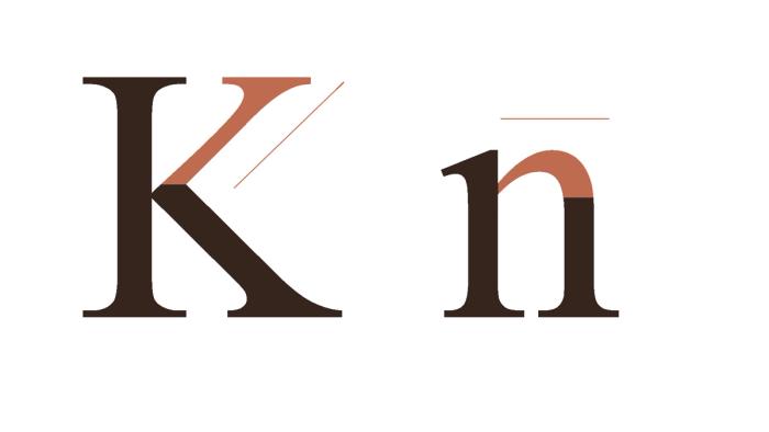
Arms in typography are horizontal or upward strokes that are attached at one end and free at the other. Examples include the capital letters "E", "F", and "K", as well as the top of "T".
Shoulders, on the other hand, slope downwards like human shoulders. They are seen in the curved beginnings of the legs of letters such as "h", "m", "n", and "r".
Spines and Loops
The spines and loops focus on the curved elements within the main structures of letterforms. These features are crucial for creating distinct, recognizable letters that add to the uniqueness of a typeface.
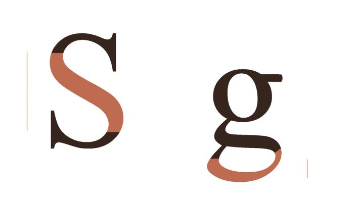
The spine refers to the main curved strokes within letters. Depending on the typeface, the spine can be vertical or, more commonly, horizontal. A clear example of a spine is found in the letter "S".
Loops are the curves at the ends or lower parts of letters. These strokes can be partially or fully enclosed, adding complexity to the characters. The loops in the lower parts of the letters "g" and "e" are prime examples of how these elements enhance the character of a typeface.
Legs and Tails
Legs and tails add dynamic qualities to letters, influencing both their aesthetic appeal and readability. These components are vital in ensuring that each letter maintains its structural integrity and visual balance within a typeface.

Legs are short, sloping elements of a letter that connect at one end and slope downward. Letters with downsloping strokes, such as "R" and "K", are particularly noticeable in leg typography.
Tails are decorative curves that give letterforms a distinct appearance. The typography tail distinguishes several letters, such as the capitals "Q", "R", and "K", as well as the lowercase "p", "q", and "g". Benton Sans font distinctly highlights the details.
Terminals and Spurs
The finishes and corners of letters are important aspects of type anatomy. Terminals and spurs typography can add sharpness and clarity to a letterform.
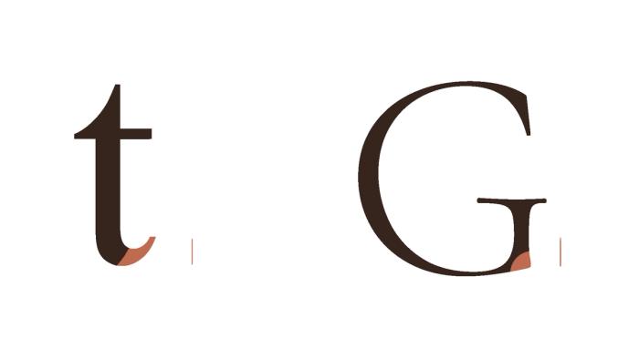
So, what is a terminal in typography? A terminal is the end of a stroke that does not include a serif, often taking the form of a simple curve. Letters like "f", "r", and "t" showcase distinct terminal finishes. Sans serif fonts like Futura ND make details easily visible.
A typography spur is a small projection from a main stroke, similar to a heel. Examples of spurs can be found in the capital "G" and lowercase "a".
Stress and Small Strokes
Lastly, we have stroke and stress in typography, which play a crucial role in the texture and flow of a typeface.
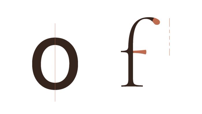
Stress typography refers to the variation in stroke thickness within a letterform, impacting its overall texture and style. This can be visualized as an imaginary line along the vertical axis of the letter. Examples of letters with noticeable stress include "o" and "d", where the thickness varies around the curves.
Small strokes at the end of a letter are the finer details that complete the structure of a letterform. These include elements like crossbars, arms, and small decorative touches that enhance the character of a typeface. The lowercase "t", "e", and "f" are good examples of small strokes at the end of a letter.
Historical Development of Fonts and Type Anatomy
The anatomy of type has evolved significantly over the years, influenced by various trends in fonts and graphic design. This transformation can be traced from the early days of print to the contemporary era of digital graphics. Early typefaces, like those used by Johannes Gutenberg, were heavily influenced by the handwritten scripts of their time, incorporating distinct parts of typography such as spines, loops, and terminals.
As technology advanced, the transition from sharp, metal type to digitally feasible fonts in the 20th century expanded the horizons of type design. This shift allowed designers to experiment with the anatomy of type using standardized digital tools. Historical typefaces like Garamond and Bodoni, alongside modern fonts such as Helvetica Neue, highlight the evolution of type anatomy. These examples illustrate how type design has continually adapted to new technologies and aesthetic trends.
Influential Type Designers and Their Contributions
Typography is an essential part of graphic design and visual communication. Behind the most famous and well-known fonts are skilled designers who have changed the letterform design.
Claude Garamond, a 16th-century French typographer, redefined typography with his eponymous typeface, which is known for its harmonious proportions and timeless aesthetic appeal. His well-thought design defined an ideal for elegance and readability that still influences type design today.
Another classic is John Baskerville, an 18th-century printer and typefounder who developed the Baskerville font, which has an anatomy of type with sharp lines and great contrast. His original use of letterforms highlighted clarity and accuracy, resulting in a timeless classic valued for its readability in both print and digital media.
Adrian Frutiger, an iconic figure in twentieth-century typography, is credited with inventing Univers and Frutiger, two renowned types noted for their systematic design. Univers font, developed in the 1950s, represented a significant improvement in clarity and uniformity. Frutiger, founded in the 1970s, has become associated with excellent signage and navigation systems across the globe.
Notable typographic works by New York-born Ed Benguiat, who was born in 1927, include ITC Souvenir and ITC Benguiat. They are known for their unique style and ornamental decorations. His designs are both beautiful and functional and have become print media classics. They also influenced the aesthetics of digital typography. Benguiat's remarkable attention to detail and ability to harmonize form gave great design insights into future letterforms.
These visionary designers not only influenced the development of typography anatomy but also inspired numerous designers. They have encouraged creativity and expanded the possibilities of typographic expression in a variety of design environments. Thanks to them, we can now play with fun fonts and create eye-catching designs.
Practical Applications of Type Anatomy
Earlier in this article, we discussed the benefits of understanding type anatomy for designers. Having explored the historical evolution of letterforms, we can now talk in more depth about their practical application. Choosing the right font type for banners and email body is crucial to conveying your brand as you want.
Improving Typography Skills
Improving your email template design involves an understanding of typography's foundational principles. The use of size, weight, color, or aesthetic variations to create eye-catching appeal and successfully separate items is an example of contrast, an important concept. Designers may make their designs easier to read and draw attention to key elements by using contrast effectively.
Hierarchy
Typography also relies heavily on visual hierarchy. It involves effectively arranging typographic parts to lead the reader through the details. Methods like changing the font size, weight, and spacing assist in creating a distinct hierarchy, making sure that key elements stand out while the design remains consistent.
Grid Systems
Since they provide a structure for regular spacing and alignment, using grid systems is beneficial in typography design. Designers create harmony and balance in their layouts by arranging typographic components inside a grid. This systematic technique improves the typography's legibility and professionalism while also increasing its aesthetic appeal.
Balance
Last but not least, keeping typography legible and aesthetically appealing requires maintaining font integrity. Fonts' proportions and visual balance are preserved when distortions like stretching or squeezing are avoided. By maintaining the integrity of the fonts, the typographic design is refined and professional, which improves the overall visual quality.
Tools and Resources
As previously mentioned, handwritten fonts were traditionally used to create new font designs. Now, thanks to digital tools, designers have access to a variety of resources, including visual examples, interactive guides, and workshops to enhance their understanding of typography anatomy.
Visual books are invaluable resources, offering a tangible reference that can be consulted anytime. Stephen Coles's book, "The Anatomy of Type: A Graphic Guide to 100 Typefaces," provides detailed insights into the structural components of letterforms, showcasing both classic and modern design details.
Online resources specifically designed to teach the details of typography anatomy can be incredibly beneficial. For instance, "Typography 101" is an excellent site for studying the terminology, anatomy, and practical uses of different typefaces. This website is a great addition to your bookmarks for ongoing reference.
Workshops, whether online or in-person, offer hands-on learning experiences in the anatomy of type. They allow you to work with experts and gain practical knowledge. The Letterform Archive offers workshops on typography and printing techniques that are worth exploring.
Lastly, online gamified teaching tools can challenge and refine your design skills. Games like "Kerntype" let you practice adjusting letter sizes, spacing, and weights to improve your sense of harmony and balance. "Shape Type" is another game that helps you compare your design intuition with actual font types, making daily practice both fun and educational. These resources collectively support a deeper understanding of typography anatomy and the anatomy of type.
Conclusion
Typography is crucial for conveying messages through graphic design. Thus, learning to professionally manipulate the size, weight, space, and aesthetics of typefaces is essential. By studying the various parts of typography, such as spines, loops, legs, tails, spurs, terminals, stress, and small strokes, designers can improve their ability to select and modify typefaces effectively.
The advantages of learning these unique aspects of type design are evident in historical examples. Applying this understanding in practical situations may increase your designs' readability, visual appeal, and overall effect. Using tools like visual books, online courses, and interactive workshops can help you improve your knowledge and abilities in typographic anatomy. Incorporating this knowledge into your work will not only improve your designs but will also push the limits of typographic expression in a variety of scenarios.
With the variety of tools, resources, and gamified methods for teaching typography anatomy, learning to use these tools becomes an enjoyable experience. We believe that practicing harmony in design enhances your ability to use these designs most effectively. Keep exploring and experimenting with the anatomy of type.
Embrace principles like contrast, visual hierarchy, and grid systems while maintaining font integrity. This method will help you create harmonious, balanced, and visually compelling typography that shines in both print and digital media. Continue refining your skills, and let the intricate details of typography guide you in creating exceptional designs.
It all may seem very complicated and hard to implement into your email template designs. Tabular is here for you to build the most compelling emails. With our drag and drop email builder and font variations to choose from, you can easily create the best HTML email template for your brand. If you haven't already, I highly suggest you check out our "Best Fonts for Banners" article and give it a try in our free template builder.