Center HTML Emails: The Nested Table Structure Guide
In web development, you might use a <div> with margin: 0 auto to center your content. In html email templates, that doesn't work reliably. In this chapter, we will build the "Russian Doll" structure: a table inside a table inside a table in html emails. This is the only way to guarantee your email is centered and has a full-width background color on all devices.
1.1 The Body Strategy
We do not simply start typing content into the <body>. We must first prepare the canvas.
HTML
<body id="body" class="t434" style="min-width:100%; Margin:0px; padding:0px; background-color:#E8E8E8;"> <div class="t433" style="background-color:#E8E8E8;">
min-width: 100%
This is crucial. Some mobile clients (like the Gmail App) might try to shrink the body to fit the content if the content is small. This forces the body to always fill the screen width. This is crucial if you want to create a responsive html email template.
background-color:#E8E8E8
We set the background color on the <body> and a wrapping <div> (class t433). This redundancy ensures that if a specific email client strips the body styles (which happens), the wrapper div still provides the grey background color.
Margin: 0px
Notice the capital "M". This is an older hack for Outlook.com, which used to strip lowercase margin. It is safer to keep it.
1.2 The Outer Wrapper (The Canvas)
Since we cannot rely on the <body> tag for layout, we create a "Master Table" that acts as our true viewport.
HTML
<table role="presentation" width="100%" cellpadding="0" cellspacing="0" border="0" align="center"> <tr> <td class="t432" style="font-size:0; line-height:0; background-color:#E8E8E8;" valign="top" align="center">
width="100%"
This table forces the email layout to stretch to the edges of the browser window.
role="presentation"
This is for Accessibility. It tells screen readers (for the visually impaired): "This is a layout table, not a data spreadsheet. Do not read the row and column numbers." Without this, a blind user would hear "Table 1, Row 1, Column 1" before hearing your headline.
align="center"
This is the "old school" way to center content. It works where margin: auto fails.
1.3 The Inner Container (The Card)
Now that we have a grey canvas, we place the white "paper" card in the center.
HTML
<table class="t430" role="presentation" cellpadding="0" cellspacing="0" style="Margin-left:auto; Margin-right:auto;"> <tr> <td width="640" class="t429" style="width:640px;"> <table class="t428" role="presentation" cellpadding="0" cellspacing="0" width="100%" style="width:100%;"> <tr> <td class="t427" style="border:1px solid #DDDDDD; background-color:#FFFFFF;"> </td> </tr> </table> </td> </tr> </table>
The 640px Standard
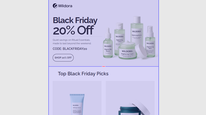
Most emails are designed to be between 600px and 660px wide. The Wildora template uses 640px. This width is safe for desktop reading panes (like the preview pane in Outlook).
The Double Width Declaration
Notice width="640" (HTML attribute) AND style="width:640px;" (CSS).
- Outlook for Windows reads the HTML attribute (
width="640"). - Webkit (iPhone/Apple Mail) reads the CSS style.
Rule: Always define width twice to satisfy both engines.
The "Card" Effect
The class .t427 has background-color:#FFFFFF. This creates the visual effect of a white paper floating on the grey background we defined in 2.1.
Tabular is an email layout builder that simplifies designing newsletter email templates with structured, grid based layouts.
Final Words
You have now built the "Skeleton."
- Layer 1 (Body): Grey Background, full width.
- Layer 2 (Canvas Table): 100% width,
role="presentation". - Layer 3 (Card Table): Fixed 640px width, centered alignment, white background.
Visualizing the Structure
Body (Grey) -> Table (100% Width) -> TD (Centered) -> Table (640px White Card) -> Content
Ready for Chapter 3? We will add the content: Adding images and typography for Outlook.