Email newsletter templates
Free editable newsletter templates you can use anywhere. Create professional newsletter templates using Tabular email builder in minutes, with premade blocks and fully customizable templates. Export as HTML or PDF and use them anywhere.


Free editable newsletter templates for every use
It doesn't have to be hard to create a newsletter. You don't need to know how to code to make email newsletter templates with Tabular. Our newsletter creator is easy to use, and it doesn't matter if you need a monthly newsletter, a weekly newsletter, or a one-page newsletter for an important statement. It's all there, with options for free editable newsletter templates you can customize in minutes.
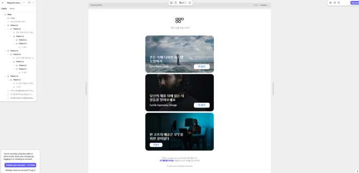
Korean, French, and English — beautiful newsletters in every language with Tabular’s multilingual support
Multilingual and customizable email templates let you reach people all over the world. Tabular makes sure that your newsletters look professional and stay on brand whether you're writing them in English, Korean, or any other language.
Create mobile-friendly newsletter templates with Tabular.
You should give your readers the best experience possible on all devices. With Tabular's drag and drop editor, your newsletters will look great on phones, tablets, and computers, and you won't even have to do anything extra. Every layout is made to be mobile-friendly and easy to read, whether it's a professional employee newsletter, a business update newsletter, or a brand newsletter.
Fully customizable blocks for faster email newsletter creation and consistent branding
Save your main content blocks, like the CTA, header, footer, and more, to use in different campaigns. This will help your brand stay consistent. With Tabular's custom blocks, premade modules, and free newsletter templates, you can make school newsletters, company newsletters, or brand updates quickly without having to start from scratch.
You Can Get Free Fonts and Icons for Any Style
- Google Fonts – Get hundreds of free, web-safe fonts.
- FontAwesome – More than 2,000 free and open-source icons for everything from logos for brands to automotive icons. Includes 160+ outline icons for a sleek look.
- Feather Icons – 280+ free and open-source outline icons with a modern style.
- Heroicons – 280+ solid and outline icons created by the makers of Tailwind CSS.
Put social icons in the footer, create a professional header, and make sure everything matches your brand’s readability and design standards.
Perfect email newsletter creator for all
- Monthly newsletter templates for regular news and updates
- Weekly newsletters to keep users engaged
- One-page newsletters for quick updates
- Professional employee newsletters for internal communication
- Company newsletters to keep clients informed
- Business update newsletters for partners and stakeholders
- School newsletters for educational organizations
With Tabular, you can start making your free editable newsletter templates right away. Create responsive and multilingual designs, reuse your best main content blocks, and share them anywhere — from email campaigns to printed copies.
You want to use it in Google Docs or InDesign, no problem.
Tabular allows you to export your newsletter designs as either HTML or PDF, with both mobile and desktop versions. This makes it easy to use your designs in Google Docs or InDesign. Simply choose PDF during export, and your newsletter will be ready.
Tips on designing email newsletters people want to read
Optimize typography for impact and readability
Typography plays a crucial role in conveying the brand's personality and improving readability in your newsletter. The font choices, sizes, and styles you use have a significant impact on how readers perceive and engage with your content. Typography sets the tone and visual identity of your newsletter, helping to establish a consistent brand experience.
When selecting fonts, consider their compatibility with your brand and the purpose of your newsletter. Different fonts evoke different emotions and associations. Choose fonts that align with your brand's personality and the overall tone of your content. Additionally, consider font sizes that are easily readable across various devices and screen sizes. Experiment with font styles, such as bold or italic, to emphasize important elements and create visual hierarchy.
Tips for optimizing typography in your newsletter:
- Establish hierarchy: Use different font sizes, weights, or styles to create a clear hierarchy of information. Headlines, subheadings, and body text should be distinct and easily scannable.
- Emphasize important elements: Use typography to draw attention to key elements like calls to action or important messages. Consider using different colors, sizes, or styles to make them stand out.
- Enhance readability: Choose fonts that are easy to read and maintain legibility at different sizes. Pay attention to line spacing and paragraph spacing to improve readability.
- Maintain consistency: Use a consistent typography system throughout your newsletter to establish a cohesive visual identity. This includes font choices, sizes, styles, and formatting.
- Test on different devices: Ensure that your chosen fonts are supported and rendered correctly across various devices and email clients. Test readability and overall visual appeal on different screens.
By optimizing typography in your newsletter, you can improve readability, convey your brand's personality, and enhance the overall design. Thoughtfully consider font choices, sizes, and styles that align with your brand and purpose. Establish hierarchy, emphasize important elements, and maintain consistency to create a visually engaging and impactful newsletter.
Give your readers some visual breathing room
White space, also known as negative space, plays a vital role in creating a clean and organized design for your newsletter. It refers to the empty space surrounding and between elements. Embracing white space is essential for a visually appealing and well-structured layout.
White space enhances readability by providing visual breathing room and allowing content to stand out. It helps guide the reader's eye and creates a sense of focus on key elements. By strategically using white space, you can improve the overall readability and comprehension of your newsletter. It also creates a sense of visual balance and gives the design a more open and inviting feel.
Tips for incorporating white space effectively:
- Give elements room to breathe by increasing margins and spacing.
- Use white space to separate sections and create clear visual hierarchy.
- Avoid overcrowding the layout with too many elements or text.
- Use generous line spacing and paragraph spacing to improve readability.
- Embrace simplicity and minimalism to let the content shine.
By utilizing white space strategically, you can create a clean and organized design that enhances readability, focuses on key elements, and improves the overall aesthetic of your newsletter. Remember that white space is not wasted space but a powerful design element that brings clarity and visual appeal to your content.
Use colors that engage your reader
Selecting a cohesive and visually pleasing color palette for your newsletter is crucial. Colors capture attention, convey messages, and enhance the overall aesthetic. A well-chosen palette improves engagement and brand recognition.
Colors evoke specific emotions and associations. Warm colors like red create excitement, while cool colors like blue convey calmness. Understanding color psychology helps you choose hues that align with your brand and tone.
Tips for a harmonious color scheme:
- Reflect your brand identity.
- Use a limited palette of three to five colors.
- Create contrast for emphasis.
- Ensure readability by considering color contrast.
- Balance colors and white space for a clean design.
Remember to consider your target audience's preferences and seek feedback. By selecting an engaging color palette, you create a visually appealing and memorable newsletter that reinforces your brand identity.
Use catchy images and graphics
High-quality and relevant images have a significant impact on capturing readers' attention in your newsletter. They can instantly engage and create a strong visual impression. Using compelling visuals can effectively convey your message and evoke emotions that resonate with your audience.
Visual elements such as graphics, illustrations, or icons can enhance the overall visual appeal of your newsletter. They add visual interest, break up text-heavy sections, and create a more dynamic and engaging experience for readers. Thoughtfully chosen visuals can help convey complex information, tell a story, or reinforce your brand identity.
Tips for optimizing images in your newsletter:
- Use high-resolution images that are clear and sharp.
- Optimize image file sizes to ensure fast loading times.
- Compress images without sacrificing too much quality.
- Consider using alt text to provide alternative descriptions for images, ensuring accessibility for all recipients.
- Maintain a balance between visuals and text to avoid overwhelming the layout.
- Choose images that are relevant to the content and resonate with your audience.
- Test your newsletter on different devices and email clients to ensure images are displayed correctly.
By incorporating eye-catching images and graphics in your newsletter, you can capture readers' attention and create a visually appealing experience. Remember to use high-quality visuals, optimize images for email, and maintain a balance between visuals and text to create a well-rounded and engaging newsletter.