Welcome email templates
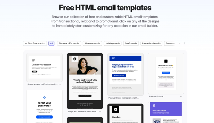
Make a memorable first impression with our free, customizable welcome email templates. From warm greetings to personalized offers, create welcome emails that leave a lasting impact on your audience.
Free Responsive HTML Welcome Email Templates
First impressions last forever. With beautifully designed, high-performing welcome email templates, you shake your customers’ hand in a way that will never be forgotten.
You never get a second chance to make a first impression. Start a long-lasting relationship with Tabular’s free welcome email templates.

Why Welcome Emails Matter:
- Higher Engagement: Your users are special. Make them feel like that, and they will respond. Welcome emails have significantly higher open rates compared to marketing emails, which means more users, better sender reputation, and more emails landing in the inbox.
- Introduce Your Brand Your Way: Your welcome emails are a great opportunity to clearly communicate with your subscribers and tell what they can expect from your service or product.
- Drive Action: New users are your guests. They don’t know where to find what. Guide them through orientation with clear instructions in welcome emails, offer them promotions, show them they are truly welcomed.
- Welcome Emails Can Be the Best Promotional Emails: Greet new users and subscribers with personalized products and solutions. Use the element of surprise on your behalf.
Welcome new users, subscribers, customers, or even employees with professionally designed free HTML email templates.
Build Better HTML Welcome Emails with Tabular Email Builder, Together
Creating that perfect HTML welcome email template often involves teamwork. Tabular makes collaboration easier than ever with teamspace-friendly features.
Comment on Email Template Designs to Collaborate Better
Get feedback exactly where it's needed by entering commenting mode. You can click anywhere on your email designs to leave precise notes for your team.
Comment on the content, images, CTAs, and resolve suggestions directly within the email editor to build the best welcome email template as a team.
Organize Your Templates Better with Unlimited Teamspaces
Keep your email templates tidy by creating separate teamspaces for different welcome sequences, brands, client projects, or campaigns.
Easily manage related templates and assets in dedicated spaces for enhanced clarity and efficient organization. You’ll never get lost in your own material again.
Keep Your Email Designs Safe with Organization/Teamspace Roles
Control who collaborates on your HTML email templates. Assign specific roles (Admin, Editor, Viewer) at the Organization or Teamspace level.
Make sure only authorized team members can edit sensitive templates, protecting your brand identity and workflow integrity.
Share Your HTML Email Template Designs Direct from the Builder with Unique IDs
Need to get quick feedback or approval for your welcome email template design? Or you got feedback that needs to be implemented now? Generate a unique, shareable link directly from the Tabular email editor so anyone with the link can view a live, interactive demo of your welcome email design online—without even needing a Tabular account.
Generate HTML Code for Welcome Emails with 1 Click or Download as PDF
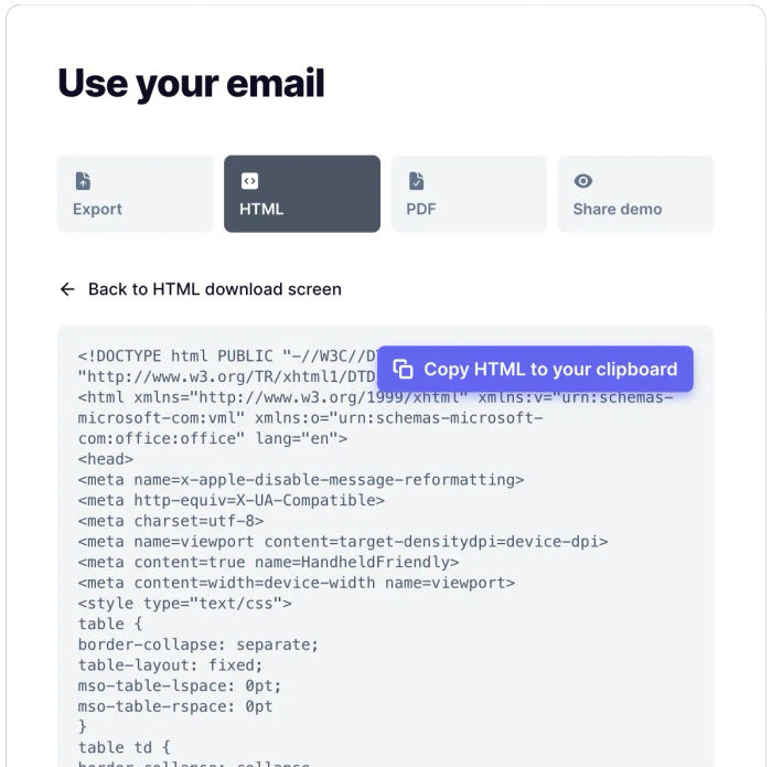
You’ve designed the perfect email template—now what? Click 'Use email' and instantly copy the clean, export-ready HTML code to paste directly into your Email Service Provider (ESP) or marketing automation platform.
You can also download a PDF version for offline sharing, presentations, or archiving, with both desktop and mobile previews.

Don't Just Create Email Templates—Create Brands with Tabular Email Editor
Your welcome email isn't just a message—it's the first message in your direct communication a subscriber receives. Good branding equals consistency.
A cohesive look and overall feeling across your welcome sequences and other digital content builds brand recognition, creates trust, and tells users that you are a professional.
Keep Your HTML Emails Consistent with Default and Custom Document Styles
Do you want every element in your design to align perfectly with your brand identity? You don’t have to edit each element one by one. Set default styles for paragraphs, headings, and buttons, or create custom style variants (like a specific quote format or secondary CTA) to reuse throughout that document. Just click on 'Apply to all' to instantly update every instance. If you need to make a change, save time, money—and most importantly—some peace of mind.
Building HTML Email Templates for Welcome Sequences Should Be Easy!
Stop struggling with code, interfaces from the stone age, broken layouts, and CSS support. Tabular provides the tools to build beautiful, effective welcome emails efficiently.
You can access thousands of professional icons from libraries like FontAwesome, Feather Icons, and Heroicons to enhance your design, easily change their colors, and save reusable Teamspace blocks for common elements like headers and footers.
Customize professionally designed email templates in our gallery, save them in your project folder to find whenever you can.
Welcome Each User by Their Name with a Sincere Message Using Dynamic Content and Variables
Call your users by their name so they know your brand. Mark text elements like %%First Name%% as variables and assign example display values (like "John") to see a realistic preview as you design.
Set up conditional blocks to show specific offers or content based on user data, or use loops to list relevant information. Connect this with your ESP's data to send a unique, personalized welcome that is unique to each new subscriber.
No One Can Say “Welcome” in Every Language—Except for Your HTML Email Templates
You can create local versions of your designs, change images, content, and everything with Tabular’s multilingual email editor.
Welcome Users on Every Device with Responsive HTML Email Templates
In Tabular email editor, you can create your design for both mobile and desktop clients, specializing your content for different experiences.
What Tabular Offers to You
- Easy-to-use, no-code HTML email builder
- A complete teamspace collaboration experience with shareable design commenting, teamspaces, and organization roles
- Fast, reliable, and consistent email building process with Reusable Content Block Library, Centralized Brand Styling Tools, Document-Level Styling Control, Asset Management, and Integrated Icon Libraries
- Unique welcome emails with multilingual email templates, dynamic content, and personalization
- Export HTML email templates with 1 click—use anywhere

