CTA (Call to Action): Design Your Email Templates for Maximum Conversion
In email marketing, having straightforward navigation and clear directions is beneficial. While highlighting the best and most engaging aspects of your business, you can also guide your target audience to contact you, visit your website, purchase your product, download a file, and more. Using Call to Action (CTA) elements while building your email templates makes directing your readers easier.
To begin with, what is CTA in email marketing? Simply put, a CTA is a prompt that encourages your email recipients to take a specific action, such as clicking a link, making a purchase, or signing up for a webinar. Therefore, they are the main link to Conversation Rate Optimization (CRO). Instead of step-by-step text directions, CTA buttons allow you to navigate your readers professionally.
Research claims that by embedding your CTAs in your email templates, you can increase conversion by 121%. When thoughtfully designed, CTAs can smoothly guide your audience through the customer journey, turning casual readers into loyal customers.
In this blog, we will explore how to use CTA buttons most efficiently and naturally in email templates. By demonstrating how CTA email design should be clear, visually appealing, navigational, and optimized with different email templates, we aim to equip you with the knowledge to build your own email marketing templates with converting CTA buttons by the end of this article.
Key Elements of an Effective Email CTA
First, we need to discuss how to build your email template for the most effective use of CTAs. Therefore, we will now explain the key elements of CTAs with examples.
Actionable Language
When you're building your email templates, CTAs must be clear and prompt your readers to take action. Therefore, keep it simple and inviting for your audience. Action-oriented CTAs use command verbs that encourage immediate responses, such as "buy," "learn," "read," "discover," and "download." These words help guide readers by clearly indicating their next steps, making sure that there is no confusion about the desired action.
Avoid long explanations and keep the text as brief as possible. Full sentences aren't necessary; just use inviting words to capture your reader's interest. According to research on email CTA examples statistics, keyword-optimized CTAs have increased overall conversion rates by up to 87%. Thus, when designing your email templates, aim for the shortest and simplest message you want to convey.
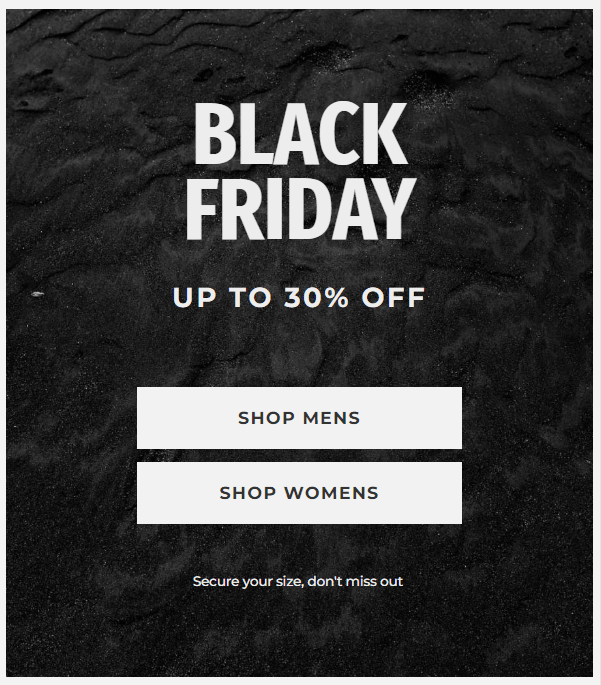
Research on the click-through rate (CTR) of CTAs shows that personalized buttons perform 202% better than non-personalized ones. Therefore, if you have data on your readers' unique demographics, you can build multiple email templates for better engagement. Alternatively, you can include multiple CTA buttons to offer choices to your readers, such as SHOP MENS and SHOP WOMENS.
CTA Placement
The CTA email template structure must be thoughtfully designed as a whole. By creating a visual hierarchy, you guide your readers through the email to your desired message. Therefore, CTA placement is as crucial as using direct language.
For instance, consider a scenario where you have an informational or educational email that is long and mostly text-based. Readers might become bored by the end and ignore the rest of your email. If your CTA is placed at the bottom, there is a high chance your email will fail to prompt the desired action.
Keep in mind that email CTA best practices vary for different types of email bodies. While some email templates benefit from having the CTA above the fold, others may perform better with the CTA in the footer, accompanied by an explanation. Therefore, make sure that your CTA is placed in the most efficient location.
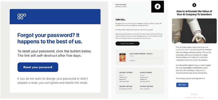
For instance, you can see three different placements of structural CTA examples from Tabular’s email builder examples. In these three examples, the intended information is positioned differently. With Tabular, you can easily build personalized email templates, you can explore both desktop and phone options to see how to interact with the button effectively.
Designing CTA Buttons
An effective and visually appealing email template should maintain a clear visual hierarchy and harmony among all its elements. However, despite the enjoyable aspect of designing, it can also be overwhelming due to the numerous criteria to consider. To streamline this process, let's simplify how to design your CTA buttons for optimal efficiency.
The primary goal of a CTA button is to be highly visible and compelling. Using contrasting colors, such as a bold red button on a white background, makes the CTA the focal point of the email. The button should be large enough to notice but not so large that it overwhelms the content. Ample white space around the button can also enhance its prominence.
If you've been using the internet for over a decade, you're likely familiar with various button designs, from rectangular gray buttons to gradient colors, marketers have tried millions of variations to convert user behavior.
Staying updated with digital UI trends benefits your email templates, including consideration of button shape. Rounded corners are more inviting and clickable than sharp edges. Make sure that your CTA button design aligns with your brand’s aesthetic and the overall email design.
Don't forget mobile optimization for button shapes; make buttons larger and space them adequately to prevent accidental clicks.
A/B Testing for CTA Optimization
It's challenging to find the most effective email template on the first attempt, so we recommend conducting A/B testing.
Research indicates that successful A/B testing can increase average revenue per prospect by 50%. Therefore, A/B testing is crucial for refining your email marketing strategy by optimizing Call-to-Action (CTA) elements to boost conversion rates. This involves testing different CTA designs, placements, and wording to determine what resonates best with your audience.
Let's walk through it. Begin with a hypothesis, test whether "Send Gift Cart" generates more clicks than "Order Now." Create two identical emails with only the CTA varied while keeping other factors like email copy consistent.
Now, you should evaluate the results by testing variables we have mentioned before, such as button color, placement within the email, and wording nuances (such as first-person vs second-person language).
Incremental changes help identify what drives engagement effectively. Analyzing click-through rate (CTR) data enables you to identify the best-performing designs and wording for your CTAs.

Here, you can see how PartnerStack, a partner ecosystem platform, increased its conversion rate by 111.55% by changing its homepage CTA copy from “Book a Demo” to “Get Started.”
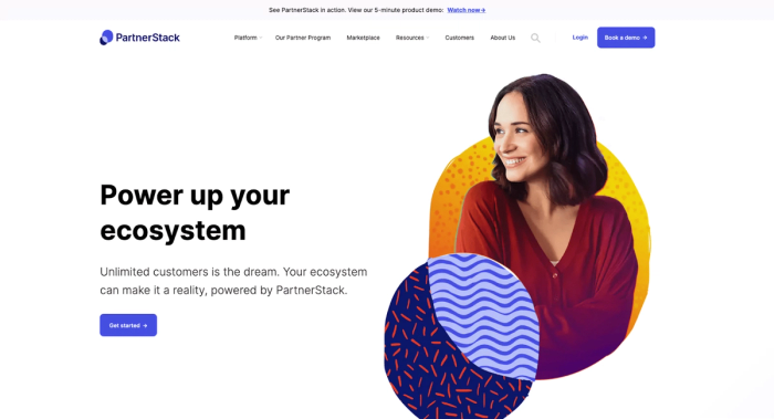
Select the CTA variant with the highest conversion rate and refine successful elements iteratively. This approach ensures ongoing Conversion Rate Optimization (CRO) and maximizes the impact of your email marketing efforts.
Typography for CTAs
Finding the best typography by playing with the type anatomy is essential when it comes to the effectiveness of your email structure. Typography can say a lot about your brand, your target audience, your values and your overall aesthetic. And yes, even in the details! Therefore, while making the CTA buttons as legible as possible, you should also be considering your email template harmony.
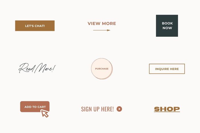
Choosing the best font for your designs crucially affects the readability and understanding of your CTA. Using clear and legible fonts, such as Helvetica, Verdana, or Arial, can enhance legibility, which aligns with email CTA best practices.
These fonts are designed to be readable even at smaller sizes, unlike serif fonts or decorative typefaces, which may hinder immediate comprehension, contrary to email CTA examples. Choosing clear, sans-serif fonts ensures that the CTA stands out and is quickly understood, which is essential for encouraging user action.
Using Whitespace Effectively
If you've worked with grid systems in UI design, you're likely familiar with terms like space and composition. In CTA email design, empty space is just as crucial as layout.
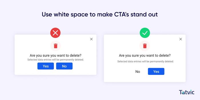
Use the whitespace within your email template to highlight your buttons. Contrast colors or whitespace frames can effectively make the button stand out and encourage interaction. When adhering to email CTA best practices, avoid overcrowding design elements on top of each other and ensure there is ample space to keep every element readable and distinct.
Adding Animations to CTAs
Animations are eye-catching in every scenario. However, overuse of them can lead to readability issues with buttons. Let's discuss which types of animations can be beneficial.
Hover and On-Click Animations
Simple animations on CTAs enhance their visibility and interactivity. Research indicates that visually appealing design elements in CTA buttons can increase clicks by 26%. One effective example of simple animations for email CTA buttons includes hover and on-click animations. These animations use dynamic movements to capture attention and make interactions more engaging and interactive.
Elements such as animations play crucial roles in optimizing email CTA buttons for CTR, contributing to improved user engagement and campaign performance.
<!DOCTYPE html>
<html lang="en">
<head>
    <meta charset="UTF-8">
    <meta name="viewport" content="width=device-width, initial-scale=1.0">
    <title>CTA Button Examples</title>
    <style>
        .cta-button-examples {
            display: flex;
            flex-direction: column;
            align-items: center;
            justify-content: center;
            height: 100vh;
            background-color: #f4f4f4;
            font-family: Arial, sans-serif;
        }
        .cta-button-examples h2 {
            margin-bottom: 20px;
            color: #333;
        }
        .cta-button-examples .button-container {
            display: flex;
            flex-wrap: wrap;
            justify-content: center;
        }
        .cta-button-examples .button {
            margin: 10px;
            padding: 15px 30px;
            font-size: 16px;
            color: #fff;
            background-color: #ff4d4d;
            border: none;
            border-radius: 5px;
            cursor: pointer;
            transition: all 0.3s ease;
        }

        /* Button 1 - Color Change */
        .cta-button-examples .button1:hover {
            background-color: #cc0000;
        }

        /* Button 2 - Grow */
        .cta-button-examples .button2:hover {
            transform: scale(1.2);
        }

        /* Button 7 - Underline */
        .cta-button-examples .button7::after {
            content: '';
            display: block;
            width: 0;
            height: 2px;
            background: #fff;
            transition: width 0.3s ease;
        }
        .cta-button-examples .button7:hover::after {
            width: 100%;
        }

        /* Button 8 - Pulse */
        .cta-button-examples .button8:hover {
            animation: pulse 1s infinite;
        }
        @keyframes pulse {
            0% {
                transform: scale(1);
            }
            50% {
                transform: scale(1.1);
            }
            100% {
                transform: scale(1);
            }
        }

        /* Button 12 - Glow */
        .cta-button-examples .button12:hover {
            box-shadow: 0 0 15px rgba(255, 77, 77, 0.7);
        }

        /* Button 19 - Bounce */
        .cta-button-examples .button19:hover {
            animation: bounce 0.6s;
        }
        @keyframes bounce {
            0%, 20%, 50%, 80%, 100% {
                transform: translateY(0);
            }
            40% {
                transform: translateY(-10px);
            }
            60% {
                transform: translateY(-5px);
            }
        }
    </style>
</head>
<body>
    <div class="cta-button-examples">
        <h2>CTA Button Examples</h2>
        <div class="button-container">
            <button class="button button1">Click Here!</button>
            <button class="button button2">Click Here!</button>
            <button class="button button7">Click Here!</button>
            <button class="button button8">Click Here!</button>
            <button class="button button12">Click Here!</button>
            <button class="button button19">Click Here!</button>
        </div>
    </div>
</body>
</html>
Incorporating subtle animations like color changes, button expansions, or transitions can make CTAs more inviting and compelling. These enhancements not only attract attention but also prompt users to interact, potentially leading to higher CTR and conversions.
Cold Email CTAs
Email marketing thrives on interactivity and establishing connections with recipients. Therefore, leveraging email types that help build long-term professional relationships, such as cold email CTAs, can be advantageous.
The goal of a cold email is to foster a trusting relationship with readers rather than initiate an immediate conversation. In cold emails, CTAs should prioritize offering value and building trust over pushing for immediate sales. For instance, inviting recipients to download a useful resource or participate in a relevant webinar can be an effective strategy.
Hence, the best CTA for cold emails should be clear, action-oriented, and concise. From the email body to the CTA buttons, maintaining a professional and respectful tone can enhance initial engagement. Below, you may see some examples of cold email CTA communication:
- Claim your free trial and experience Tabular firsthand. Start Your Trial!
- Request a consultation with our experts to discuss your email templates. Schedule Here!
- Unlock our exclusive whitepaper on Typography Anatomy. Download Now!
Email Signature CTAs
We've discussed the importance of CTA button placement within the structure of an email. A CTA email signature functions similarly to other CTAs, it's a clickable design element aimed at prompting recipients to take specific actions, such as visiting a website, downloading a resource, scheduling a meeting, or engaging on social media.
Including a CTA in your email signature provides continuous visibility and subtle prompts that enhance professional communication and engagement.
It ensures that readers see the CTA and encourages actions like downloading resources, making purchases, subscribing to newsletters, and more. This approach uses email communications effectively to foster engagement, drive traffic, and nurture relationships. Here are some examples of CTA email signatures:
- Connect on LinkedIn for more email tips!
- Visit our website for free email templates!
- Download our free ebook for expert tips.
Measuring CTA Effectiveness
In order to understand if the CTA buttons are effective in the way you want, you can test your designs. You can send sample emails with CTA examples to various readers and analyze several metrics. Let's explain some of these metrics:
Open Rate measures the percentage of readers who open your email. This rate is heavily influenced by the subject line or sender name, as the email body isn't visible until it is opened. To build your email templates according to CTA best practices, you can try different variations, record the results, and A/B test with the recorded data. You can try more engaging and eye-catching phrases in the subject lines.
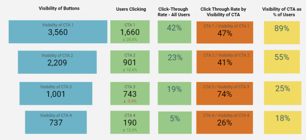
Click-Through Rate (CTR) measures the percentage of recipients who interact by clicking on a CTA link within an email. A higher CTR indicates that your CTA is more effective. Evaluate design, placement, and wording to identify factors contributing to increased CTR.
Conversion Rate indicates the percentage of readers who complete a desired action after clicking. For example, if you're selling a product, this includes readers who first clicked on a "SHOP NOW!" button and then made a purchase. To improve conversion rates, analyze user behavior on landing pages or forms linked to your CTA and optimize accordingly.
Using Analytics for Improvement
As mentioned earlier, analyzing data using various metrics can significantly enhance the effectiveness of your email CTA best practices. To improve open rates, CTRs, or conversion rates, leveraging analytic techniques to track performance is essential.
Popular tools for monitoring CTA metrics include Google Analytics, HubSpot, and Mailchimp. These tools are used by marketers to gather insights into user behavior and campaign effectiveness. Detailed reports provided by these analytics tools reveal how users interact with CTAs, highlighting strengths and areas needing improvement.
From this analysis, you can devise new strategies for your email CTA examples. For instance, if a particular CTA example has a high CTR but a low conversion rate, focusing on improving landing page content may help retain visitors on the site longer.
Staying updated with visual design and email marketing trends through online tools allows you to test relevancy and adapt accordingly. By identifying what influences your metrics positively or negatively, you can enhance user experience and improve engagement.
Conclusion
Today, we've explored how to effectively use CTAs in email marketing and their potential effectiveness. There's ample evidence supporting the usefulness of CTAs; for instance, CTAs designed as buttons have shown a 45% increase in clicks. When designing your buttons, it's crucial to consider factors such as using a readable font, employing contrasting colors, and adopting modern button shapes.
A well-crafted CTA not only prompts recipients to take specific actions but also significantly contributes to overall campaign success. Key practices for creating impactful CTAs include using actionable language, incorporating eye-catching designs and colors, ensuring mobile responsiveness, and conducting A/B testing to optimize performance.
By integrating analytics tools to track metrics like Click-Through Rate (CTR) and Conversion Rate, marketers can gain valuable insights to continually enhance their CTAs. We hope you can create the most impactful CTA buttons for your email templates using this information.
Get started with Tabular's drag-and-drop email builder and apply what you've learned. You can send personalized, ready-to-use free email templates and test them. Try Tabular now for more effective email campaigns!