Inverted Pyramid Design in Email Marketing Campaigns
Table of contents
- What is the inverted pyramid in email?
- Inverted Pyramid Email Design Examples
- Why Brands Choose Inverted Pyramid in Their Email Designs
- When to Use Inverted Pyramid Email Design
- When to Avoid Inverted Pyramid Design in Email Marketing Campaigns
- Final Words: How to Use Inverted Pyramid Design in Email Marketing Campaigns
You do everything right but can’t convert from your email templates? Most marketing emails fail because readers do not know where to look first. Cluttered layouts, multiple CTAs, and scattered text make it harder for readers to take action. The inverted pyramid email design solves this by guiding readers through a clear visual hierarchy that naturally leads to a single call to action.
This article shows you how inverted pyramid design works and how to apply it to your email campaigns.
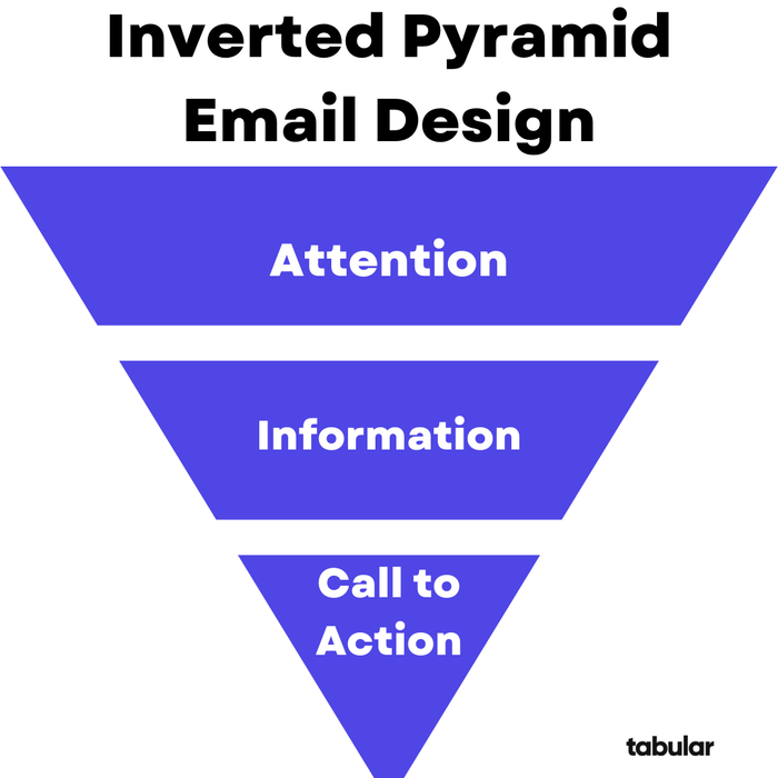
What is the inverted pyramid in email?
The inverted pyramid email templates adapts journalism’s classic structure but tailors it for marketing and skimming audiences.
The inverted pyramid in email refers to a hierarchical content structure where the most important information appears first to grab attention. It is followed by supporting details that build interest and ends with a clear call to action that guides the reader to take the desired step. This approach works well for email readers who tend to skim because of short attention spans.
.png?w=700&fit=max&auto=format)
Journalism focuses on factual news reporting, for example placing the 5 W's at the top and background or context below, to ensure quick comprehension amid deadlines or transmission risks. Inverted pyramid email template designs emphasize visual hierarchy with hero images, bold headlines, and CTAs to drive conversions rather than simply inform.
Typical emails using the inverted pyramid start with a compelling headline or hero image that delivers the main message immediately. Supporting details follow to build interest, ending with a prominent call to action (CTA) button that encourages clicks.
Inverted pyramid email designs naturally guide the reader’s eye downward, placing key information above the fold and less important details below. This approach boosts engagement, with email marketing stats showing up to 28% higher click rates when emails feature clear CTAs. Emails using an inverted pyramid format have also achieved around 371% higher conversion rates compared to emails with random or unfocused layouts.
Inverted Pyramid Email Design Examples
The following examples show how the inverted pyramid design in email marketing improves clarity, guides reader attention, and increases click-through rates. These designs are perfect examples for inverted pyramid email design that moves the reader naturally from headline to message and finally to a focused call to action.
All of these HTML email templates are free to use in Tabular’s email template gallery. You can customize them with the easy-to-use email builder and download them as HTML or PDF.
Example 1: Cyber Monday Sales Email Template
This email is a textbook execution of the inverted pyramid. It uses a clean, centered layout to drive the user toward a single, inevitable conclusion: clicking "Shop Sale."
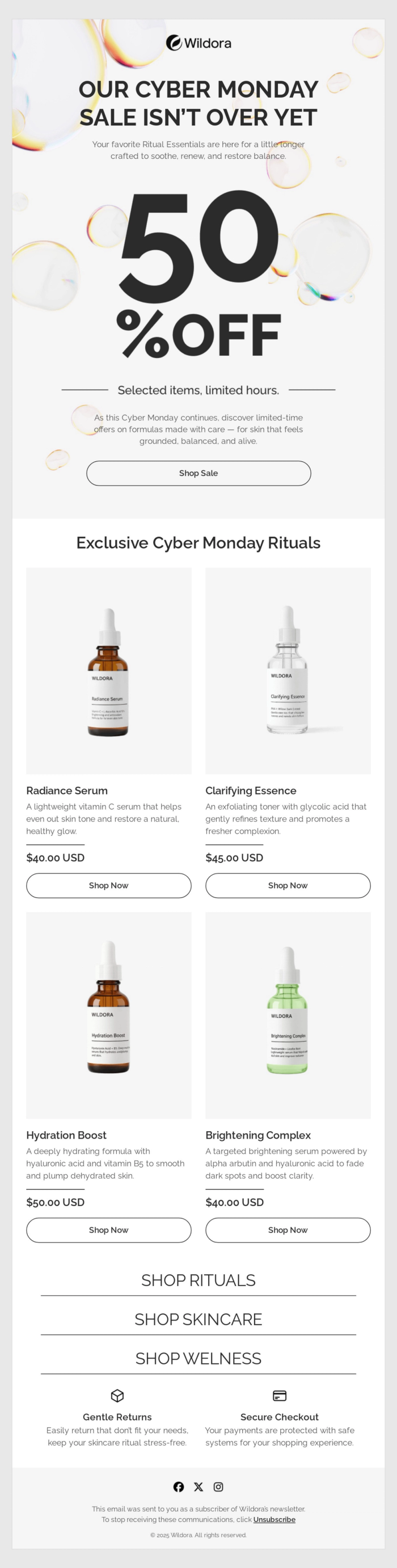
You need to understand that in promotional email templates, users decide whether to stay or leave in under 2 seconds. By placing the most vital information (The Offer) in the center of the pyramid and the action (The Button) right at the point, they eliminate "visual friction." The user doesn't have to hunt for what to do next.
Example 2: Sales Countdown Email
This email design uses the principle twice: first to drive an immediate click through urgency, and then again to provide visual proof and time-bound pressure.
.pdf.png?w=700&fit=max&auto=format)
The logic here is Efficiency + FOMO (Fear Of Missing Out). By placing the CTA above the product photography and the timer, this promotional email template moves users to a secondary section (the products and the ticking clock), providing the extra push needed to keep them scrolling to the individual product offers below.
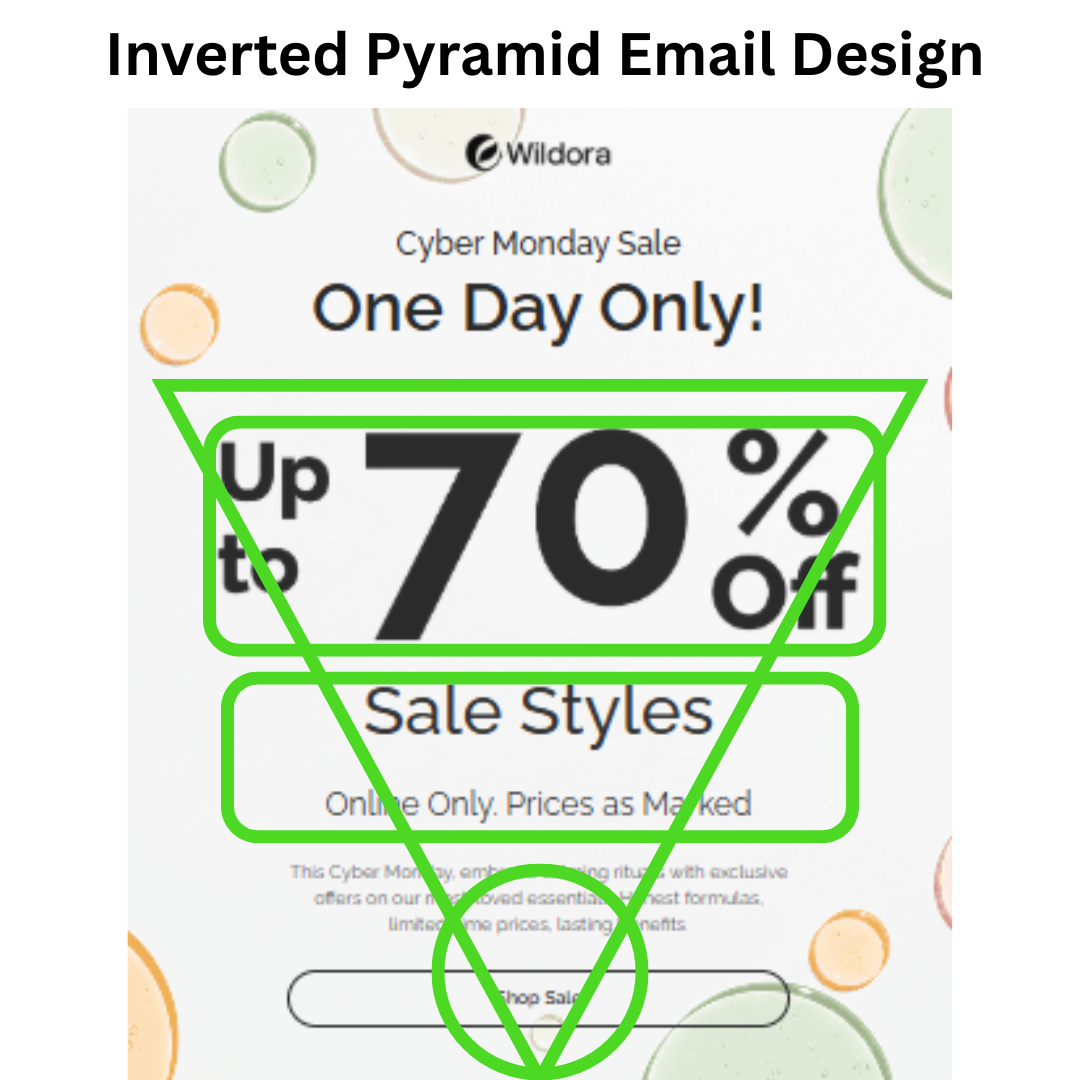
Example 3: Inverted Pyramid Email Design with High Energy Visuals
While the previous email design examples were minimalist and airy, this design uses diagonal lines and layered textures to create a sense of movement.
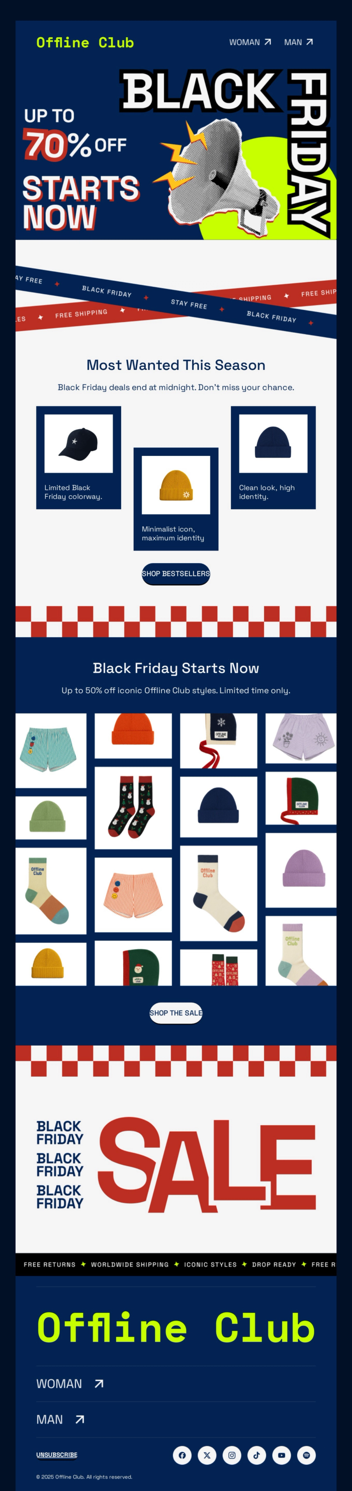
The logic here is Visual Momentum. Because there is a lot of graphic detail, the designer used diagonal lines and staggered product placement to ensure the user’s eye doesn't get "stuck" on any one image. Everything is angled to funnel the energy of the "70% OFF" headline into the "Shop Bestsellers" button.
Example 4: Abandoned Cart Email with Inverted Pyramid Email Design
This simple html email template uses a very clean, modern and photographic-led inverted pyramid to re-engage a customer.
The logic here is Visual Clarity. By using a large image and a very simple, centered button, this abandoned cart email design removes all distractions.
Why Brands Choose Inverted Pyramid in Their Email Designs
According to latest email marketing statistics, 41% of people will view their emails from their mobile devices. Inverted pyramid suits mobile email reading perfectly as users can skim vertically with limited screen space.
- Quick Attention Capture: Mobile users decide in 3-5 seconds whether to engage; placing headlines, key benefits, and CTAs "above the fold" ensures visibility without scrolling. This matches natural top-down eye flow on small screens.
- Scannability on Small Screens: Concise, prioritized content (broad top, narrow CTA bottom) aids finger-scrolling, preventing overwhelm in portrait mode. It keeps essential info readable even if images load slowly or fail.
- Higher Engagement: The structure boosts mobile CTRs by guiding users seamlessly to actions, with shorter, digestible sections outperforming dense text. Tests show pyramid emails perform better on mobile due to this optimized flow.
When to Use Inverted Pyramid Email Design
The inverted pyramid design excels in email marketing for scenarios demanding quick attention and clear action, like promotions with short reader attention spans.
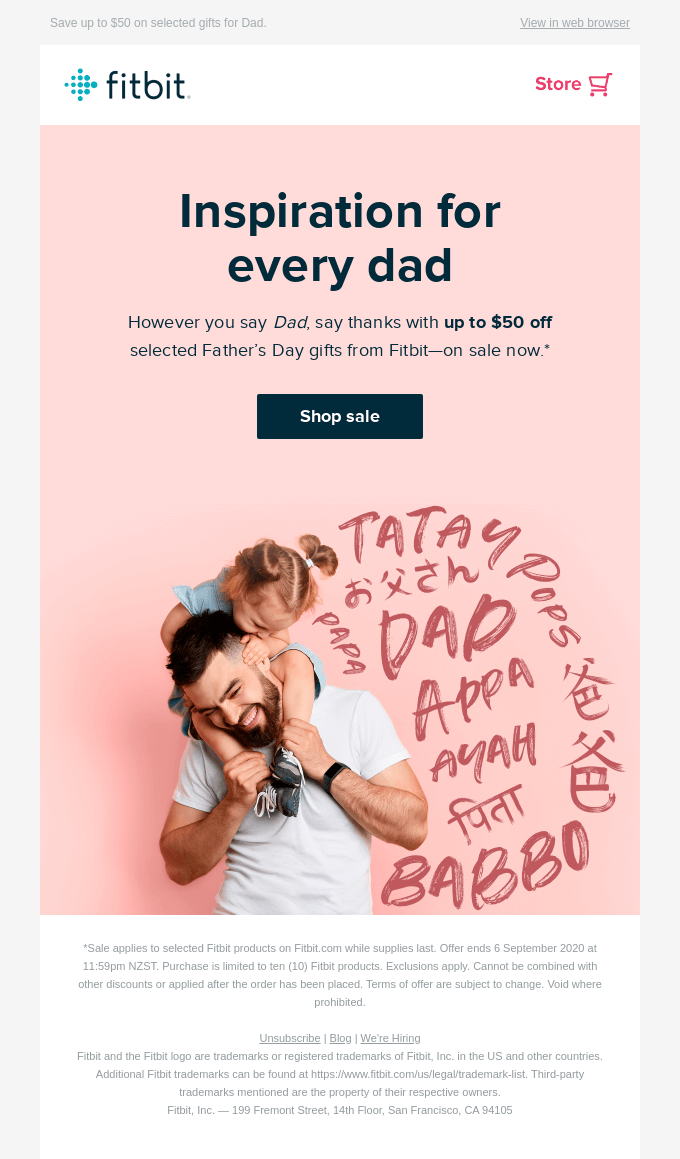
Single-Message Promotions: Ideal for sales, discounts, or product launches where one key offer needs immediate visibility. Fitbit's Father's Day sale used a bold headline, sale details, and CTA button, driving fast scans to conversion. Grammarly's Cyber Monday email highlighted "50% OFF" upfront, funneling to "Upgrade Now".

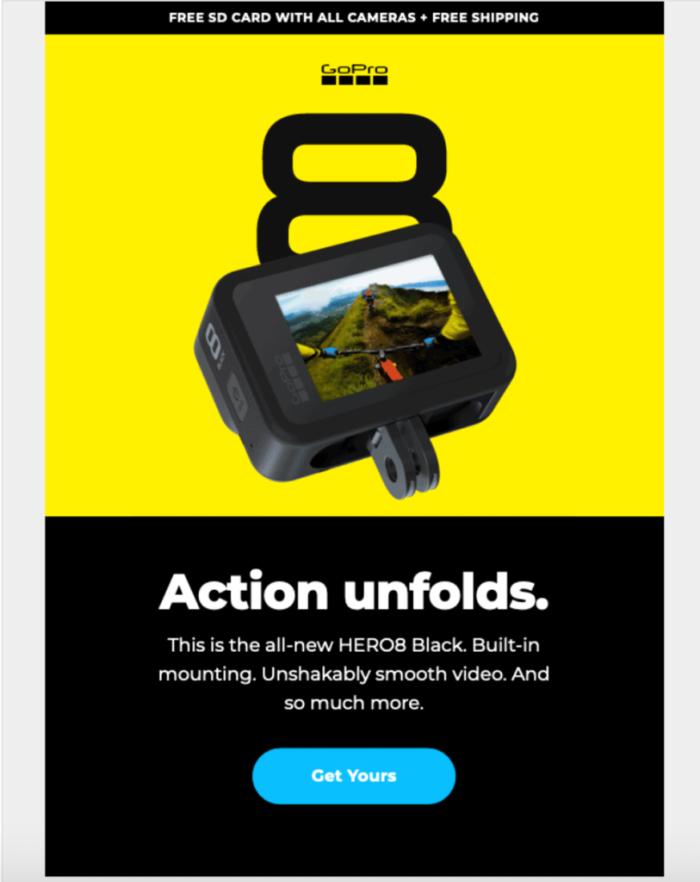
Product Launches and Invites: Perfect for webinars, events, or new features with a singular CTA. GoPro's colorful launch emphasized excitement top-down.
Newsletters with Sections: Apply mini-pyramids per block for multi-content emails. Weekly digest that brake stories into headline > details > CTA sections for high engagement.
Transactional Emails: Suits Order confirmations, or reminders needing concise value first. Ensures users quickly confirm actions without confusion.
When to Avoid Inverted Pyramid Design in Email Marketing Campaigns
- Storytelling Emails: Narrative-driven campaigns, like brand stories or customer journeys, require suspense and buildup from hook to reveal—revealing everything upfront kills engagement. Use chronological or teaser flows instead.
- Multi-Goal Newsletters: Overloaded emails with 3+ unrelated CTAs dilute the single-message funnel; pyramid forces awkward prioritization. Opt for modular grids or Z-patterns to balance parallel messages without hierarchy.
- Complex Educational Content: In-depth guides or tutorials need layered explanations building from basics to advanced—starting with conclusions confuses learners. Break into progressive sections or accordions.
- Visual-Heavy Creative Campaigns: Art-driven or image-led emails (e.g., fashion lookbooks) demand immersive browsing over quick scans; pyramid text emphasis disrupts aesthetics. Prioritize F-pattern or full-bleed visuals.
Final Words: How to Use Inverted Pyramid Design in Email Marketing Campaigns
- Lead with the offer: Put a concise value proposition or hero image at the top to grab attention. Make the headline clear and benefit-focused.
- Use brief, scannable content: Inverted-pyramid emails should be succinct. Keep paragraphs short (people tend to skim) and highlight the key points so readers get the idea even if they don’t read every word.
- Emphasize one main CTA: Include one prominent button near the bottom of the email. 2026 email marketing stats show a large button in place of a text link can boost conversions by ~28%. The CTA button should stand out (good contrast and ample whitespace) to guide the eye.
- Optimize for mobile: Since roughly half of opens occur on phones, design inverted-pyramid emails in a single-column, mobile-first format. This focus on mobile-friendly layouts has been linked to ~15% better conversion.
- Scale for newsletters: If sending a multi-section newsletter, apply the inverted pyramid to each block. Give each story its own mini-pyramid (header, short text, CTA). This keeps the email organized and readers engaged with each item.
- Test and iterate: Always A/B test critical elements (subject line, header image, CTA placement/text, etc.) to see what resonates with your audience. What works can vary by sector and list.
- Balance CTA count: In general, one clear email CTA aligns with the inverted-pyramid goal. (Note: in longer emails, adding 2–3 CTAs has driven many more total clicks in some tests, but it may dilute a single message.) Always tie each CTA directly to the section’s content.
- Avoid clutter: Use whitespace and simple layouts so nothing distracts from the funnel to the CTA. For example, keep navigation links minimal and images relevant. Designers often find that leaving space around the CTA increases click likelihood.