Understanding Positive and Negative Space in Art and Design
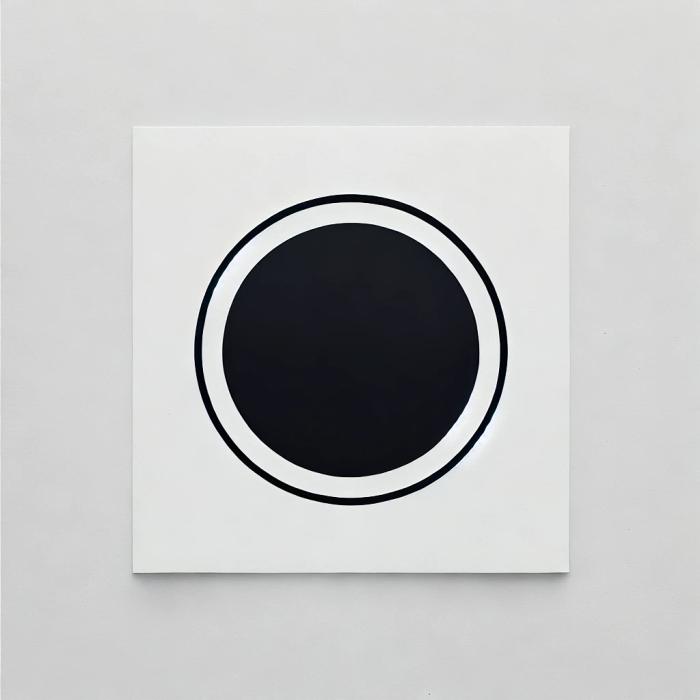
In art, positive space refers to the areas occupied by the main subject or objects within a composition. It is the "figure" or the parts of the artwork that command the viewer's attention as the primary forms.
Positive space is defined by its boundaries and is often considered the tangible or "filled" space in a design. Think of positive space as the things you are drawing or painting - the subject matter itself.
Negative space, conversely, is the area surrounding the positive space. It is the "background" or the "empty" space that exists between and around the subjects in an artwork. Although it is often perceived as empty, negative space is not merely a void; it plays a crucial role in defining the positive space and the overall composition.
Positive and negative space are interdependent. The shape of the negative space is determined by the shape of the positive space, and vice versa. The interplay between these two elements is fundamental to the composition of any visual artwork.
Dieter Rams’s Eighth Principle of Good Design :
“Good design is thorough down to the last detail. Nothing must be arbitrary or left to chance. Care and accuracy in the design process show respect towards the user.”
Negative space creates balance, enhance forms, and even introduce secondary subjects or hidden meanings within artworks.
Negative space frames the composition and guides the viewer’s eye through the actual design.

In digital, when designing a user interface, it is crucial to consider how design elements interact with the white spaces.

Negative spacing provides breathing room, enabling users to better understand and appreciate the overall design. Furthermore, proper use of negative space can enhance clarity, focus, and the aesthetic appeal of a design.
Design fundamentals matter in email. Tabular's html email templates apply proven spacing and layout principles, so your emails look professional and breathable—giving your content room to stand out.
Famous Examples of Negative and Positive Space in Art

Rubin's Vase (1915): This classic optical illusion by Edgar Rubin perfectly demonstrates the subjectivity of positive and negative space.
You can perceive the white area as a vase (positive space) against a black background (negative space), or see two black faces in profile (positive space) facing each other against a white background (negative space). This example shows how our perception can shift and how both spaces are equally important in defining the image.

Sky and Water I (1938) by M.C. Escher: In this woodcut print, Escher masterfully plays with positive and negative shapes to create a rhythmic transition between birds and fish. At the top, black birds are the positive shapes against a white sky. As your eye moves down, the black shapes transform into negative space, and the white areas become fish. This artwork showcases the dynamic relationship between positive and negative space, where each shape borrows meaning from the other.
Actionable Steps to Use Negative Space Effectively in Digital Art
When discussing actionable steps for designing negative space effectively, we will provide clear guidance. These steps involve first understanding the key terminology, then analyzing examples, and finally determining the appropriate actions to create an impactful user interface.
Step 1 - Start with a Purpose
- Define Goals: Designing requires clear objectives and a well-thought-out strategy to achieve them. Therefore, the first step is to define the direction you wish to take. Narrowing down or refining your primary goal will help your design stand out.
- Examples: Negative space in design is particularly evident in logo design. Instead of overcrowding with letters or numbers, logos effectively use negative space to create legible words or initials. A classic example is the FedEx logo, which incorporates a white arrow in the space between the “E” and “x.” By applying Gestalt principles, the viewer’s eye naturally completes the lines, perceiving the arrow without it being overtly depicted.
- Action: To enhance the design’s purpose, strive to achieve balance. Begin by sketching the core elements integral to the design and then evaluate how the empty areas can be utilized effectively.
Step 2 - Prioritize Readability
- Typography: Readability is crucial for creating a strong visual impact on the viewer. Prioritizing negative space can significantly enhance text readability. A design should be easily readable within moments, rather than requiring prolonged effort to decipher. Instead of embedding complex meanings or treating the design as a puzzle, aim to establish clear and clean lines in your design.
- Line Spacing (Leading): Effective typography often involves adjusting line spacing to integrate all design elements harmoniously. This approach can help draw attention to key words. Incorporating design elements or applying Gestalt principles to reduce overcrowding can further guide readers through a clear hierarchy of text.
- Action: Experimenting with different fonts is essential in design. To broaden your visual repertoire, use your slogan or logo and test it with various fonts and spacings. Additionally, conducting user testing can provide valuable external feedback on how to refine and enhance your design.
Step 3 - Use Strategic Alignment
- Grid Systems: "Random" is rarely a term designers appreciate. Utilizing grid lines or reference points is an excellent starting point for defining your active design space. Grid systems also play a key role in helping you understand how to balance negative and positive space in design effectively.

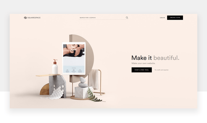
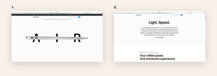
A notable example is Apple’s website, where the focus is on making product visuals the most prominent elements. They use white space to create a subtle background effect that highlights their products. Additionally, calls-to-action (CTAs) like "BUY NOW" or "MORE INFORMATION" are designed to contrast with the negative space, ensuring they stand out clearly to users.
- Action: Similar to the manual grids used by hand sketchers, digital tools like Adobe XD or Figma allow you to experiment with grid-based layouts. These tools help you refine alignments by placing your hand-drawn or digital designs within structured grid frameworks.
Step 4 - Incorporate Contrast
- High Contrast: In email or website design, the primary objective is often to prompt viewer action, such as downloading a resource or purchasing a product or service. High contrast demonstrates how negative space can improve a design by balancing light and dark areas to create depth and direct focus.
- Example: For businesses employing monochromatic color schemes with similar hues, contrasting lines and frames can help make CTAs stand out effectively.
- Action: Leveraging color psychology and color theory to identify matching and complementary tones can greatly enhance your design. By applying contrast tools to refine spacing decisions, you can achieve a clean, readable, and visually engaging layout.
Step 5 - Experiment with Advanced Techniques
- Dual Imagery: If you’re concerned about overdesigning by incorporating multiple images, consider merging your ideas into a single composition. Utilizing negative space to convey two ideas within one design can result in attention-grabbing logos or CTAs that hold greater value. A prime example is the WWF logo, where only the black parts of the panda are visible, prompting the viewer to complete the image using their visual memory. Applying Gestalt principles can help achieve a minimalistic yet meaningful design.
- Layered Designs: In digital design, layering can be an effective way to create depth. By treating the background as a design element, you can overlay text or graphics to add dimension and enhance the overall aesthetic.
- Hidden Messages: Negative space provides an opportunity to include hidden messages or images within a design. By embedding subtle elements or concealing easter eggs, you can engage your audience and reward loyal viewers who uncover these details.
Advanced Applications of Negative Space
We have shared tips on applying negative space in design for your website, logo, or email marketing. Now, let’s explore advanced techniques for using negative space to ensure your designs leave a lasting impression from the very first glance.
Negative Space in Logo Design
Creating a memorable presence in your viewers’ minds is crucial for a brand’s long-term success. When designing a logo, focus on minimal, well-aligned negative spacing to ensure clarity and impact.
For example, in the NBC logo, the peacock is cleverly hidden using negative space and color, making it easily recognizable to viewers. Similarly, the Baskin-Robbins logo incorporates the number "31" in both the updated and previous versions, using contrast coloring and subtle negative spaces to distinguish the letters from the number.
We recommend sketching extensively! A designer’s thought process often evolves through sketching and doodling. Create sketches that allow you to explore negative space, hide meaningful messages, and add depth to your logos.
Negative Space in Web Design
- Improving Navigation: To guide your users effectively, it’s important to map out the elements you want them to focus on. By strategically using negative space, you can create navigating whitespace for menus and buttons, helping users easily find what they need.
- Enhancing Visual Flow: Web design is essentially a storytelling tool, allowing you to introduce your brand, products, or services. By using visual guides, you can direct your users’ attention to key elements and ensure proper spacing. This approach facilitates smooth navigation, making the user experience more intuitive.
- Action: Overdesigning a website can create problems in showcasing the actual layout. If you use too many design elements that are similar in size or color, it may lead to unnecessary complexity. A cluttered design, with overflowing content stacked on top of each other, signals poor design and hampers user experience.
Common Mistakes and How to Avoid Them
Overcrowding the Design
- Mistake: Your design space should maintain a balance between content, visuals, and empty spaces. If you try to fill every empty space with text, visuals, bold colors, or animations, your website or email marketing campaign will appear unprofessional and difficult to understand.
- Solution: Embracing minimalism helps balance negative space in design. In logos, especially, focusing on creating something instantly recognizable can make your design unforgettable from the first glance.
Uneven Spacing
- Mistake: Inconsistent or uneven use of negative space can make a logo or design less readable. This imbalance often leads to uneven spaces and misaligned lines.
- Solution: By adopting design principles for negative spacing, you can effectively use grids and guides. Applying consistent spacing helps you avoid random lines and ensures your design stays balanced.
Ignoring Responsive Design
- Mistake: We must recognize that designs will be viewed not just on wide screens but also on mobile devices. If you add reasonable spaces only on the sides, the design will become distorted when viewed on narrower screens.
- Solution: Optimizing designs for various devices by considering their screen sizes is key to creating responsive designs. Testing layouts across multiple platforms will help you identify which configurations best suit your design vision and visual elements.
Real-World Examples of Negative Space in Design
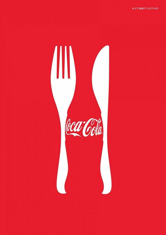
Coca Cola: The Coca-Cola bottle's shape is so iconic that it’s recognizable even by its silhouette. To emphasize this design, Coca-Cola occasionally highlights the silhouette. Since the bottle is often paired with dining, the brand integrates dinner table elements alongside its design, using negative space effectively.
Formula 1 Logo: In the old Formula 1 logo, the sense of speed is conveyed through the design itself. The logo’s dynamic motion and the number "1" embedded within it provide subtle clues about the brand's focus on racing and speed.
Spartan Golf Club Logo: Merging two distinct visual elements into a single logo is a creative approach in design. The Spartan Golf Club logo combines a golfer in action with the image of a Spartan helmet. The swing of the golf club creates a visible head frame, blending the two icons seamlessly.
Final Words
Positive space is the part of your design that contains the main subject or objects—what viewers first notice and engage with. Negative space, on the other hand, is everything around and between those objects. Far from being “blank,” it’s an active design element that frames the positive space, creates balance, and guides the viewer’s eye.
In your email templates and other digital materials, these definitions matter greatly. The content blocks, images, texts, and calls-to-action are your positive space, while the surrounding margins and line spacing function as negative space. Thoughtful use of white space in emails can make headlines pop, highlight key messages, and draw attention to buttons or links. By embracing negative space, you give recipients room to absorb information quickly and clearly, increasing the overall impact and readability of your campaign.
When you design with both positive and negative space in mind, you transform an ordinary email template into a compelling visual experience. Strive for clarity, balance, and intention. Experiment with spacing, alignment, and color contrast to ensure your primary message stands out.
We hope this article has helped highlight the importance of negative space in design. With thoughtful application, your designs will become more readable, attention-grabbing, and compelling. Happy emailing!