2025 Email Newsletter Design Tips and Templates
Table of contents
- How to Design Effective Email Newsletters
- The Impact of Email Newsletter Design on Consumer Behavior
- Understanding Email-Safe Fonts and Typography
- Key Elements of Effective Email Newsletter Design
- How to Embed Images
- Best Practices for Professional Email Newsletter Design
- Consistency with Branding
- Common Mistakes to Avoid in Your Newsletter Designs
- Scientifically Proven Strategies for Successful Newsletter Designs
- The Importance of an Effective Newsletter Design
Email stands out among other digital marketing channels with its capability to directly reach your customers, and the strategies behind newsletters continue to evolve. However, the fundamentals remain the same: design, personalization, and value.
To help you stay ahead in 2025, we have sought the opinions of digital marketing experts and designers to analyze the best newsletter templates and present the most effective trends. By the end of this article, you will learn. By the end of this article, you will learn:
✅ Proven newsletter design best practices for higher engagement
✅ Typography, layout, and branding tips to enhance readability
✅ Technical considerations for mobile responsiveness and email client compatibility
✅ Real-world examples of successful newsletter strategies
Stay competitive and optimize your newsletter templates to stay ahead of your competition in 2025.
How to Design Effective Email Newsletters
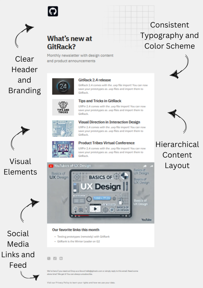
Imagine visiting your local store to pick up some essentials. You can stroll through the aisles, explore what’s new, chat with the seller about how sales are going, and get insights or updates on products directly from them. Unfortunately, online shops lack this same interactive atmosphere. However, you can recreate it through effective email newsletter design. The challenge then becomes: will your subscribers actually read it?
Create your template using our email template builder.
With a strong email newsletter, you can update subscribers on your store's latest changes, new products, or brand priorities, like eco-friendly living. A thoughtfully crafted, engaging newsletter design boosts readability and keeps your audience interested.
The Impact of Email Newsletter Design on Consumer Behavior
The readability and attention-grabbing power of an email depend on several key factors. When considering how to design a newsletter, it’s essential to incorporate design elements that reflect consumer behavior. If you’re unsure where to start, remember that tried-and-true methods for email newsletters have emerged through research.
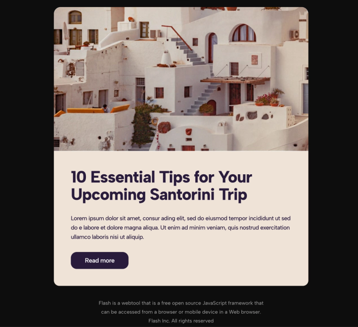
These elements range from subject line length to email size. For instance, if your goal is to boost email metrics like open rates, click-through rates, or reopens, you’ll need to follow specific best practices. Here are a few key insights:
- Avoid lengthy subject lines, as they can hurt open rates or trigger spam filters.
- If your newsletter solely promotes products, it may end up looking like a generic marketing email. To keep it engaging, include a few non-purchase links to drive click and reopen rates.
- Effective timing is also critical. Most people open emails in the morning, so schedule your newsletters to arrive early in the day.
- Finally, monitor email metrics frequently. By segmenting your audience based on engagement, you can target the most engaged customers—those likely to be interested in purchasing.
Understanding Email-Safe Fonts and Typography
Legibility is essential in newsletter header design. Using clear, readable fonts in both the header and body can significantly boost engagement rates. While decorative or bold fonts may catch the eye, they might not display correctly on all devices. If your carefully crafted design doesn’t render as intended, it can create consistency issues.
To avoid this, opt for email-safe fonts compatible across Mac, PC, and mobile. Here’s a list of email-safe fonts you can rely on:
- Arial
- Courier New
- Verdana
- Georgia
- Helvetica
- Times New Roman
- Open Sans
- Roboto
- Calibri
- Garamond
- Palatino
- Impact
This selection includes fonts from serif to sans-serif styles, and from bold to italic. For more on typography and choosing the font that best represents your brand, check out our blog post on Type Anatomy.
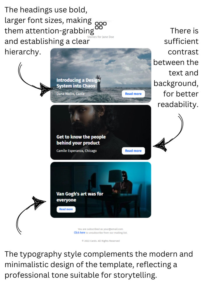
Choosing the Right Font for Your Newsletter
Font choice, like color, speaks volumes about your brand identity. Different typefaces can convey various moods—whether playful, understated, or clean and professional. You can also tailor font selection based on the theme of your newsletter content to better align with your message.
For example, a bookstore might use serif fonts and minimalist designs, echoing the style often found in books. This familiar, book-inspired aesthetic helps reinforce your brand identity. Meanwhile, a brand selling mountain hiking shoes could use a bold, sans-serif font for a rugged, sporty feel. Just remember to maintain consistency; using familiar fonts and styles across newsletters creates a cohesive, recognizable brand experience.

Key Elements of Effective Email Newsletter Design
Layout and Structure
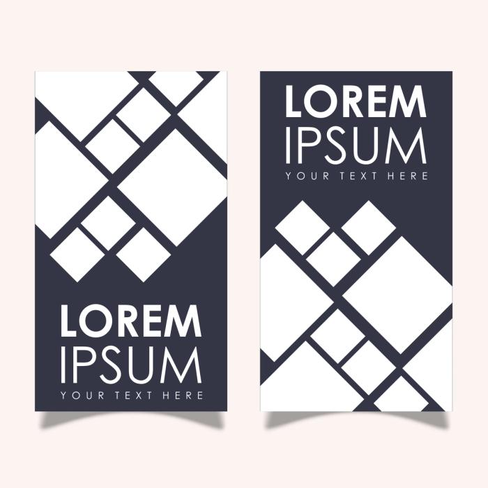
The way the eye perceives a design is closely tied to its layout. By applying principles like hierarchy, dominance, and direction, you can create a clear structure for readers to follow. For example, grouping design elements within a column layout ensures your newsletter is responsive across various devices.
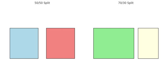
Here are some effective layout options:
- 50/50 Split: Use equal-width columns to present two equally important content sections side by side.
- 70/30 Split: With one column larger than the other, you can make the primary column the focal point. This layout works well for dividing content into main and supporting sections.
Experiment with placement to decide which content fits best on each side. Be sure to optimize and check that the layout displays well on all screen sizes.
Images and Visual Content
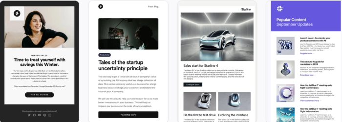
Proper image usage can assist you in creating engaging readers. However, you must be careful when placing these images. By making sure that you are optimizing the images you can ensure that the reader can open them in any device screen ratio and get the best results.
Best Practices for Using Images in Newsletter Designs
Limit images to 25% of the content area to maintain a professional look.
- Use alt-text for images so they can still be understood when images are not loaded due to poor connection or user settings.
- Avoid using an all-image email format, as it may negatively affect readability and deliverability if users zoom in or out.
Technical Specifications
- Optimize image files to around 100KB for quick loading, preventing readers from closing the email without reading it.
- Use compatible image formats like JPEG, PNG, and non-animated GIFs to ensure universal compatibility.
- Keep images under 600px in width to ensure responsive design across different devices.
- Host images on your own server and use absolute URLs to avoid issues with third-party hosts.
Colors and Branding
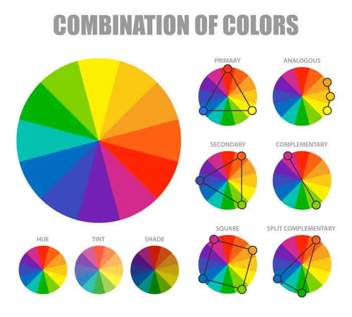
Color choices significantly influence customer behavior by evoking emotions and shaping perceptions. If your brand already has established colors, it’s beneficial to incorporate them into your email branding to maintain consistency. For a deeper understanding of how color psychology impacts email design, check out our blog on the topic.
If you’re feeling overwhelmed by the many color options, try using an online color theory calculator. This tool can help you explore popular color combinations and palettes that align with your brand. You can even start with a single color and generate new palettes, then evaluate their psychological effects to ensure they match your brand identity and messaging.
Calls to Action (CTAs)
Email marketing depends on two key factors: staying top of mind for your customers and motivating them to take action. Call to actions (CTAs) are design elements that guide customers toward the actions you want them to take, whether it’s clicking a download link, visiting a website, reading a blog, or purchasing a product.
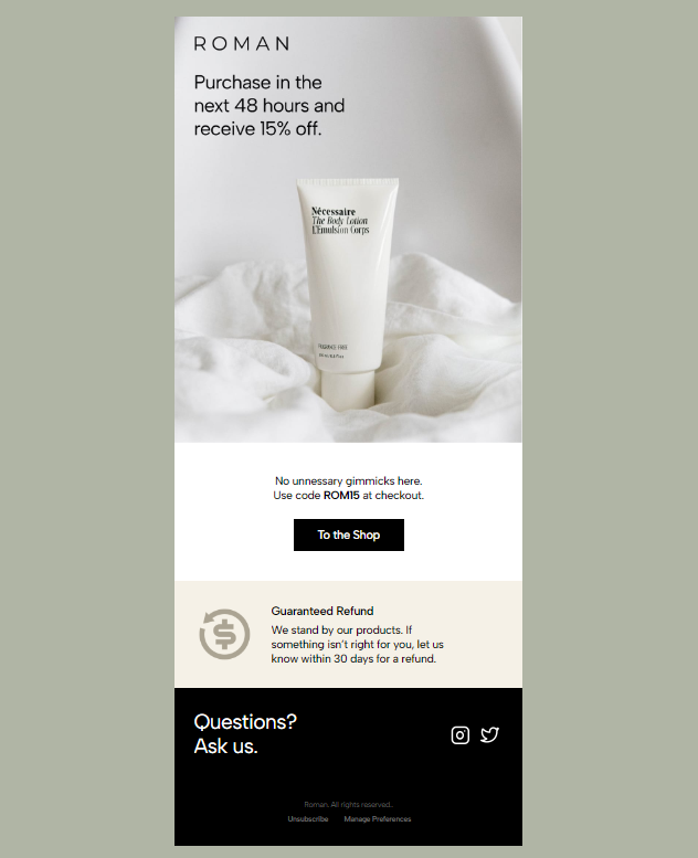
CTAs rely on three main visual elements:
- Action-oriented Language: Since button space is limited, use concise phrases that encourage action, like “Buy Now,” “Learn More,” or “Download Here.”
- Contrasting Colors: Choose colors that stand out from the rest of the design, ensuring both attention and readability. The color should draw the eye without clashing with the rest of the layout.
- Proper Placement: The placement of CTAs influences their effectiveness. Position them in visible, engaging locations such as at the top or bottom of the email text to increase the likelihood of interaction.
For more tips on placing CTAs to maximize conversions, check out our blog on designing email templates with the highest conversion rates.
Technical Considerations in Email Newsletter Design
Not all syntax and inline styles work across every platform. If you’re new to coding, you might find languages like JavaScript familiar, but these aren’t widely supported by email clients, so it’s best to avoid them.
Even if you’re comfortable with a specific coding language, always use strict HTML4/XHTML syntax and inline styles for better compatibility. We recommend using HTML tables rather than divs, as divs may not be consistently supported in email clients. Additionally, when using images as backgrounds, avoid complex CSS, as it can cause issues for recipients’ email servers, making it harder for them to open and read your content.
Responsive Design
Nowadays, no one waits to sit at a desktop or laptop to check their emails. We check them on the go—on the subway, bus, or even while having coffee using our phones or smartwatches. Therefore, if you design only for desktop screens, your brand and e-newsletter will feel outdated.

It’s important to design for multiple screen sizes and ratios, ensuring your images and layout adapt well to all devices. If you're looking for a template creation site, you can explore email builder. It offers tools to check whether your design fits across different devices, and you can find plenty of professional email newsletter design inspiration there.
How to Embed Images
We’ve all experienced it: you place an image into a document with text, only to find that everything becomes jumbled, and the file throws errors because it can't locate the original image source. You definitely don’t want this kind of issue affecting your professional newsletter design.
To avoid this, we recommend embedding images rather than attaching them to the email. Below is a table for you to check:
| Attached images | Embedded Images |
|---|---|
| Increases email size | Reduces email size |
| May trigger spam filters | Improves load speed and deliverability |
| They are viewable offline; hosted images need an internet connection | Allows for updates without resending |
Best Practices for Professional Email Newsletter Design
Personalization and Segmentation
A 2012 study by the Wall Street Journal found that personalized emails have a significantly higher response rate than generic, one-size-fits-all emails. The great news is that personalization can be as simple as addressing recipients by name or segmenting them based on previous purchasing behavior.
By leveraging user data, such as recent purchases, abandoned carts, or preferences, you can craft tailored offers just for them. This allows you to send personalized coupons, relevant offers, and more. Segmenting your audience in this way ensures you're targeting the most engaged groups with content that resonates.
Consistency with Branding
When we see a creative newsletter design from brands like Spotify or Amazon, we instantly recognize it. This recognition stems from their consistent use of colors, design, and logos throughout their e-newsletter designs. You can build this same consistency by aligning your design elements, reinforcing your brand identity, and fostering trust with your audience.
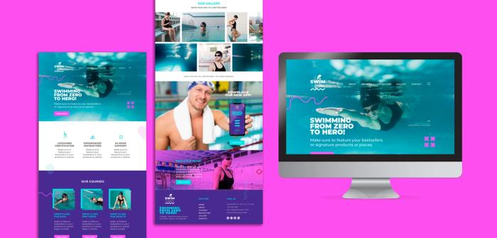
Ensure that your newsletter design aligns with other marketing materials, such as your social media headers, website, logo, color choices, and font styles, to create a cohesive and recognizable brand experience.
Optimizing Content for Readability
- Navigating your recipients through a newsletter is a key challenge in email design. Since the goal is to encourage reading and engagement, you want to keep them interested and prompt them to interact with the CTAs. To do this, you can use both text and visual hooks to guide them.
- Incorporating headings, bullet points, and ample white space helps break up text, guiding the reader's eyes in the desired direction and encouraging them to follow through on your CTAs. Keeping paragraphs short and clear will also improve readability, as today’s readers prefer easy-to-digest content due to shorter attention spans.
- Avoid using long images that take up the entire screen, as this can overwhelm the reader and deter them from scrolling further. Additionally, limit the number of products or blog posts per email—around 4 to 6 images, arranged in 2 columns, is ideal for maximizing content. If you have more content to share, consider breaking it into separate emails and scheduling them accordingly.
Common Mistakes to Avoid in Your Newsletter Designs
For email newsletter design best practices, we’ve compiled a list of the most common mistakes to avoid:
Overloading with Images or Text:
Content that is either image-only or text-heavy tends to be overlooked and not read thoroughly. It’s essential to strike a balance between text and visuals to ensure the content is easy for the eye to follow. This balance is also crucial for maintaining brand consistency.
Using Non-Email Safe Fonts:
Your text may not render properly on all devices due to factors like large image sizes, attached images, or hard-to-find fonts. To avoid this issue, we recommend using classic, widely supported fonts such as Verdana, Impact, Times New Roman, Arial, Open Sans, and similar options.
Neglecting Mobile Optimization:
If you design your e-newsletter solely for desktop devices, there’s a high chance it won’t display well on other devices. Be mindful of how you place your columns and ensure your design is optimized for various screen sizes.
Including Large Attachments or Embedded Videos:
Large image file sizes can cause emails to load slowly or not render properly. To avoid this, link to videos instead of embedding them. Additionally, large attachments may not always pass through spam filters.
Ignoring Email Client Limitations:
Some email clients don’t support all features. Therefore, when sending emails, ensure you use standard syntaxes like HTML4 and avoid JavaScript.
Inconsistent Branding:
To maintain a consistent brand identity, ensure that your use of logos, colors, and styles is uniform across all platforms. Apply the same design elements to your social media accounts and website to create a cohesive brand experience.
Scientifically Proven Strategies for Successful Newsletter Designs
Analysis of Verkkokauppa.com’s Newsletter
Verkkokauppa, an electronic market located in Finland, was analyzed in a 2014 academic study by Thomas Djupsjö. The study examined their newsletter through 30 subscriber emails using various coding techniques.
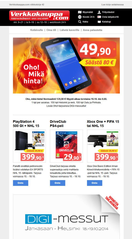
Strengths:
- They have a consistent and well-planned delivery system, sending weekly newsletters mainly on Wednesdays at noon.
- They use consistent colors, such as red and blue, in their newsletter design, helping to build brand recognition.
- They include CTAs with “Buy” (Osta in Finnish) buttons under each product to guide customers toward making a purchase.
Weaknesses:
- Their generic subject lines sometimes fail to grab the recipients' attention, leading to lower open rates. These subject lines often appear similar to each other and to those of other brands.
- Despite the potential for greater customer engagement through social media, the lack of links to their social media platforms means they miss out on fostering direct connections with their audience.
Analysis of Clas Ohlson’s Newsletter
Clas Ohlson, a brand focused on home electronics, was another case studied by Finnish researcher Djupsjö. During the study, they sent 19 newsletters. Here are the strengths and weaknesses identified:
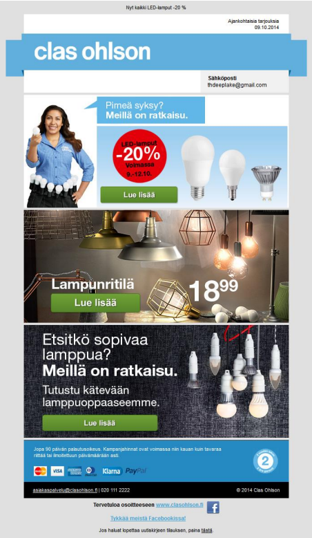
Strengths:
- They reward their newsletter subscribers with promotions, and by mentioning these offers in the subject lines, they encourage recipients to open the emails.
- Clear CTAs and visually distinct buttons contribute to positive email metrics. The high contrast and easy navigation make it simple for recipients to engage with the content.
- They include links to their social media platforms in the emails, allowing recipients to follow and interact with them through various social media channels.
Weaknesses:
- Their email delivery schedule was inconsistent, which created a lack of strategy and reliability in their approach.
- Overreliance on images caused some emails to be unreadable for certain recipients, as they did not always render properly across all devices.
Lessons Learned
- It’s essential to strike a balance between visuals and text. This ensures that users can access your content even if images are disabled or if the email is viewed quickly.
- Consistency in brand design elements is crucial for maintaining a professional newsletter design and making your brand easily recognizable.
- Make CTAs compelling and visually contrasting to help them stand out, guiding recipients toward the desired actions.
- Personalize emails by addressing users by their first names or using data segmentation to tailor content. Specific subject lines can also increase relevance and engagement.
We extend our thanks to Thomas Djupsjö for his research on digital newsletter design, which provided valuable insights for this article.
Djupsjö, T. (2014). Visual appearance and effective communication in commercial digital newsletters: Constructing digital commercial newsletters in a visually appealing format as a part of an effective company marketing strategy (Degree thesis). Film and Television.
The Importance of an Effective Newsletter Design
In conclusion, you should craft your email newsletter design very well thought out if you want to get successful results. Key design elements such as layout, images, typography, and technical considerations all contribute to creating a visually appealing and functional experience for your subscribers.
A well-tailored newsletter not only boosts open rates and click-through rates but also enhances conversions, ultimately driving engagement and sales. By applying these best practices to your next email campaign, you can strengthen your brand's presence and foster deeper connections with your audience. The positive impact of a well-crafted newsletter on both engagement and sales is undeniable, making it an essential tool for any successful marketing strategy.
We hope as you have finished our blog, you were able to write down related notes that can apply to your brand identity. Happy emailing!