Onboarding Email Best Practices with Examples from Top Brands That Work
Table of contents
Onboarding emails differ from simple welcome emails in that they are part of a broader, ongoing sequence designed to guide the customer through the early stages of using the product or service. This makes onboarding email sequences extremely important for SaaS businesses.
Good welcome email templates for onboarding emails usually consist of these same three parts: a personalized welcome message, a next steps section, and a main CTA. But is that all? What are the best practices for onboarding emails? How do you create these email templates in HTML? What better way to learn than analyze the great onboarding emails, and this is what we'll exactly do.
Great Onboarding Email Examples
Example 1: Sziget Festival
The first email is from a music festival, one of Europe's biggest: Sziget Festival. The main goal for this message is to capture the attention of the audience and make them feel like they are in the right place with targeted visuals and email design. You wouldn't want to see a bland text email when signing up on a music festival's page, right?
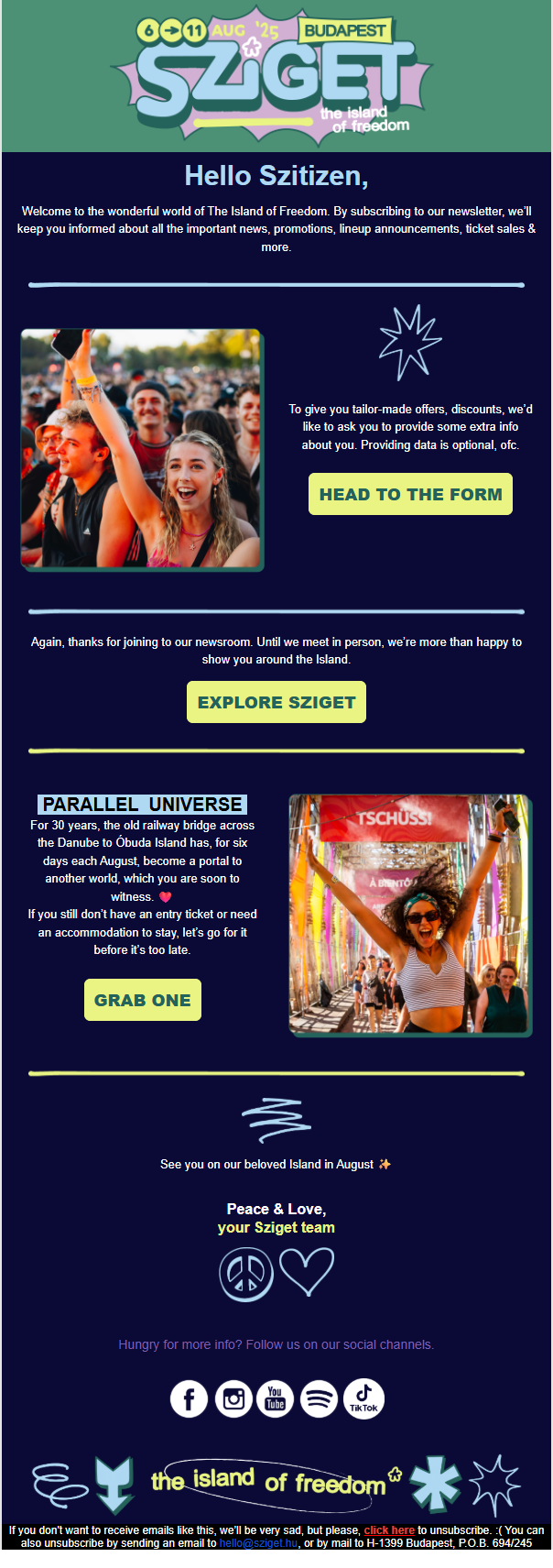
- Strong Visual Storytelling: The email heavily relies on happy and energetic images of festival people. This is a powerful strategy for an event-based brand like Sziget as the product is an experience. Community, excitement, and freedom are all important parts of festival's identity and the email design reflects just that.
- Clear and Compelling Call-to-Action (CTA): The primary CTAs, "HEAD TO THE FORM" and "EXPLORE SZIGET," are visually distinct and use action-oriented language. The offer to provide more information for "tailor-made offers" is a good incentive for subscribers to share more data, which can be used for future personalization.
- Engaging and On-Brand Copy: The language used is informal and welcoming, with phrases like "Hello Szitizen" and "Welcome to the wonderful world of The Island of Freedom." This helps to build a sense of community and belonging from the very first interaction. The "Parallel Universe" section effectively romanticizes the festival experience.
- Social Proof and Community Building: The inclusion of social media icons at the bottom encourages new subscribers to connect with the Sziget community on multiple platforms, fostering a deeper sense of engagement beyond just email.
Areas for Improvement:
- Lack of Immediate Personalization: The email addresses the subscriber as "Szitizen," which is a clever branding move. However, using the subscriber's actual first name in the greeting is a simple yet highly effective way to increase engagement. Statistics show that personalized email subject lines can boost open rates by 26%.
- Vague Next Steps: While the email provides a link to "EXPLORE SZIGET," it doesn't set clear expectations for what the new subscriber will receive next. An effective onboarding series should guide the user. For instance, the email could mention that in the coming weeks, they will receive information on the lineup, tips for planning their trip, or exclusive early-bird ticket offers.
- Information Hierarchy could be clearer: The email presents two main sections with distinct CTAs. While visually separated, a clearer flow could be established. For instance, the section on providing more data for tailored offers could be framed as a way to customize the content they will receive in the future, making the benefit for the user more explicit.
- Missed Opportunity for Immediate Value: Beyond the welcome, the email could have provided a piece of high-value content to solidify the new subscriber's interest. This could be a link to a "Best of Sziget 2024" video, a curated Spotify playlist of past performers, or a downloadable guide to Budapest for festival-goers. This would provide instant gratification and reinforce the value of being on the mailing list.
Example 2: Warmy.io
The second one is from Warmy.io, an email warm-up service for better deliverability, an important aspect of email marketing. Like I said, onboarding emails are crucial for SaaS companies to guide users to the next step and draw a clear image of what the software can do, and Warmy’s email does exactly that.
- Clear and Urgent Subject Line: The subject line, "[Warmy.io] - You have not connected the mailbox 😬," is highly effective. It immediately communicates the purpose of the email, and the use of the grimacing emoji adds a touch of personality and conveys a sense of urgency without being alarming. Subject lines that clearly state the email's purpose can significantly improve open rates.
- Excellent Personalization: The email greets the user by their full name, "Hi Umut Deniz." This simple act of personalization is known to increase open and click-through rates, making the user feel recognized and the message more relevant.
- Minimalist Design: The design is clean, with plenty of white space and the company logo prominently displayed. This minimalist approach ensures that the user's attention is focused squarely on the message without any distractions. For a SaaS company, a clean design can convey efficiency and professionalism.
- Direct and Concise Copy: The email gets straight to the point. The first sentence clearly states the issue: "We have noticed that you did not connect your mailbox to Warmy.io." It then reminds the user of the ongoing trial, which subtly hints that they are losing valuable time to test the service.
- Human Touch: The invitation to "feel free to reply to this email" for any questions is a great touch. It opens a direct line of communication and makes the support process feel more personal and accessible than directing users to a generic contact form.
Areas for Improvement:
- The Lack of a Prominent Call-to-Action (CTA): This is the email's most significant flaw. It tells the user what they haven't done but doesn't provide a direct path to fix it. A brightly colored, clickable button with a clear action, such as "Connect Your Mailbox" or "Complete Setup," would make it much easier for the user to take the desired next step. Emails with a single, clear CTA have been shown to increase clicks significantly.
- Missed Opportunity to Reinforce Value: The email mentions the free trial but doesn't remind the user why they should care about connecting their mailbox in the first place. A brief sentence reiterating the core benefit, such as "Connect your mailbox now to start improving your sender reputation and ensure your emails land in the inbox," would provide a stronger motivation to act.
- No Guidance for Stuck Users: If a user hasn't connected their mailbox, it might be because they are unsure how or have encountered a problem. Including a link to a help guide, a short tutorial video, or an FAQ page could provide the necessary support to overcome any obstacles.
- Passive Language: The tone is polite but could be more action-oriented. Framing the message to focus on the benefits the user is missing out on could be more compelling.
Example 3: Wizz Air
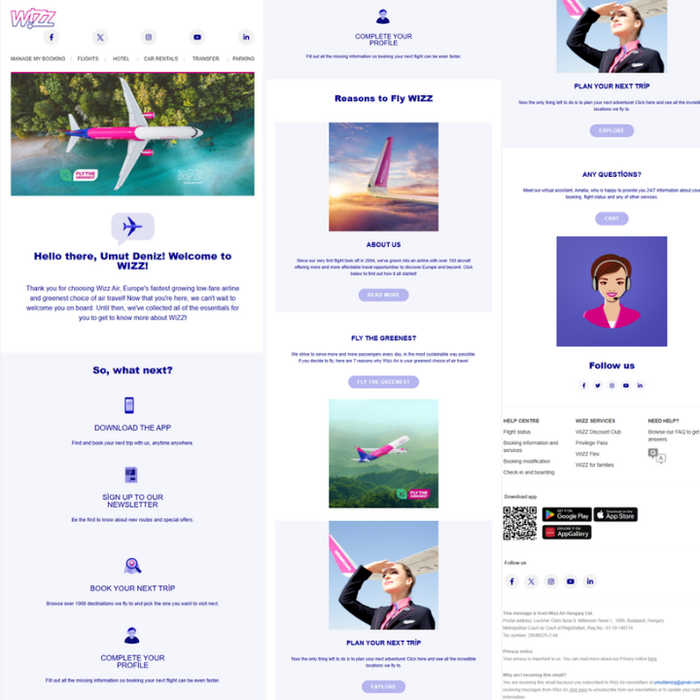
The next stop on our journey is Wizz Air, a prominent European low-cost airline, and its masterclass of an email that is personalized, properly designed, and a perfect definition of the category. The airline industry is highly competitive, and customer loyalty is often driven by price and convenience. This email aims to immediately embed the Wizz Air brand in the user's mind as a go-to for affordable travel, guiding them through the various ways they can interact with the airline.
- Excellent Personalization and Welcoming Tone: The email starts with a warm, personalized greeting, "Hello there, .....! Welcome to WIZZ!," which immediately makes the user feel seen and valued. This is a simple but powerful tactic for building an initial connection.
- Clear, Action-Oriented Structure: The "So, what next?" section is brilliant. It breaks down the key initial actions a new user should take into four simple, scannable steps: Download the App, Sign Up to Our Newsletter, Book Your Next Trip, and Complete Your Profile. Each step has a clear icon and a brief explanation, which is great for user guidance. This approach helps prevent cognitive overload, which can be a problem with feature-rich services.
- Strong Value Proposition: The "Reasons to Fly WIZZ" section effectively highlights the airline's key selling points: its history, its commitment to sustainability ("Fly the Greenest"), and the ease of planning a trip. This helps to build brand trust and differentiate Wizz Air from its competitors. Using "Fly the Greenest" is a particularly smart move, as sustainability is an increasingly important factor for many travelers.
- Visually Engaging Design: The email uses a clean layout with on-brand colors (the distinctive Wizz Air pink and purple), high-quality images, and clear typography. The visuals are aspirational and travel-focused, which is perfect for an airline. The design is also mobile-friendly, which is crucial as a significant percentage of users read their emails on their phones.
- Comprehensive Help and Support Section: The inclusion of a dedicated section for "Any Questions?" with a link to a virtual assistant, along with a detailed footer with links to the Help Centre and social media, shows a commitment to customer support. This is reassuring for new users who may have questions about the booking process or their account.
Areas for Improvement:
- Potential for Information Overload: The email is quite long and contains multiple calls-to-action (CTAs). While they are well-organized, a user might not know which action is the most important to take first. A/B testing a shorter version of the email that focuses on one or two key CTAs (like "Download the App" and "Book Your First Trip") might reveal higher engagement rates for those specific actions.
- Generic "Book Your Next Trip" Section: The "Book Your Next Trip" CTA is a general invitation to browse destinations. This could be made much more powerful with personalization. For example, if Wizz Air has data on the user's home airport (which it likely does from the sign-up process), it could showcase a few popular or discounted routes from that specific airport. Dynamic content in emails can lead to significantly higher click-through rates.
- The "Sign Up to Our Newsletter" CTA is redundant: The user is likely receiving this email because they just signed up for the newsletter or created an account. This could be confusing and might be better replaced with a CTA to "Set Your Travel Preferences" to receive more personalized offers in the future.
- Lack of a Time-Sensitive Incentive: While the email is very welcoming, it doesn't create a sense of urgency. Including a small, time-limited welcome offer, such as a discount on their first baggage fee or a small number of bonus points for their loyalty account, could be a powerful motivator to encourage the user to make their first booking sooner rather than later.
Example 4: TinyMCE
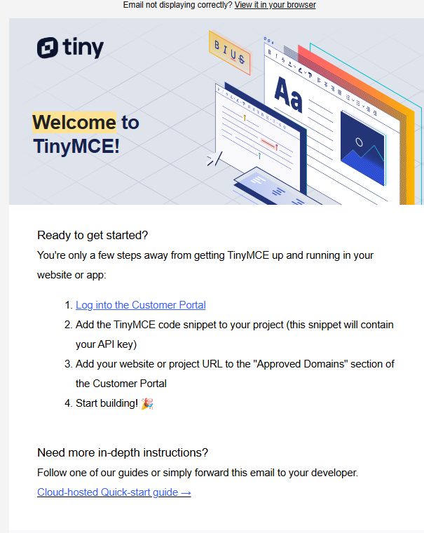
- Clear, Sequential Onboarding Steps: The "Ready to get started?" section is the email's biggest strength. It provides a simple, numbered list of the exact steps the user needs to take. This clarity is invaluable for a technical product where the setup process can be a major friction point. By breaking it down into "Log in," "Add snippet," "Add URL," and "Start building," it makes the process feel manageable.
- Audience Awareness: The email is written for a developer. It uses appropriate terminology ("code snippet," "API key") and anticipates the user's needs by providing a link to a more in-depth "Cloud-hosted Quick-start guide." The suggestion to "simply forward this email to your developer" also shows an understanding of how teams work, acknowledging that the person who signs up might not be the one implementing the code.
- Transparent and Upfront Information: The email does an excellent job of setting expectations regarding the free trial and billing. It clearly states the 14-day trial period, what happens afterward (option to upgrade or stay on the free plan), the limitations of the free plan ("1,000 Editor Loads per month"), and the cost of exceeding that limit. This transparency is crucial for building trust with business customers.
- Highlights the Value of the Trial: The "Take advantage of your free trial!" section effectively teases the premium "advanced features" like PowerPaste and Spell Checker. This incentivizes the user to actively test the product during the trial period to experience its full value, which is a key strategy for converting trial users to paying customers.
Areas for Improvement:
- Lack of Personalization: The email lacks a personalized greeting. Starting with "Hi [First Name]" is a simple, standard practice that makes an automated email feel more personal and can improve engagement rates.
- Weak Call-to-Action (CTA) Design: All the calls-to-action are plain text links. The most important first step, "Log into the Customer Portal," is buried in the first line of a numbered list. Transforming these key links into prominent, high-contrast buttons would make them much more noticeable and clickable. Studies consistently show that buttons outperform text links for primary CTAs in emails.
- Visually Underwhelming: The email is very text-heavy. While the header image is nice, the body of the email could benefit from some visual elements to break up the text. For example, using icons next to each of the four setup steps could make that section more scannable and visually appealing.
- Doesn't Sell the "Why": The email is very focused on the "how" (how to get set up). It misses the opportunity to reinforce the "why" – the core value proposition. It could benefit from a brief, inspiring sentence at the beginning to remind the user of the awesome user experiences they are about to build. Something like, "Get ready to empower your users with a world-class content creation experience."
Example 5: Booking.com
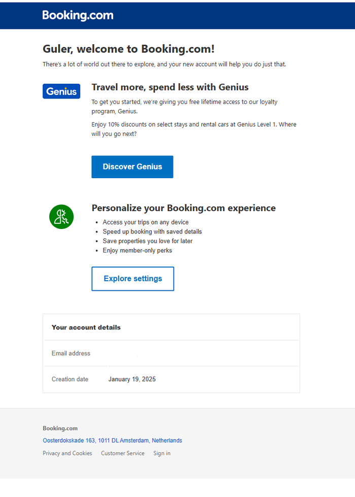
- Immediate and Powerful Value Proposition: The email's most prominent feature is the introduction to the "Genius" loyalty program. By immediately granting the user "free lifetime access" and a tangible benefit ("10% discounts on select stays"), Booking.com provides instant gratification. This is a highly effective strategy to make the user feel they've gained something valuable just by creating an account, which can significantly influence their decision to book with Booking.com over a competitor.
- Clean, Scannable Design: The email has a very clean layout with ample white space, clear headings, and a simple, on-brand color scheme. This makes the information easy to digest. The content is broken into logical sections ("Travel more, spend less with Genius," "Personalize your Booking.com experience"), each with a clear purpose.
- Strong, Action-Oriented Calls-to-Action (CTAs): The primary CTAs, "Discover Genius" and "Explore settings," are presented in high-contrast buttons that stand out. The language is clear and encourages action, guiding the user to the next logical steps in their journey.
- Effective Personalization: The email uses the user's last name in both the subject line and the main heading. While using the first name might feel slightly more personal, this level of personalization still makes the email feel directly addressed to the recipient.
- Reinforces Benefits of Having an Account: The "Personalize your Booking.com experience" section clearly lists the practical benefits of being logged in, such as accessing trips on any device and speeding up the booking process. This reinforces the "why" behind creating an account in the first place.
Areas for Improvement:
- Could Be More Inspirational: The copy is very functional and benefit-driven. It's effective but not very exciting. Adding a touch of inspirational language, perhaps by framing the Genius discount as "10% closer to your next adventure," could make the message more engaging and align better with the emotional nature of travel.
- No Direct Path to Search: The email successfully sells the benefits of the account but doesn't provide a direct, low-friction path to start using it for its primary purpose: searching for a place to stay. Including a simple search bar or a section with "Popular destinations" or "Deals from your nearest airport" could be a powerful way to bridge the gap between onboarding and user activation.
- Formal Greeting: Using the last name ("Guler, welcome...") is a bit formal for a consumer travel brand. Using the first name would create a warmer, more personal tone.
Example 6: Amazon Prime
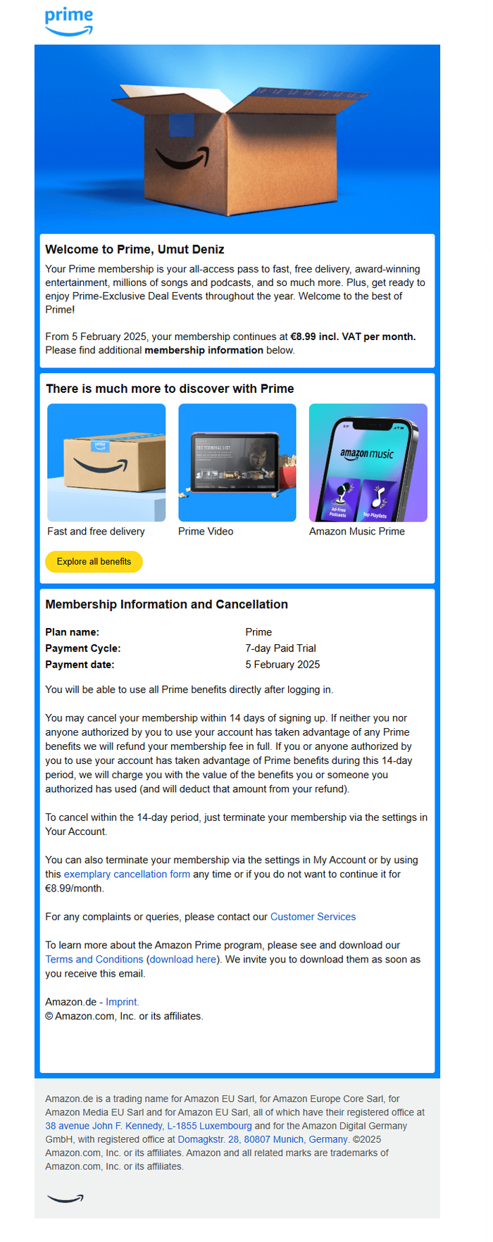
- Excellent Personalization: The email immediately addresses the user by their full name in the welcome message. This simple touch makes a mass-sent email feel personal and direct.
- Powerful Summary of Benefits: The opening paragraph is concise and compelling, summarizing the core pillars of the Prime service: "fast, free delivery, award-winning entertainment, millions of songs and podcasts, and so much more." This immediately reinforces the user's decision to sign up.
- Visual and Scannable Benefit Showcase: The "There is much more to discover with Prime" section is highly effective. It uses clear, representative images for the key services (delivery, Prime Video, Amazon Music), allowing the user to quickly grasp the breadth of the offering at a glance. The single, clear "Explore all benefits" call-to-action serves as a central gateway for users who want to learn more.
- Exceptional Transparency: The "Membership Information and Cancellation" section is incredibly detailed. It clearly outlines the plan type (7-day Paid Trial), the first payment date, and the recurring cost. Furthermore, it provides extensive and clear information about the user's cancellation rights, which is not only good for building customer trust but is also a legal requirement in many regions.
Areas for Improvement:
- Potential for Information Overload: The email contains a significant amount of text, particularly in the lower half concerning membership details and cancellation policies. While this transparency is a strength, the dense blocks of text can be intimidating and may cause some users to disengage. Breaking this information up with formatting like bullet points or bold text could improve readability.
- Broad and Non-Specific Call-to-Action: The primary CTA is "Explore all benefits." While this is a good starting point, it's also very broad. For a service with so many distinct features, providing direct CTAs to engage with each one could be more effective. For instance, adding a "Start Watching" button under Prime Video or a "Listen Now" button under Amazon Music would create a more direct path to activation and help the user experience the value of each feature immediately.
- Lack of a Guided "First Step": The email presents all the benefits as equals, but a new user might not know where to start. The sheer volume of choice can lead to inaction. A more curated onboarding experience might suggest a specific first action, such as "Your Prime journey starts here: Watch the latest episode of [Popular Show]" or "Tip: Find your favorite artist on Amazon Music to get started." This would provide a clear and easy entry point into the ecosystem.
- Could Be More Emotionally Resonant: The email is very functional. While the iconic Amazon box is a strong brand asset, the overall feel is more transactional than exciting. Incorporating more lifestyle imagery—people enjoying movies, listening to music, or unboxing a much-anticipated item—could create a stronger emotional connection and better sell the experience of being a Prime member, not just the list of features.
Example 7: Bandsintown
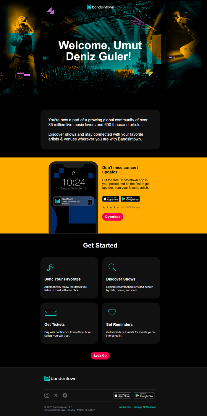
- Visually Immersive Design: The email immediately plunges the user into the atmosphere of a live concert. The dark theme, vibrant color accents, and dynamic hero image of a performer on stage are all perfectly on-brand. This strong visual identity sells the feeling of live music, not just the features of an app.
- Excellent Personalization and Welcome: The headline, "Welcome, Umut Deniz Guler!," is large, personalized, and front-and-center. This makes the user feel instantly recognized and important, like a VIP at the show.
- Powerful Use of Social Proof: The line, "You're now a part of a growing global community of over 85 million live music lovers..." is a fantastic use of social proof. It validates the user's decision to join and fosters an immediate sense of belonging to a massive, passionate community.
- Clear and Guided "Get Started" Section: This is a standout feature. The email breaks down the core functions of the platform into four simple, benefit-oriented steps: Sync Your Favorites, Discover Shows, Get Tickets, and Set Reminders. The use of icons and concise descriptions makes it incredibly easy for a new user to understand what they can do and why they should do it.
- Prominent and Compelling Push for the App: The bright, high-contrast yellow section dedicated to the mobile app is impossible to miss. It clearly states the primary benefit ("Don't miss concert updates"), provides direct download links, and includes star ratings as further social proof. For a service where timely notifications are crucial, driving app downloads is a key business objective, and this design accomplishes that brilliantly.
- A Single, Focused Call-to-Action: After educating the user on the key features, the email funnels them toward a single, clear CTA: a vibrant "Let's Go" button. This avoids decision paralysis and provides a clear next step.
Areas for Improvement:
- Lack of Geo-Personalization: This is the single biggest missed opportunity. The email is visually personalized but lacks content personalization. Imagine how much more impactful it would be if it included a section saying, "Upcoming Shows Near You," and featured a few artists playing in the user's city. This would instantly demonstrate the core value of the service in a highly relevant way and create an irresistible reason to click through.
- Could Be More Immediately Actionable: The "Sync Your Favorites" step is a crucial part of the onboarding. If the user signed up by connecting a music streaming service like Spotify, the email could be even more powerful by pre-populating this section with a few of their top artists and asking, "Ready to track [Artist Name] and get notified when they're in town?" This would reduce the friction to get started.
- Ambiguous Final CTA: The "Let's Go" button is energetic but a little vague. Where does it lead? To the website dashboard? To the app store? A more descriptive CTA, such as "Start Discovering Shows" or "Find Concerts Near Me," could set a clearer expectation for the user.
Example 8: Riot Games
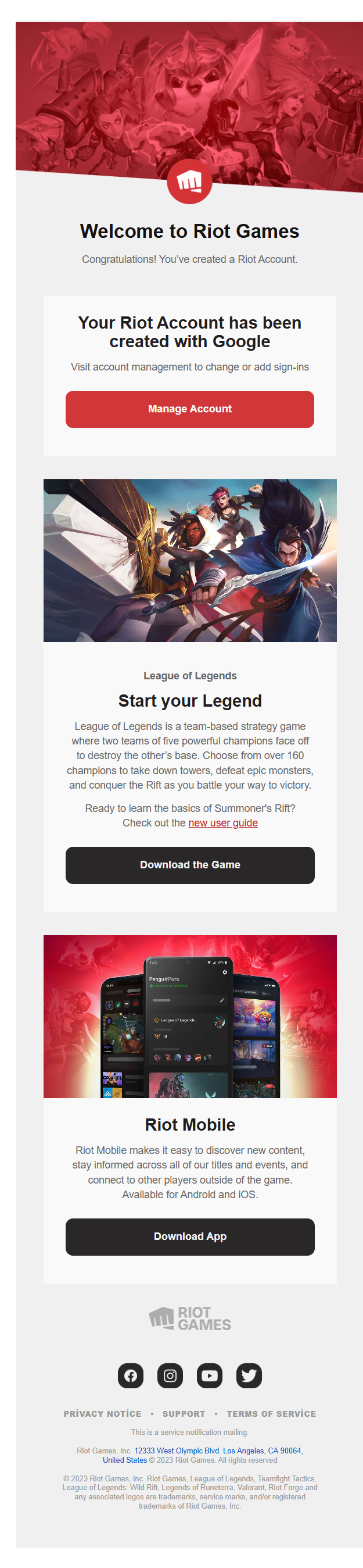
- Visually Striking and On-Brand Design: The email immediately grabs the user's attention with high-quality, dynamic artwork from their flagship game, League of Legends. For a gaming company, selling the fantasy and aesthetic of their world is paramount, and the visuals do this perfectly. The color scheme and layout are clean and consistent with the Riot Games brand identity.
- Clear and Action-Oriented Structure: The email is brilliantly structured into logical, digestible blocks: Account Confirmation, Game Download, and Mobile App Download. This clear hierarchy guides the user's attention sequentially, with each section having a single, unambiguous call-to-action (CTA). The buttons ("Manage Account," "Download the Game") are high-contrast and use direct, simple language.
- Focus on the Core Product: The email wisely prioritizes League of Legends, which is likely the reason a new user created a Riot account in the first place. The "Start your Legend" section provides a concise and exciting description of the game, enticing the user to jump in.
- Excellent Support for New Players: The inclusion of a link to a "new user guide" is a thoughtful and strategically important touch. Games like League of Legends can have a steep learning curve, which is a major drop-off point for new players. By proactively offering a resource to learn the basics, Riot is directly addressing a potential pain point and investing in the user's long-term retention.
- Introduction to the Broader Ecosystem: While focusing on League of Legends, the email also introduces the "Riot Mobile" app. This is a smart way to subtly educate the new user that their Riot Account is a key to a larger universe of games and content, encouraging deeper brand engagement.
Areas for Improvement:
- Lack of Personalization: This is the email's most significant weakness. It doesn't use the recipient's name in the greeting. A simple "Welcome to Riot Games, Umut!" would make the email feel far more personal and less like a generic system notification. Personalized greetings are known to significantly increase user engagement.
- No Dynamic Content: The email assumes the user's primary interest is League of Legends. However, a user might have created their Riot Account to play Valorant, Teamfight Tactics, or another of Riot's titles. A truly exceptional onboarding email would dynamically change its content based on the sign-up source. If a user signed up from the Valorant website, the main section should be about Valorant, not League of Legends. This level of relevance is key to a seamless user journey.
- Missed Community-Building Opportunity: Gaming is an intensely social activity. The email features small social media icons in the footer, but it misses a huge opportunity to actively invite the user into the community. A dedicated section with prominent links to the official Discord server, Twitch channel, or subreddit could immediately connect the new player with other fans, which is a powerful driver of long-term engagement.
- Underwhelming Copy: The copy is clear but could be more exciting and on-brand. For a company that builds epic worlds, the welcome message ("Congratulations! You've created a Riot Account.") is very functional. Using more evocative, game-related language ("Your legend awaits," for example) could create a more immersive and exciting first impression.
Onboarding Email Best Practices
- Define a Clear Goal for Each Email: Each email in your sequence should have one primary objective. Don't try to do everything at once.
- Example: Warmy.io's goal was singular: get the user to connect their mailbox.
- Set Expectations Early: Tell users what they can expect from your emails and how many they'll receive. This builds trust and prevents them from marking you as spam.
- Example: This was a noted improvement area for Sziget Festival. A line like "You'll get 3 emails from us this week with lineup news and travel tips" would have helped.
- Segment Your Audience: Not all users are the same. Tailor your onboarding flow based on how they signed up, their user role, or their expressed interests.
- Example: Riot Games missed an opportunity here. A user signing up for Valorant should get a Valorant-focused email, not a generic one about League of Legends.
- Use the User's Name: This is Personalization 101. It’s a simple but powerful way to make an automated email feel human.
- Example: Warmy.io and Bandsintown did this excellently. Riot Games and TinyMCE did not.
- Counterpoint: Booking.com's use of the last name felt too formal for a consumer brand.
- Leverage Dynamic & Geo-Personalized Content: Go beyond the first name. Use any data you have to make the content hyper-relevant.
- Example: This was the biggest missed opportunity for Bandsintown. Showing local concerts would have been a killer feature. Wizz Air could have shown flights from the user's nearest airport.
- Use Strong, On-Brand Visuals: Your design should immediately communicate your brand's identity and value proposition.
- Example: Sziget Festival used energetic festival photos to sell an experience. Riot Games used game art to immerse the user. Booking.com was critiqued for lacking inspiring travel imagery.
- Prioritize Mobile-Friendliness: A huge percentage of emails are opened on mobile devices. Ensure your design is responsive, with large text and tappable buttons.
- Example: Wizz Air's email was noted for its mobile-friendly, scannable layout.
- Embrace White Space and Scannability: Don't overwhelm users. Use short paragraphs, bullet points, icons, and headings to break up text.
- Example: TinyMCE's email was very text-heavy and could have used more visual spacing and icons to improve scannability.
- Reinforce Your Value Proposition Immediately: Remind the user why they signed up in the first place. What problem do you solve? What desire do you fulfill?
- Example: Amazon Prime's opening paragraph is a masterclass in concisely listing core benefits. Warmy.io could have added a sentence on why connecting a mailbox matters.
- Adopt an Appropriate Tone: Match your language to your brand and audience.
- Example: Sziget Festival used informal, community-focused language ("Hello Szitizen"). TinyMCE used technical, developer-friendly terms ("code snippet," "API key").
- Incorporate Social Proof: Build trust by showing the user they've joined a respected community.
- Example: Bandsintown's "85 million live music lovers" line is perfect. The app download section with star ratings also serves as social proof.
- Have One Primary CTA Per Email: Guide the user to the single most important next step. Avoid multiple competing buttons that cause decision paralysis.
- Example: Bandsintown funneled the user to a single "Let's Go" CTA after educating them. Wizz Air had many CTAs, which risked overwhelming the user.
- Make CTAs Action-Oriented and Visually Prominent: Use verbs and design buttons that stand out from the rest of the email.
- Example: Warmy.io's biggest flaw was the lack of a prominent "Connect Your Mailbox" button. TinyMCE used underwhelming text links instead of buttons.
- Provide a Clear, Guided Path: Break down the onboarding process into simple, sequential steps. This reduces cognitive load and makes the process feel manageable.
- Example: TinyMCE's numbered list and Wizz Air's "So, what next?" section are excellent models for this.
- Offer a Path to Help: Acknowledge that users might get stuck. Provide easy access to help docs, tutorials, or human support.
- Example: Warmy.io's offer to "reply to this email" was a great human touch. TinyMCE provided a link to a "Quick-start guide."
- Be Transparent: Especially for SaaS with trials, be crystal clear about pricing, trial duration, and what happens when it ends.
- Example: TinyMCE and Amazon Prime were praised for their exceptional transparency regarding trial terms and billing.
- Create a Sense of Urgency or Exclusive Value: Encourage immediate action with a time-sensitive offer or an exclusive benefit for new members.
- Example: Booking.com's instant "Genius" status grant provides immediate value. A missed opportunity for Wizz Air was to not include a welcome discount.
- Foster Community & Connection: Introduce users to your broader ecosystem, including social channels, forums, or events.
- Example: Sziget Festival included social media icons. A noted improvement for Riot Games was to more prominently promote their Discord or Twitch communities.