How to Create an HTML Email Line by Line with Code and Logic
Table of contents
- Part 1: The Document Standard (The "Doctype")
- Part 2: The "Head" (Meta Tags & Hacks)
- Part 3: The CSS Reset (Normalization)
- Part 4: The Layout Architecture (Tables on Tables)
- Part 5: Typography & The Outlook MSO Fix
- Part 6: Handling Images (The "Block" Rule)
- Part 7: Hiding Elements (Mobile vs. Desktop)
- Part 8: The Gmail Clipping Fix
- Summary Checklist for Production
Creating a responsive HTML email template is hard, but don’t worry. We’ll get you ready with the fundamentals and the necessary workarounds, leaving the confusion only for the design. We will analyze the code of a beautiful Black Friday email generated by Tabular line by line to understand the “ancient” web standards required to make emails render correctly across Gmail, Outlook, Apple Mail, and Yahoo. This guide moves from the outer shell (the setup) to the inner core (the responsive layout).
Part 1: The Document Standard (The "Doctype")
Unlike modern web pages that use HTML5, robust emails rely on XHTML 1.0 Transitional. This older standard forces the Microsoft Word rendering engine (used by Outlook desktop apps) to behave more predictably.
<!DOCTYPE html PUBLIC "-//W3C//DTD XHTML 1.0 Transitional//EN" "http://www.w3.org/TR/xhtml1/DTD/xhtml1-transitional.dtd">
<html xmlns="http://www.w3.org/1999/xhtml" xmlns:v="urn:schemas-microsoft-com:vml" xmlns:o="urn:schemas-microsoft-com:office:office" lang="en">
The Logic
- xmlns:v (VML): This declares the "Vector Markup Language" namespace. VML is Microsoft's legacy vector graphics format. If you want background images, rounded buttons, or complex shapes to work in Outlook, you must include this.
- xmlns:o (Office): This namespace activates Microsoft Office-specific rendering properties, allowing us to control how Word renders the HTML.
- lang="en": Critical for accessibility. It tells screen readers which language profile to use.
Part 2: The "Head" (Meta Tags & Hacks)
The <head> is where we fight the battles against specific clients like iOS and Windows Phone.
1. The Viewport & Scaling
<meta content="width=device-width" name="viewport" />
<meta name="x-apple-disable-message-reformatting" content="" />- width=device-width: This is the trigger for Responsive Design. It tells the phone, "Do not treat this email like a desktop site; match the width of the screen."
- x-apple-disable-message-reformatting: Apple Mail sometimes tries to "help" by rescaling your font sizes. This tag disables that behavior so your Typography Anatomy remains consistent.
2. The Outlook DPI Workaround (Crucial)
<!--[if mso]>
<xml>
<o:OfficeDocumentSettings>
<o:AllowPNG/>
<o:PixelsPerInch>96</o:PixelsPerInch>
</o:OfficeDocumentSettings>
</xml>
<![endif]-->
The Logic: If a user has their Windows display settings set to 125% magnification (common on high-res laptops), Outlook will stretch your email, breaking the layout. o:PixelsPerInch>96 forces Outlook to ignore the system zoom and render at standard 96 DPI.
Part 3: The CSS Reset (Normalization)
Email clients apply their own messy styles (padding, blue links, etc.). We must aggressively reset them in the <style> block.
The Essential Resets
/* Fix Outlook Table Spacing */
table {
    border-collapse: separate;
    mso-table-lspace: 0pt;
    mso-table-rspace: 0pt;
}

/* Fix Hotmail/Outlook.com Line Heights */
.ExternalClass {
    width: 100%;
    line-height: 100%;
}

/* Prevent iOS Font Resizing */
body, a, li, p, h1, h2, h3 {
    -ms-text-size-adjust: 100%;
    -webkit-text-size-adjust: 100%;
}- border-collapse: separate: While web devs use collapse, in email, separate often renders consistently across newer clients, provided you handle spacing on the <td> level.
- .ExternalClass: This is a class automatically applied by Outlook.com (Hotmail). If you don't force line-height: 100%, your email will look double-spaced.
Part 4: The Layout Architecture (Tables on Tables)
We do not use <div> for layout structure because Outlook does not support it properly. We use HTML Tables.
1. The Master Wrapper
Everything sits inside a centered table with a specific width (usually 600px or 640px).
<body style="background-color:#E8E8E8;">
    <table role="presentation" width="100%" cellpadding="0" cellspacing="0" border="0" align="center">
        <tr>
            <td align="center">
                <!-- Inner Layout Table -->
                <table class="t407" width="640" style="width:640px;">
                    <!-- Content -->
                </table>
            </td>
        </tr>
    </table>
</body>
Key Concept: role="presentation" is mandatory for Accessibility Best Practices. It tells screen readers, "This is a layout table, not a data spreadsheet."
2. The Stacking Grid (The "Responsive" Part)
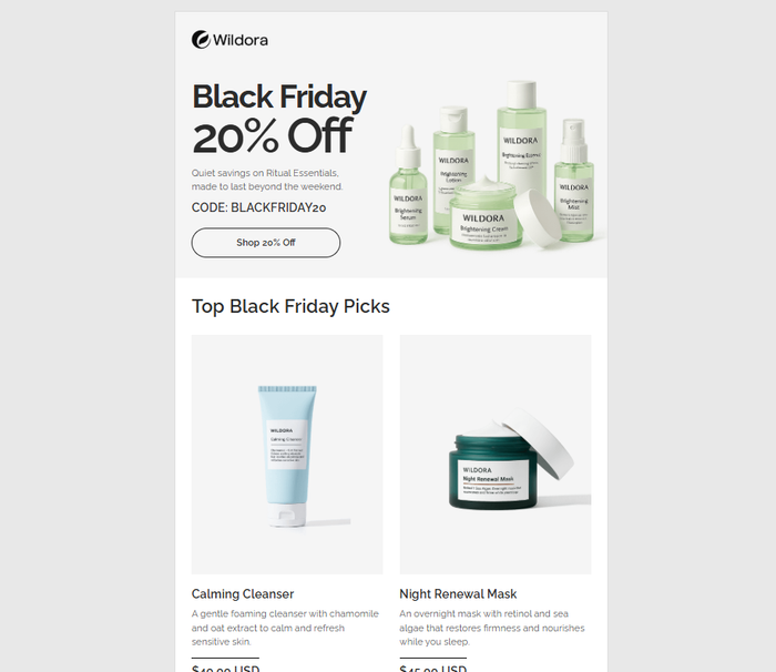
In your example code, look at the "Top Black Friday Picks" section. On desktop, the products are side-by-side. On mobile, they stack vertically.
The Desktop HTML:
We use display: inline-block on the table cells (or nested tables acting as cells) to allow them to sit next to each other.
The Mobile CSS:
Inside the @media (max-width: 480px) query, we force these elements to take up 100% width.
@media (max-width: 480px) {
    /* Target the columns by class ID from your template */
    .t131, .t95 {
        display: block !important; /* Force block to break the line */
        width: 100% !important;    /* Force full width */
        max-width: 100% !important;
    }
}
This transforms a row of 3 products into a vertical stack of 3 products. This is the core principle of Fluid Design.
Part 5: Typography & The Outlook MSO Fix
Your template uses Raleway (a Google Font). However, Outlook does not support web fonts. If you just link it normally, Outlook might default to Times New Roman, which looks unprofessional.
The Fix: MSO Conditional Comments
We hide the web font link from Outlook so it doesn't get confused, and then we define a fallback stack in the CSS.
The HTML:
<!--[if !mso]>-->
<link href="https://fonts.googleapis.com/css2?family=Raleway:wght@400;600;700&display=swap" rel="stylesheet" type="text/css" />
<!--<![endif]-->The CSS Fallback:
font-family: Raleway, BlinkMacSystemFont, 'Segoe UI', Helvetica, Arial, sans-serif;If Raleway fails (Outlook), it falls back to Arial. For help choosing fonts, see Best Fonts for Banners.
Part 6: Handling Images (The "Block" Rule)
<img class="t0" style="display:block; border:0; height:auto; width:100%; Margin:0; max-width:100%;" width="113" src="..." />Why these styles?
- display:block: The most important rule. Without this, Gmail adds a small white gap (approx 3px) below every image, breaking layouts.
- width: 100%; max-width: 100%;: This ensures the image is fluid. It will fill its container but never exceed its natural size.
- border: 0: Prevents blue borders on linked images in older browsers.
- Always include Alt Text for Email Deliverability and accessibility.
Part 7: Hiding Elements (Mobile vs. Desktop)
Sometimes you need a different image for mobile (vertical) vs desktop (horizontal). Your template uses utility classes .hm and .hd.
The CSS Logic:
/* Standard CSS */
@media (min-width: 481px) {
    .hd { display: none !important } /* Hide Desktop-specific elements on large screens if needed, or vice versa */
}

@media (max-width: 480px) {
    .hm { display: none !important } /* Hide Mobile-specific elements on small screens */
    .hd { display: block !important } /* Show the Desktop alternative if needed */
}
Note: ".hm" likely stands for "Hide Mobile" and .hd for "Hide Desktop".
This technique of creating different classes allows you to swap a large banner for a square one on phones.
Part 8: The Gmail Clipping Fix
At the very bottom the your code, you will see this strange div:
<div class="gmail-fix" style="display: none; white-space: nowrap; font: 15px courier; line-height: 0;"> </div>The Logic:
- Prevent Clipping: If an email is too short (in file size) or lacks content, Gmail sometimes behaves oddly. However, the main reason for clipping is if the file size exceeds 102KB.
- Layout Preservation: This long string of non-breaking spaces forces the email body to be at least a certain width. This prevents the layout from collapsing in the iOS Mail app if the content is too narrow.
Summary Checklist for Production
- Check Links: Are your specific UTMs and formatting variables working? See Variables and Dynamic Content.
- Test Responsiveness: Did the 3-column product row stack to 1-column on mobile?
- Send a Test: Use a tool or send to a real device. See Sending Test Emails.
- If this coding process seems too manual or error-prone, modern teams use builders like Tabular to generate this exact code automatically. You can start with their Free HTML Email Templates to skip the manual coding phase.