Accessibility Best Practices in Email Design
Many marketing professionals see email as the most effective marketing channel, and more than 70% of brands choose email to connect with their customers and users, according to 2025 email marketing statistics. While the look is important, it is not the only factor of good email design; accessibility also plays a crucial role
The content of your email should be clear, descriptive, and understandable for users; even for those with disabilities.
While you may think some marketing practices like capitalizing for capturing attention might be a good idea, using all caps wherever possible to enhance reading visibility is certainly not an accessibility best practice in email design. This is because our brains recognize words partly by their overall shape (ascenders like "b/d/h" and descenders like "g/p/q" create unique silhouettes), and ALL CAPS eliminates these distinctive shapes, making every word a uniform rectangle. This particularly affects users with dyslexia, low vision, cognitive disabilities, or visual processing disorders.
Before creating email templates, you should thoroughly learn email design best practices, like using semantic HTML elements, providing alt text for images, using clear language, ensuring color contrast and visibility for color-blind users and choosing fonts that are clear and supportive across language-specific special characters.
But don’t worry; we’ll go through each email design best practice for accessibility one by one and explain everything in detail later on.
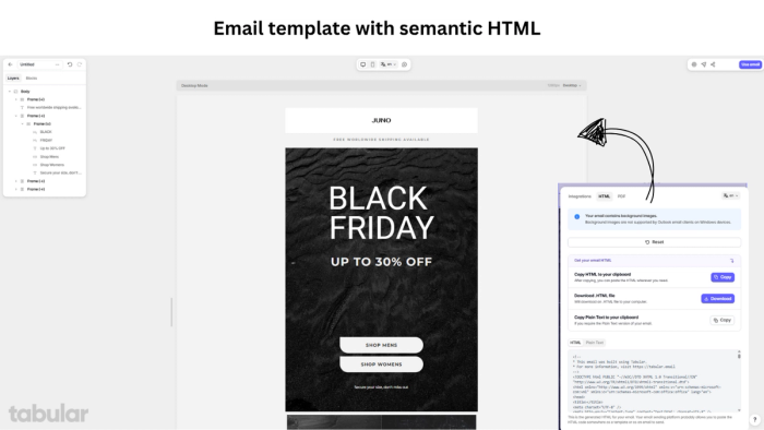
But before you move forward, I’m taking a second to introduce Tabular’s free Email Builder that allows you to create accessible, beautiful, and high-converting HTML email templates without having to write a single line of code. You can create professional email templates in seconds using the modules in the Tabular's email editor, or customize one of the free HTML email templates offered by Tabular.
Why not check out Tabular’s free account right now?
Key Best Practices for Accessible Email Design
Beyond legal compliance (ADA, WCAG), accessible emails increase engagement by 30%, reduce unsubscribes, and demonstrate brand inclusivity. To create accessible emails, focus on making your content understandable and navigable for all users, considering individuals with a spectrum of disabilities.
1. Plain Language
15% of adults have low literacy or are struggling with some cognitive disabilities. Clear language increases comprehension by 47% and makes your emails understandable for everyone. Using short sentences, active voice, and avoiding jargon is the most effective approach.
Avoid using marketing practices like all caps or wordplay. Instead, use proper grammar, common vocabulary, understandable sentences, and sentence case for accessible email designs.
2. Semantic HTML
Screen readers and ISPs rely on HTML structure. Using proper headings and other semantic HTML tags improves navigation efficiency by 70%. Use <h1> for main titles, <h2>/<h3> for sections, <p> for paragraphs, and <ul>/<ol> for lists. Create a logical reading order for both sighted users and screen readers.
3. Sufficient Color Contrast
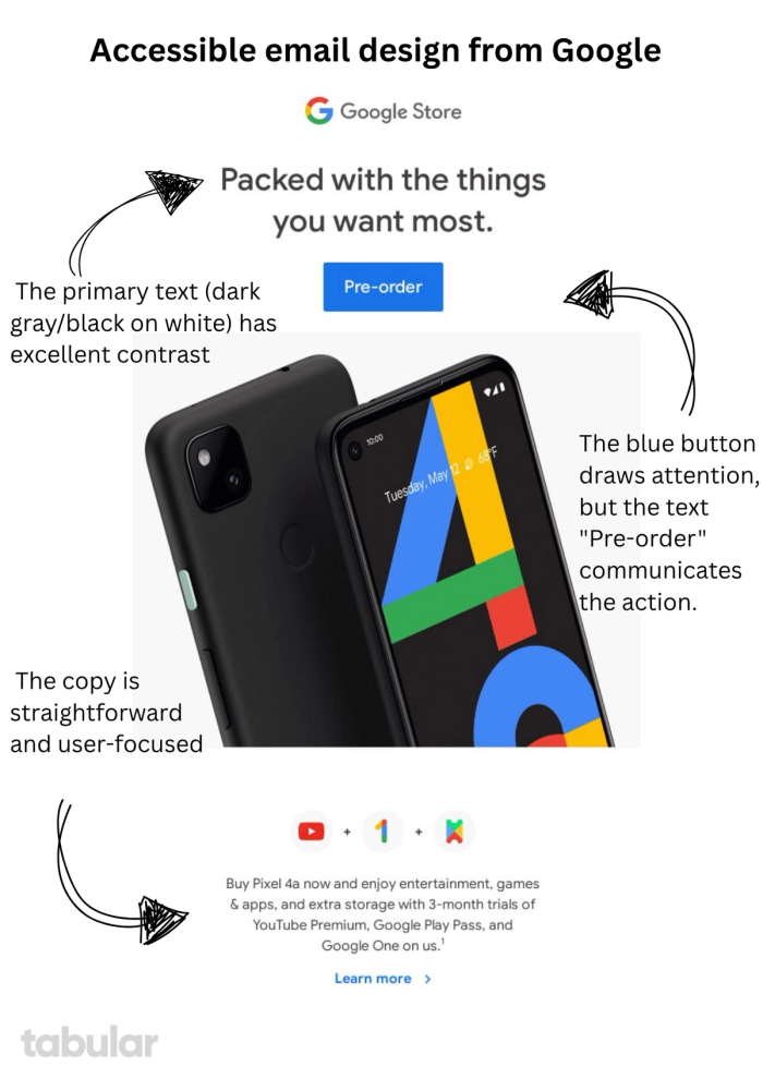
Adequate color contrast is critical for users with low vision, color blindness (1 in 12 men), or age-related vision loss. It also benefits everyone in low-light environments, such as mobile users outdoors. Use a minimum 4.5:1 contrast ratio for body text (≤18pt) as per WCAG 2.1 AA standards. For large text (≥18pt or ≥14pt bold), a minimum contrast ratio of 3:1 is acceptable.
4. Choose Readable Fonts
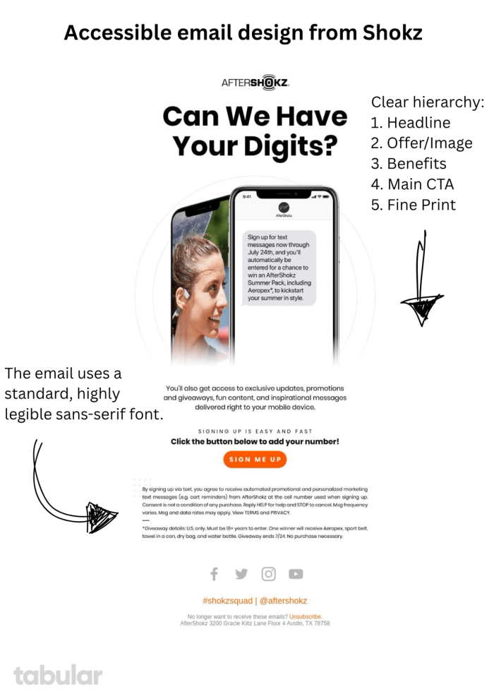
Choosing readable fonts for headers and body content is crucial in email design. Around 26% of U.S. adults have some form of vision impairment, and dyslexic users process sans-serif fonts 35% faster. Avoid script fonts (e.g., Brush Script) and monospaced fonts. Opt for accessible, clean fonts like Arial or Helvetica, which have clearer type anatomy. Use sentence case as using all caps reduces reading speed by 20% and is not an accessibility best practice.
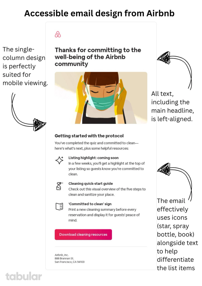
5. Left-Align Text
Justified or centered text creates irregular spacing patterns ("rivers") that make it harder for readers to track line starts. Left-aligned text reduces reading errors by 32% compared to centered alignment. It also provides visual consistency, reduces cognitive load, and supports assistive technologies. Only center short headlines (six words or fewer), and never justify body text in emails.
6. Use Clear and Descriptive Link Text
72% of screen reader users navigate by links. Generic link text forces cognitive guessing. Link anchors like “Click here” violate WCAG 2.4.4 (Link Purpose in Context). Descriptive anchors build trust through transparency and help users understand the purpose of the link at a glance.
7. Make it Responsive
23% of users with disabilities rely on mobile-only access. Non-responsive emails see 42% lower engagement. You can create accessible, responsive HTML emails easily by using Tabular’s drag-and-drop email editor.
8. Organize Content Logically
According to Miller’s Law, working memory can process only 4 ± 1 chunks of information at a time. Emails with a clear visual hierarchy support this limit and lead to 47% faster decision-making. Group content logically and structure it for easy scanning.
9. Avoid Using Color Alone as a Semantic Indicator
Using color psychology in email design can be a strong marketing technique, but emails should remain understandable even without color. Around 42% of users experience screen glare in sunlight, and 100% of screen readers ignore color semantics. Design your emails so they are meaningful through structure, icons, and text—not color alone.
10. Use a Clear Subject Line
The subject line is one of the most important parts of an email. Choosing the right subject line for sales or promotional emails can be a delicate balance—it must capture attention without triggering spam filters. For better accessibility and performance in your marketing campaigns, always use clear and direct subject lines.
11. Designing for Physical Interaction Diversity
Touchscreen interaction errors increase by 300% for users with motor disabilities. Designing CTA buttons and links with adequate size, spacing, and tappable areas helps people with limited dexterity take actions more easily. Ensure buttons are at least 44x44 pixels and spaced far enough apart to avoid accidental taps.
Final Words: Design with Empathy, Reach Everyone
Creating accessible emails isn't just about checking compliance boxes or avoiding legal risk; it's about fundamental respect and inclusion.
Using clear language, semantic structure, smart typography, thoughtful color use, and logical design can easily transform your emails from mere marketing messages into genuinely inclusive communication tools.
And what would be the result? Stronger engagement, deeper trust, and a brand that demonstrates its values through action.
- Avoid mere marketing tricks like using all caps to grab attention as using all caps in your email can harm the accessibility of your email design.
- Avoid using generic link text like "Learn More," as this provides no context for screen reader users who navigate by jumping from one link to the next.
- Ensure high color contrast between text and its background for all elements, as low-contrast text is often unreadable for people with low vision or color blindness.
- Structure your content with proper semantic HTML (e.g., <h1>, <p>), as this creates a logical document outline that allows screen reader users to navigate efficiently.
- Design large, well-spaced buttons and links, as this makes them easy-to-tap targets for users with motor impairments or anyone using a small touchscreen.
The relationship between your brand and your users is special, and accessible emails are one of the many ways to show that.
You can create accessible email template designs with Tabular's drag-and-drop Email Builder in seconds. Show your customers and users how much you care with simple yet meaningful actions.