Email Header Design Tips That Will Make Your Templates Unforgettable
We’ve all heard the saying: don’t judge a book by its cover. However, in today’s visually driven world, we often prioritize aesthetic harmony and visual appeal when viewing content online. In this case of email marketing, the email header serves as the cover of your email body. In today's article, you'll learn how to build email templates with the best email header examples and best practices.
You may have crafted the most informative or compelling campaign email for your target audience. But if it’s not presented in a visually appealing way, your readers might overlook it. The header might be the most important part among the three major sections of an email template. Therefore, using a well-designed, effective email header is crucial for successful email marketing.
Since the first thing your readers will notice is the header of your email, you need to put as much effort into it as you do into the body of the email. In this article, we will focus on designing unforgettable email headers and achieving visual harmony. Let’s dive into how to create effective email header designs.
Key Elements of Effective Email Header Design
Designing an effective email header can be tricky when you have so many options. However, when you learn about the best way to make eye-catching designs, you can enjoy the click-through rates.
But we understand that designing email templates on your own requires a lot of effort and expertise. Tabular is a drag and drop email builder with cutting-edge technology that creates email templates that look beautiful in every device. Click below to try one of our free email templates!
Create your template using our email template builder.
Visual Appeal and Branding
Brand identity on a visual level can be considered as a showcase for your brand. Your logo, font, color selection, and imagery can define the brand's priorities and identity. So, it would be right to say that having a harmonious design in the overall brand can be appealing to the readers. This consistency helps build trust and familiarity for the readers. Therefore, while trying creative email header image examples, you can use the matching colors from your logo or website. Colors are not only important for consistency; color psychology in email marketing is a whole other subject. After all, all you need is to evoke the right emotion.

For example, using bold colors may provoke certain emotions while also creating a visual hierarchy that navigates the reader's attention to the most essential components. Similarly, selecting the correct typefaces may improve readability and compliment the overall design, but great imagery can offer context and appeal, increasing the email's engagement.
To match your brand website, logo, or color, you can try different email header design ideas with Tabular's drag and drop email builder.
Functional and Clear Layout
The readability of your email significantly influences how much time your reader will spend on it. Since the header is the first thing they see, your design choices will guide their attention. A well-structured email layout will naturally lead readers to a navigation menu.

For example, you can define empty spaces and white areas in your email headers design. Using sufficient whitespace creates breathing room and helps the header stand out within the entire email. Additionally, consider selecting the most readable fonts.
Finding the best font for your email header design is as crucial as other elements.
When you find a font and color palette that align with your brand, designing an attention grabbing CTA becomes almost the whole game.
For the best email headers, use design elements that serve your functional needs.
Responsive Design
In email marketing, the metrics differ from those of trending social media ads. Since emails are accessed on various devices, such as computers, tablets, and phones, it’s crucial to create responsive email header examples.
Create your template using our email template builder.
Optimizing for different devices is essential in today’s digital age to ensure a seamless experience for your readers.
The technology we use is engineered to work seamlessly with every device and major email service provider. Plus, Tabular is an email builder with direct integrations to ZeptoMail, Mailchimp, HubSpot, and more.
To determine if your designs are good email headers, you can test your templates. Online email template tools, Tabular, offer options to preview your designs on both mobile and computer screens.
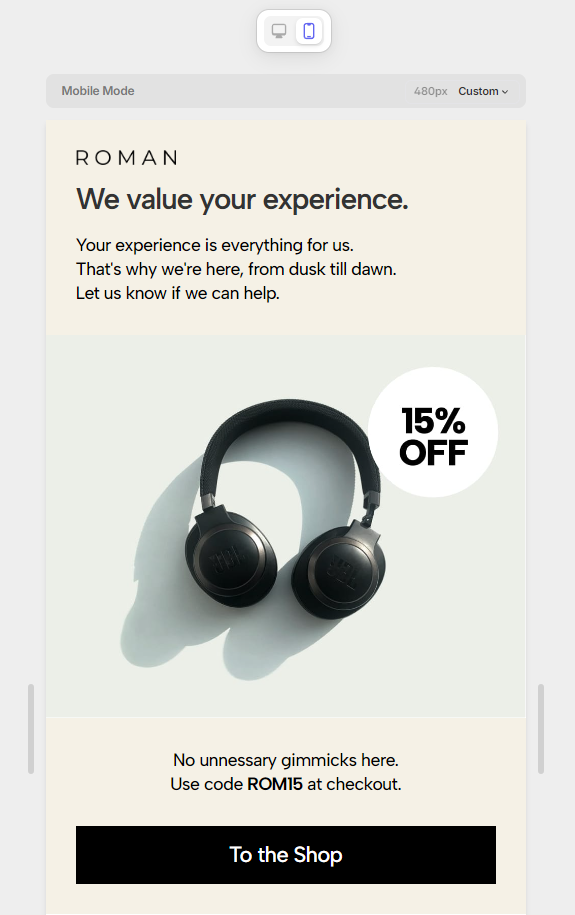
When working with responsive design templates, consider how the email template categories are received. Ensure that the header fits the phone screen when the email is first opened. Additionally, you can use different font sizes and types to establish hierarchy and harmony. You may check our blog post about email template UI design to find user-friendly design tips.
Email headers may be made more engaging and readable by designers by using these concepts and tools to create headers that are aesthetically pleasing and responsive across various devices.
Common Mistakes in Email Header Design
We have used explanations and visual examples to give tips on how to design your email header. When designing formal email header templates, you should consider both the do’s and do not’s. Thus, we should also discuss common mistakes to avoid.
Overloading with Information
We have emphasized the importance of keeping your design clear for readability. Therefore, the first thing to avoid is overdesigning the email template. While you might want to include many elements in your email header design ideas, remember the minimalist principle: less is more.
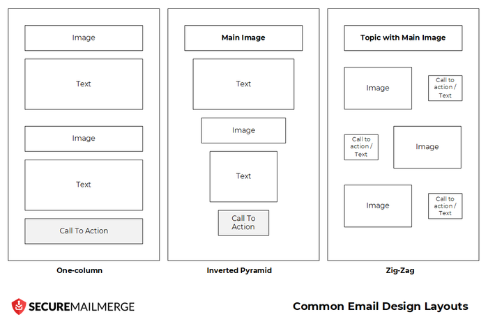
Even if you only use simple design elements such as basic shapes, font types, and simple coloring, you can avoid cluttered header designs.
Headers filled with numerous components, various fonts, and gradient colors can become difficult to read. Since your readers should grasp the message at a glance, keeping the design as simple as possible is crucial.
Font choice and wording are also important considerations. Overloading information, using long sentences, and complex text structures can overwhelm readers. For email header best practices, you can rephrase lengthy sentences and create concise messages. If you want your email headers to be aesthetically pleasing and simple to comprehend, testing your designs is crucial to determine if they are overloaded or not.
Ignoring Brand Consistency
Consistency in brand visuals builds trust and familiarity for readers. For example, if a reader consistently sees the same color palette in every email design, they will become accustomed to it and immediately recognize your brand's campaigns when they see those colors. Therefore, using color psychology in email templates with a consistent design helps customers identify your brand.
Of course, you can use different colors for various types of emails. For instance, you might use different hues for cancellation, informative, or approval emails.

Utilizing colors helps your readers track the type of information your email provides. Moreover, keeping consistent design elements can create a professional email header.
You can also maintain brand consistency by using different font types. Analyzing the font anatomy on your website or logo can help you select a consistent font style. Consider maintaining similar decorative lines or letter thicknesses to maintain a cohesive font type throughout your communications through business email header designs.
How to Create an Email Header
So far we have discussed the ideal ways to design your email header template. Let's now explore the steps to creating a well-constructed, responsive, and clear email header design.
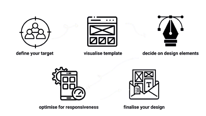
This systematic approach not only builds trust but also allows for creative exploration within a structured framework, that is leading to more effective and impactful email header designs.
Steps to Design an Email Header
Having discussed various design elements, we understand that this can be overwhelming for a first-time designer. Now, we can take a systematic approach to the step-by-step guide.
- Define Your Target Reader
Understanding your target audience is crucial when shaping your template. The design elements, wording, and overall structure should align with your intended purpose. For instance, if your target audience is an older generation, you may prioritize readability and clarity.
- Visualize A Template
To find how to make an email header, you must first create a rough sketch of the design elements you want to place. You can use wireframes to visualize the layout and placement of elements such as logos, navigation menus, and promotional text.
- Decide on the Design Elements
We have discussed how to create harmony, familiarity, and clarity. To guide your audience effectively, it's crucial to select design elements that reflect your brand identity and maintain consistency.
For example, incorporating call-to-action (CTA) buttons in the header area can drive sales or clicks, ensuring engagement with your audience.
- Optimize for Responsiveness
Ensure the header design is responsive and looks good on various devices such as computers, tablets, and mobile phones. Test the design across different screen sizes to ensure it fits well and maintains its visual appeal.
- Finalize Your Design
After testing for optimization and readability, finalize your design. Conduct A/B tests for email header design examples on call-to-action metrics to refine your template and ensure effectiveness. Verify that all links and interactive elements function correctly before implementation.
Now we know how overwhelming it may sound. Designing professional emails that convert, and knowing how to code them to be adaptable to email service providers like Gmail and Outlook. But don't worry, Tabular is here for you. With Tabular email builder, you can leave the boring details to us and focus on the emotions you want to evoke with your brand. What are you waiting for? Try one of our free email templates!
Create your template using our email template builder.
Tools and Resources
Design trends are constantly evolving, and when creating an email header example, using the right tools and resources can simplify the process. Professional email headers often involve the use of professional-grade software and online tools, whether on a computer or accessed online. This approach helps maintain organization and clarity in design.
Email headers are typically crafted using software and online tools that offer features like customizable layouts, image editing capabilities, and responsiveness.
These tools empower designers to create visually appealing headers that adapt well across different devices, including smartphones and computers. Additionally, leveraging pre-designed email templates can save time and ensure consistency across campaigns.
Tabular is an email building service that offers you everything. With our technology, you don't need to worry about integrating your email templates with major email service providers or responsive design. And it's free to try!
As email template designers continue to innovate and adapt new design trends, learning these tools and resources becomes increasingly important. This not only meets the aesthetic standards of an ideal email banner design but also effectively engages with audiences.
This dual focus on visual appeal and audience engagement ensures that email headers not only look impressive but also serve their intended purpose of capturing attention and driving meaningful interactions with readers.
Recommended Tools and Resources for Email Template Design
Figma
Figma is a web-based design tool that allows real-time collaboration. This means that multiple designers can work on the same project simultaneously, which is ideal for big companies or agencies.
Features:
- Multiple users can edit the same file at once.
- Create interactive prototypes with animations.
- Manage and share design assets and styles.
- Enhanced functionality with a wide range of plugins.
How to use Figma with Tabular:
- Create interactive prototypes to visualize how the email will function.
- Export design assets (e.g., images, icons) to be used in Tabular.
Tabular
Tabular is a drag-and-drop email builder with cutting-edge technology for creating email templates that look beautiful and are compatible with major email service providers.
Features:
- Easily create email templates without coding.
- Make sure your emails look great on all devices using Tabular's responsive email builder.
- Directly integrate with your email services like ZeptoMail, Mailchimp, HubSpot, and many more.
- Utilize an extensive library of free templates to get started quickly.
Mailchimp
Mailchimp is a comprehensive marketing automation platform designed to help businesses manage and communicate with their audience effectively.
Features:
- Get detailed insights into your email campaign's performance.
- Set up automated email sequences based on user behavior.
How to use Mailchimp with Tabular:
- Directly integrate Tabular into your Mailchimp account.
- Use your email templates to reach out to your clients and customers.
- Utilize Mailchimp's automation and analytics tools to make your campaign more effective.
Conclusion
Designing the best email headers involves integrating various critical considerations.
It's essential to carefully weigh all the criteria during the design process. Visual appeal plays a pivotal role not only in capturing attention but also in reinforcing brand identity through thoughtful use of colors, fonts, and imagery.
A functional layout is key to organizing elements logically, navigating the reader's attention, and improving overall functionality.
Establishing responsiveness across different devices, including desktops and mobile phones, is crucial and requires thorough testing.
Additionally, avoiding common pitfalls like overdesigning or cluttered layouts is essential to ensure the header effectively communicates a clear and impactful message at first glance. We hope you were able to find beneficial tips and tricks for your email banner designs.
We know how valuable your time and brand are to you. Tabular offers you the time and recognition you deserve with its easy to use html email generator.