Stop Letting Bad Image to Text Ratios in Email Design Ruin Your Performance
Table of contents
- Things to Know About User Experience When Designing Emails with Visuals
- Email Template Examples with an Excellent Image-to-Text Ratio
- Ratios for Different Email Types with Logic
- Image-to-Text Ratio in Email Design: Best Practices
- Common Misconceptions About Image-to-Text Ratio When Designing Emails
- Key Takeaways
- Final Summary & Action Plan
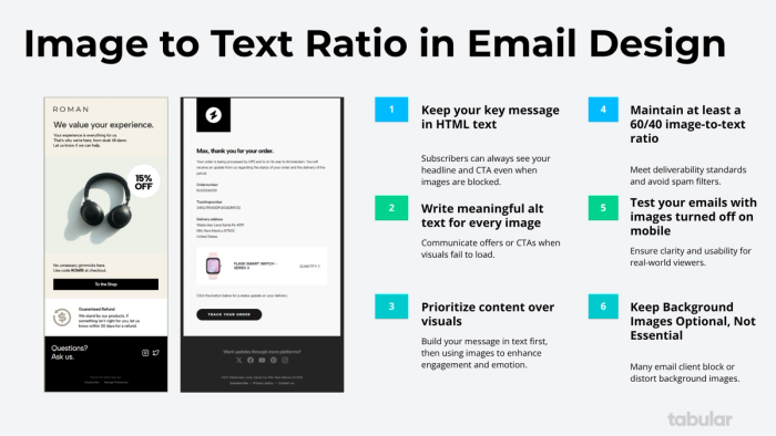
Image-to-text balance is not just important for deliverability, it’s also essential if you want your emails to function properly. There are different best practices for image-to-text proportions across various types of HTML emails.
The 60/40 rule is the most widely accepted one, as SpamAssassin, one of the most commonly used spam-detection systems, recognizes it as a general threshold. However, if you want to create professional email templates, there’s much more to consider. Transactional emails, newsletters, and welcome emails all serve different purposes and therefore require different design approaches and content balances.
Understanding the underlying logic behind image-to-text ratios in HTML emails and using them effectively in your email design is a must for achieving both visual appeal and optimal deliverability.
The 60/40 rule is a fundamental principle in email design and marketing that dictates the ideal balance between visual content (images) and textual content (copy) in an email.
- 60% Visual: This refers to images, graphics, icons, and GIFs. Their primary role is to capture attention, create an emotional connection, showcase products, and break up large blocks of text to improve scannability.
- 40% Text: This refers to the written content of your email. This includes headlines, body copy, value propositions, calls-to-action (CTAs), and disclaimers. Its role is to deliver your message, provide context, persuade the reader, and drive action.
However, the rule is not just about literal space on the screen. It's a guideline for creating a harmonious and effective user experience.
The Deeper "Why": Is 60/40 Rule in Email Design Just for Aesthetics?
Short answer: no, it's not. Slightly longer answer: yes, there are spam filters that check this ratio, but today the only major one is SpamAssassin. The filter exists for a reason, it provides the best possible balance for humans to interact with marketing emails.
- Spam Filter Avoidance: This is the most critical technical reason. Email clients like Gmail, Outlook, and Yahoo use sophisticated algorithms to filter spam. One of the red flags for these filters is an email that is image-heavy with very little text. If your email is just one big image, it's highly likely to be flagged as spam or sent directly to the Promotions/Junk folder. Having a healthy amount of text (around 40%) provides enough "meat" for spam filters to analyze and confirm your email is legitimate.
- Accessibility: Not all users can see images. Some people disable images by default for speed or privacy, while others rely on screen readers due to visual impairments. If your entire message is contained within an image, these users will see nothing but a series of broken image alt-text or blank spaces. Text is always rendered and can be read by screen readers, ensuring your message is accessible to everyone.
- User Experience (UX): A wall of text is intimidating and difficult to read. A block of images with no context is confusing. The 60/40 split creates a rhythm that is easy for the eye to follow. Images grab attention, and text provides the necessary details, guiding the reader smoothly toward your email CTA.
- Load Time: Image-heavy emails can load slowly, especially on mobile devices or slower connections. If a subscriber gets impatient and your email hasn't loaded, they will delete it. Balancing with text ensures the core message is visible almost instantly.
Things to Know About User Experience When Designing Emails with Visuals
- Image Blocking: ~45% of emails are opened with images off by default. If your entire message is an image, these users see nothing but a blank box with a red "X."
- Accessibility: Screen readers for visually impaired users can't read text embedded in images.
- Load Times: Heavy images take longer to load, especially on mobile data.
Email Template Examples with an Excellent Image-to-Text Ratio
Email 1: The Transactional Email
This "Forgot your password?" email is primarily functional, a common characteristic of transactional emails which are sent in response to a user's action.
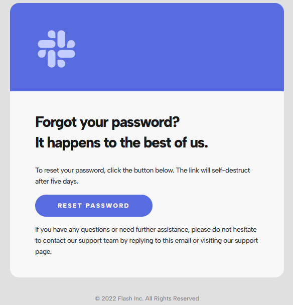
Clear and Concise Messaging: The purpose of the email is immediately clear from the headline. The text is short and to the point.
Prominent Call-to-Action (CTA): The "RESET PASSWORD" button is visually distinct, making it easy for the user to take the necessary action. A clear CTA is crucial in transactional emails to guide the user.
Minimalist Design: The clean and simple layout focuses the user's attention on the primary message without distractions.
Email 2: The Newsletter Email
This Newsletter email template is a typical example of content marketing, designed to engage subscribers with valuable content and build brand authority.
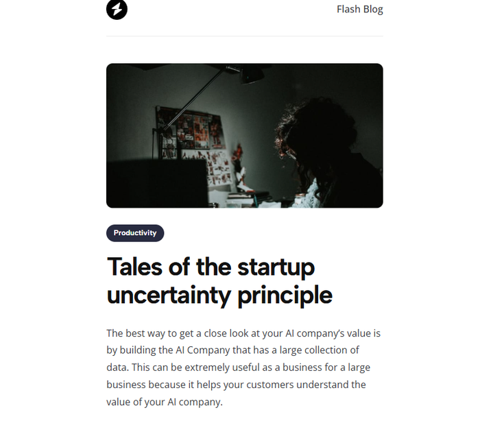
Engaging Headline: The title is the first thing that users see, immediately capturing attention.
Compelling Visuals: The header image is relevant to the topic, providing a visual summary and helping the reader to draw in.
Clear CTA: The "Read this story" button is a clear and direct call-to-action, prompting the user to engage further with the content.
Unsubscribe Option: Providing a clear unsubscribe link is a legal requirement and a best practice for maintaining a healthy email list.
Email 3: The E-commerce Email
This marketing email is a promotional email aimed at driving sales for an e-commerce brand.

Strong Visual Appeal: The email uses high-quality, aspirational imagery to create a wintery mood and entice the user.
Clear Product Showcase: Products are clearly displayed with their names, making it easy for users to see what's on offer.
Multiple CTAs: The email includes a general "SHOP THE GIFT GUIDE" CTA as well as specific "SHOP FOR HIKERS" buttons, providing multiple opportunities for the user to convert.
Themed Content: The "Winter Gift Guide" theme is relevant and timely, making the promotional content feel more like helpful curation.
Ratios for Different Email Types with Logic
- For transactional emails such as receipts or password resets, the recommended ratio is 95% text to 5% image. This works because the content is critical and expected, consisting almost entirely of information. A logo is usually the only image needed, which builds high trust and ensures high deliverability.
- For newsletters, a 70% text to 30% image ratio is recommended. The primary value comes from the written content, while images serve to enhance and break up the text rather than replace it. This approach helps build reader loyalty.
- For marketing or promotional emails, the suggested ratio is 60% text to 40% image, or sometimes 50/50. This balances visual appeal with deliverability, using compelling copy—headlines, benefits, and features—supported by strong product visuals.
- For B2B and lead nurturing emails, a 70% text to 30% image ratio is ideal. The focus is on building trust and providing value through information. These emails are less "salesy" and more "helpful," with a headshot and a logo often being sufficient.
- An advanced concept to keep in mind is that it’s not just about the quantity of text, but also its quality and relevance. For example, an email with 30% relevant text like "Your Q4 Report is Ready, John" is more effective than one with 60% irrelevant text or "lorem ipsum."
Image-to-Text Ratio in Email Design: Best Practices
1. Use Real HTML Text for Critical Content
- ❌ Don't: Put your email headline, main offer, or call-to-action button text inside an image.
- ✅ Do: Code all primary messaging as HTML text. This ensures it's always visible and can be indexed by email clients.
2. Alt Text is Important
- What it is: The descriptive text that appears when an image doesn't load.
- Practical Use: Don't just write "product image." Describe it and include your CTA: *"Blue running shoes - 50% off this week. Shop Now."*
- Pro Tip: For decorative images, use
alt=""(empty alt text) to keep the email clean for screen readers.
3. Build Your CTAs with HTML Buttons
- Why: HTML buttons in in emails load instantly, are always clickable, and work with image blocking.
- Bonus: They are easier to make mobile-responsive than image-based buttons.
4. Deliverability: The Direct Consequences
Here’s what happens when you ignore image-to-text ratios:
- Direct Spam Filter Trigger: ESPs like Gmail and Yahoo have explicit filters for emails that are too image-heavy. Your email may go straight to spam.
- The Engagement Death Spiral:
- Poor Ratio → Image-Heavy Email → Images Blocked → User sees nothing → User doesn't engage (no opens, no clicks).
- Low engagement tells ISPs your emails are unwanted.
- Future emails (even well-designed ones) get routed to the Promotions tab or spam folder.
- Inbox Placement Issues: Even if you don't hit spam, a poor ratio is a negative signal that can keep you out of the Primary Tab and locked in the Promotions Tab forever.
Common Misconceptions About Image-to-Text Ratio When Designing Emails
- Misconception 1: "60/40 is a strict, literal measurement."
- Reality: The 60/40 rule is a guideline, not a rigid law. You don't need to break out a ruler and measure pixels. The core principle is balance. An email that is 70% text and 30% image can be perfectly fine if it's well-designed and accessible. The problem arises when you approach 90%/10% in either direction. Think of it as "enough text to keep you out of spam and serve your audience, and enough imagery to be engaging."
- Misconception 2: "The text ratio includes the footer and boilerplate."
- Reality: When considering the 60/40 rule for spam filtering, the algorithms are smart enough to focus on the primary content of your email. While your footer text (address, unsubscribe link) does contribute, stuffing your footer with paragraphs of useless text to "game" the system won't help if the main body of your email is just a single image. The meaningful, engaging copy in the header and body is what truly matters.
- Misconception 3: "I can just put all my text in an image."
- Reality: This is one of the biggest and most costly mistakes.
- Accessibility Failure: Screen readers cannot read text embedded in an image unless you use perfect alt text for every single text element, which is impractical.
- Spam Filter Trigger: Spam filters cannot read text inside images. To them, it's still just an image.
- Poor Rendering: Text in images doesn't scale well on different screen sizes, can become pixelated, and won't be selectable or searchable by the user.
- Load Time: A large image with lots of text detail will have a large file size, slowing down the email load time.
- Misconception 4: "This rule is outdated because of modern HTML and CSS."
- Reality: While modern email design allows for more complex layouts with HTML and CSS, the core principles behind the 60/40 rule are timeless.
- Spam filters are still active and still penalize image-only emails.
- Accessibility is more important than ever and is a legal requirement in many regions.
- User psychology hasn't changed: People still respond better to a balanced mix of visuals, email ui, and well-written copy.
Key Takeaways
- Think Balance: Aim for a harmonious mix of images and text. Don't let one dominate the other completely.
- Always Use Alt Text: For every image you use, write descriptive alt text. This helps with accessibility and provides context if images are blocked.
- Text for CTAs is Crucial: Your primary call-to-action should always be live text, preferably in a styled button. Never rely on a CTA written inside a graphic.
- Test, Test, Test: Always send yourself a test email and disable images. Can you still understand the core message and take the desired action? If not, you need more text.
Final Summary & Action Plan
- Aim for at least 40% HTML text in every email as a safety net.
- Prioritize your key message and CTA as live text, never embed them in an image.
- Before sending, always view your email with images turned off. If it's unreadable, go back and fix it.
- Remember the goal: Deliverability and clarity always trump pure aesthetics.