How to Design Transactional Emails That Build Trust
Transactional emails are non-promotional communications sent to individuals based on their specific actions (e.g., purchasing, signing up, requesting a reset). Unlike marketing emails, transactional emails offers extraordinarily high engagement rates (often 6x higher CTRs) because the user is actively expecting the content.
Transactional emails are also great for building customer trust and increasing the reliability of your brand. Every interaction with your users reflects your brand’s authority — even something as simple as a password reset. Without further ado, let’s look at how to design a transactional email template with free downloadable examples.
Branding and Cognitive Load
Users rely on familiar visual cues (logos, brand colors) to quickly validate the email's authenticity. If the logo is wrong, or the design is inconsistent, the user’s threat perception increases, leading them to abandon the email or flag it as phishing.
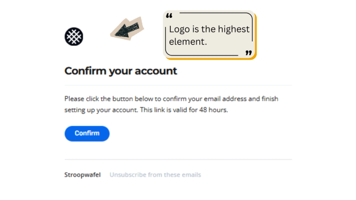
Logo Dominance
The brand logo must be the highest element in the header. It acts as an anchor of trust. Placing it centrally aligns with standard reading patterns and is accepted as a best practice for email template ui.
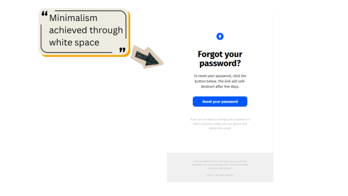
Minimalist Layout
Transactional emails must minimize cognitive load. Use copious white space and a single-column structure (ideally 600px wide for desktop/mobile compatibility).
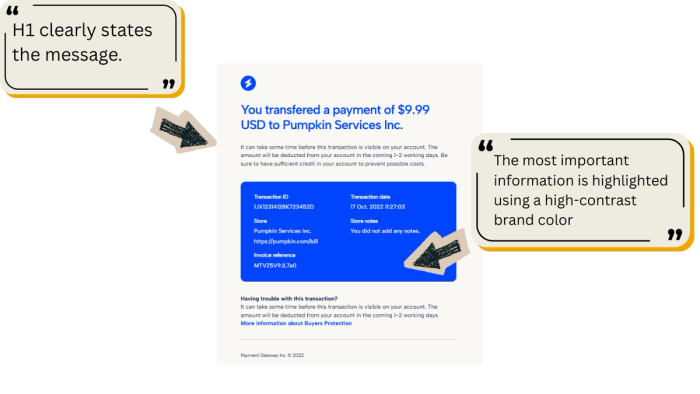
These emails utilize white space perfectly, directing the eye immediately to the H1 and the blue CTA button.
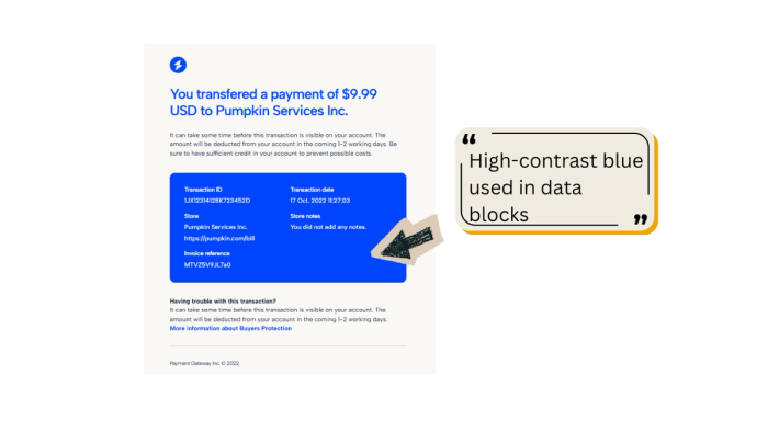
Both email templates uses a distinct blue lightning for key areas, which correlates with the high-contrast blue used in their CTAs and data blocks.
Branding Consistency
Brand colors should be used selectively—primarily for the logo and the Call-to-Action (CTA). All other elements (text, background) should remain neutral.
Content Hierarchy and Visual Salience
Clarity is the way to go if you want to create professional email templates. Users should be able to scan the email using the F-pattern (reading top to bottom, focusing on bolded headings) and immediately grasp the required action.
The closer a user feels to completing their goal (confirming an account, resetting a password), the faster they act. A clear hierarchy guides them to the endpoint (the CTA) with minimal friction.
The heading must explicitly state the purpose. Ambiguity increases processing time and frustration. Use large, bold font sizes (24pt+) to ensure visual salience.
Body text must be direct and action-oriented. Avoid jargon. The goal is to quickly validate the action.
For emails containing multiple data points (financials, security logs), visually isolate the critical data from the instructional text. Use high-contrast color blocks.
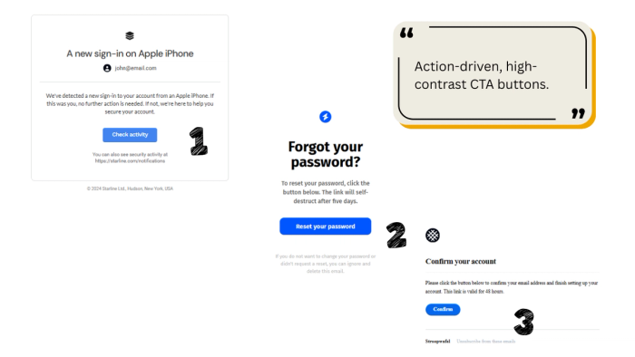
The Call-to-Action (CTA)
Studies consistently show that buttons that contrast highly with the email background and are sufficiently large for mobile touch targets (minimum 44px high) generate higher CTRs. Poorly sized buttons are a major failure point, given that over 50% of emails are opened on mobile.
The CTA button must be the single most dominant non-text element in the email. Use your primary brand color to draw the eye instantly.
Button copy must use strong verbs that describe the resulting action. Avoid vague phrasing.
Ensure sufficient vertical padding between the instructional text, the button, and the footer content. The CTA of the email should feel isolated and deliberate.
Security, Validity, and Recourse
Account-related emails (resets, confirmations, alerts) require built-in mechanisms to manage user anxiety and prevent phishing exploitation.
By explicitly outlining security risks and providing immediate recourse, the brand demonstrates accountability, which reinforces trust. Additionally, setting a deadline taps into the Urgency Principle, compelling immediate action.
Always include an expiration timeframe for security links. This protects the user if the email is intercepted late.
Links valid for shorter periods (24–48 hours) are perceived as more secure than those valid for weeks.
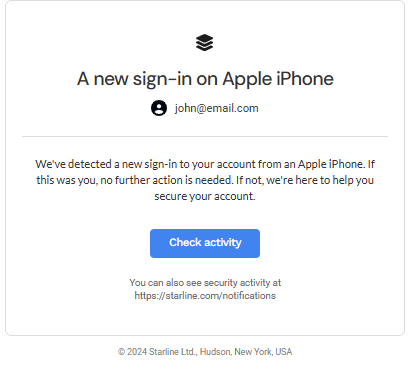
In security-sensitive emails, explicitly tell the user what to do if they did not request the action (i.e., ignore and delete).
If the email is about a financial transaction, provide links to dispute resolution or buyer protection policies.
For alerts, provide a direct, branded link where users can review all past security events, consolidating the user’s defense dashboard.
Footer Compliance and Transparency
The footer serves regulatory and transparency needs. It must be present but visually subordinate to the main content.
Regulations like CAN-SPAM (US) and GDPR (EU) require specific identification and contact information in all commercial emails, even transactional ones.
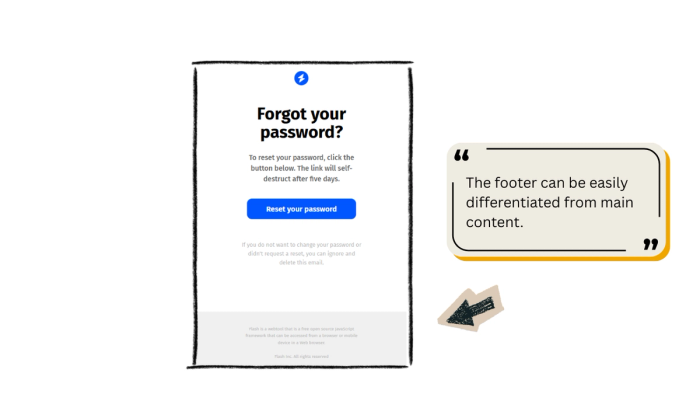
The footer should be visually separated from the main content using a horizontal line, a lighter font color (often light gray), and a smaller font size.
Include the legal company name, copyright date, and physical address (or link to legal documentation).
True transactional emails (receipts, password resets) are legally exempt from requiring an unsubscribe link. However, account confirmations (like Template 1) are often considered "soft transactional" and should include one to maintain good sender reputation.
Sometimes helpful to include technical notes or links to the web version, especially if the email relies on dynamic formatting.