10 Free Newsletter Templates That Actually Look Good (and Free)
Table of contents
- 1. The Simple Newsletter Email
- 2. Blog Email Newsletter Template
- 3. Seasonal Sale Newsletter
- 4. The "Popular Content" Newsletter
- 5. Feature Update Newsletter with Video
- 6. Travel Blog Email Newsletter Template
- 7. Modern Card Layout Newsletter
- 8. Product Launch Newsletter Template
- 9. Trending Posts Newsletter
- 10. Blog Post Promo Email Newsletter
You know that feeling when you sit down to write an email update, open a blank document, and the cursor just blinks at you? It’s mocking you. Honestly, it happens to the best of us. We all want to send something that looks professional and slick, but let's be real—most of us aren't graphic designers.
You might have tried to hack together a layout using newsletter templates in Google Docs, hoping it would translate well to an email inbox. But usually? It ends up looking a bit... clunky. The alignment breaks on mobile, or the images just don't sit right. If you want to grab attention in a crowded inbox, you need a layout that flows naturally and responds to the device it's being viewed on.
That’s where these examples come in. We’ve pulled together a list of stunning, versatile html email templates you can customize right now using Tabular.
Whether you are looking for newsletter ideas for a tech startup, a nonprofit newsletter layout, or a sleek product showcase, we’ve got you covered.
And here’s the best part: You don't need to know how to code. You can customize these email newsletter templates, export them as HTML or PDF, and they are ready to go.
Let's look at 10 newsletter templates that will make you look like a pro.
1. The Simple Newsletter Email
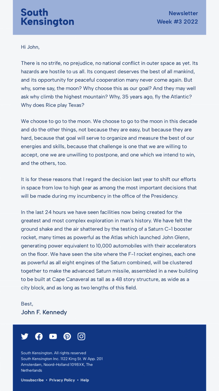
This is a classic. It strips away the noise and focuses entirely on the message. You’ll notice it mimics a traditional letter format but with a clean, digital polish. It feels personal, like a one-on-one conversation rather than a mass marketing blast. In a world where our inboxes are stuffed with flashing gifs and loud banners, sometimes the most radical thing you can do is just write a letter.
This layout leverages a concept often discussed in the HTML vs plain text email debate: it gives you the deliverability benefits of text with the tracking capabilities of HTML. It uses a calming blue header to establish branding, but the rest is pure readability.
Why it’s a good template
It builds trust. By removing heavy graphics and sidebars, the reader focuses purely on your voice. It’s perfect for storytelling or high-level company updates where the text is the star of the show. The typography hierarchy—using a serif font for the body—makes it easy to scan and pleasant to read for long periods.
Strong Sides
- Minimalist Design: No distractions, just pure content.
- High Readability: The serif font choice mimics high-quality print journalism.
- Personal Feel: Feels like a direct note from a founder or editor.
- Mobile Friendly: Because it is text-based, it stacks perfectly on any phone screen.
Who can use this template
- CEOs sending monthly updates or "thoughts from the founder."
- Writers sharing essays, personal stories, or Substack-style content.
- Brands that value a direct, no-nonsense email writing format.
- Nonprofits making a serious appeal for support.
2. Blog Email Newsletter Template
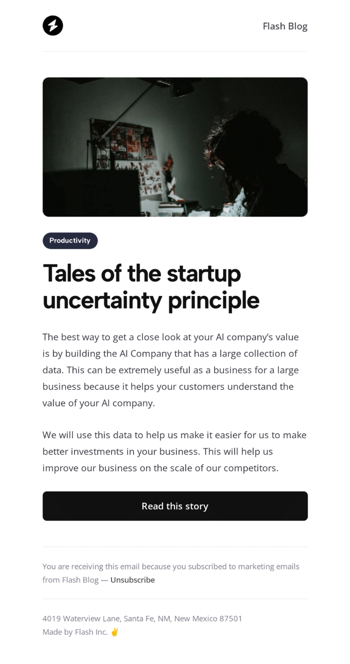
When you create email newsletter campaigns, you have to consider the environment the user is in, this template uses a high-contrast theme that makes the text pop and gives off a modern, tech-savvy vibe. It’s designed specifically to tease a blog post, giving just enough info to earn that click.
Why it’s a good template
It’s easy on the eyes and feels premium. The layout guides the eye from the hero image straight down to the "Read this story" button. It’s a great example of how newsletter design best practices can influence click-through rates by reducing visual friction.
Strong Sides
- Visual Impact: Minimalist design makes the text and the banner pop up.
- Focused CTA: One clear goal—get the reader to the blog.
- Modern Aesthetic: Appeals to tech and creative audiences who prefer minimalist look.
- Space Usage: It uses negative space to frame the content.
Who can use this template
- Tech startups sharing product stories or SaaS content marketing pieces.
- Bloggers promoting their latest long-read.
- Creative agencies showcasing portfolio work.
- Developers and coding bootcamps.
3. Seasonal Sale Newsletter
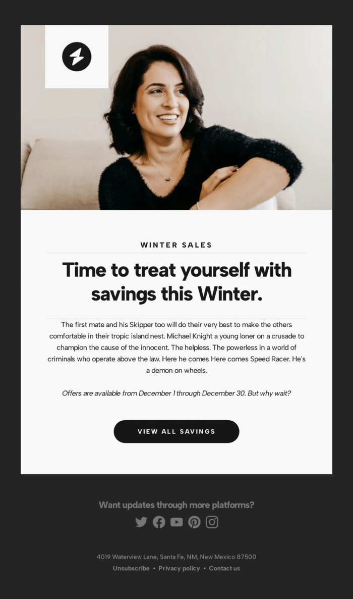
This template balances lifestyle imagery with a clear sales offer. It features a warm, inviting photo of a woman smiling, followed by a bold headline: "Time to treat yourself with savings this Winter." The button clearly sets expectations with "VIEW ALL SAVINGS".
It solves a common problem in ecommerce email templates: how to be promotional without being aggressive. The top image sets a cozy mood before the offer is introduced.
Why it’s a good template
It creates an emotional connection. You aren't just selling a product; you're selling a feeling (comfort and happiness). The "Z-pattern" layout (Image -> Headline -> Button) naturally leads the eye to the action you want the user to take.
Strong Sides
- Emotional Hook: Uses imagery to set a seasonal tone.
- Clear Hierarchy: Headline, body text, and button are perfectly aligned.
- Specific CTA: "View All Savings" tells the user exactly what happens next.
Who can use this template
- Fashion and apparel brands.
- Lifestyle stores running seasonal promotions.
- Subscription boxes announcing winter themes.
4. The "Popular Content" Newsletter
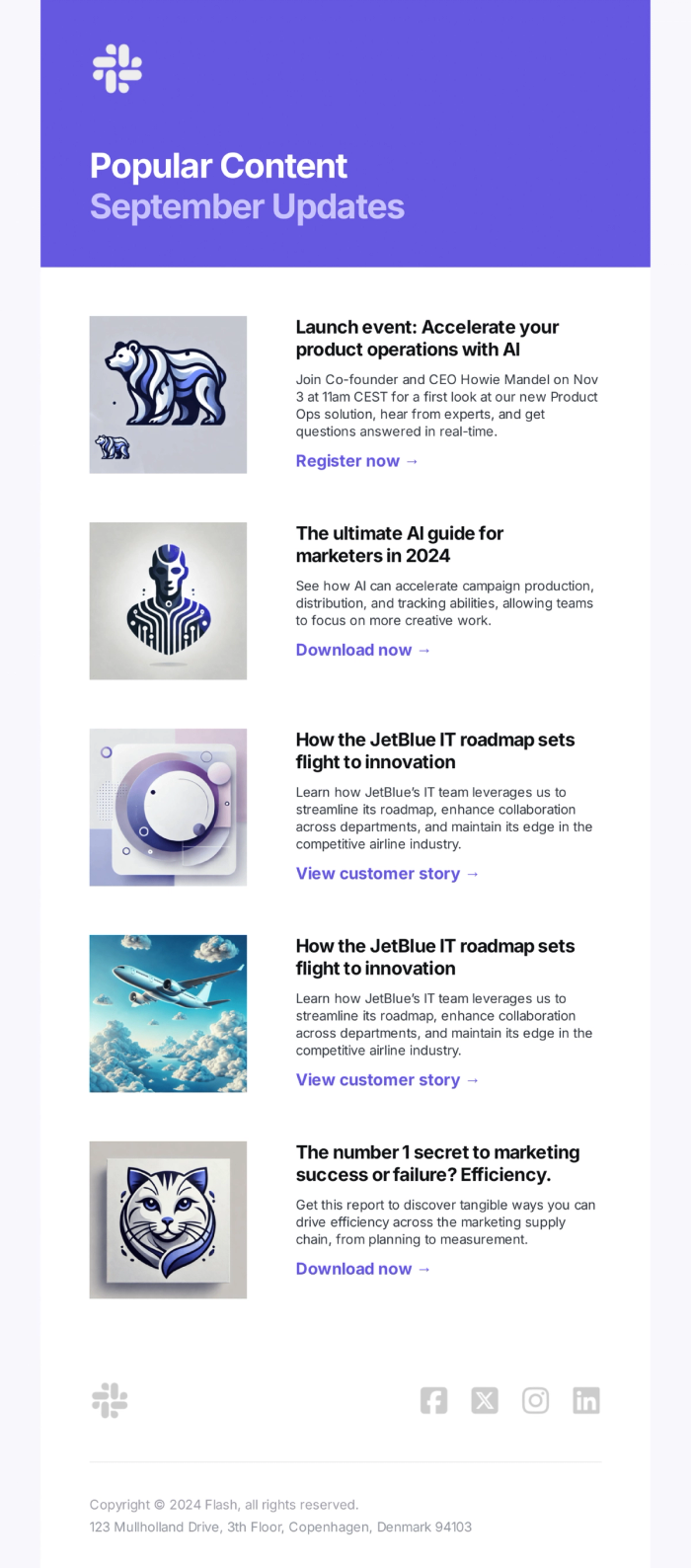
Ever wonder how to share multiple updates without overwhelming your reader? This is the answer. The list format with small thumbnails allows you to pack a lot of value into a single email. It’s efficient and respectful of the reader’s time.
This utilizes modular design principles. You can stack as many or as few of these content blocks as you need. It’s the "Swiss Army Knife" of newsletter templates.
Why it’s a good template
It offers choice. Not every subscriber cares about every topic. By providing a menu of options—some product news, a guide, a customer story—you increase the odds that they'll click on something. It keeps your unsubscribe rate low because there is usually something for everyone.
Strong Sides
- Scannability: Readers can quickly find what interests them.
- Content Variety: Great for mixing video, blogs, and product news.
- Consistent Layout: The repeating pattern creates a nice rhythm.
- High Click Potential: Multiple entry points to your website.
Who can use this template
- Publishers and media companies sending weekly digests.
- SaaS companies sending product updates.
- Marketers curating industry news.
- HR departments sending internal company newsletters.
5. Feature Update Newsletter with Video
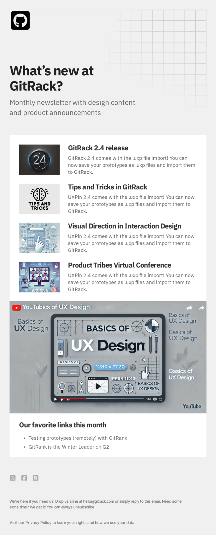
When you release a new feature or product update, you need clarity above all else. This template uses a structured grid system (the background grid graphic is a nice touch) to organize technical information. It allows for a main announcement followed by smaller "tips and tricks."
It mimics the look of a google newsletter template or a technical doc but with much better styling options. The layout is disciplined—it tells the reader, "This is important information, and we have organized it logically for you."
Why it’s a good template
It looks authoritative. The structure suggests that the information is trustworthy and organized. If you work in software, using SaaS email templates like this helps break down complex release notes into digestible chunks. The video embed placeholder is also a smart addition, as video often explains features better than text.
Strong Sides
- Professional Layout: Clean lines and organized sections build authority.
- Multimedia Friendly: The large central block is perfect for video thumbnails.
- Sectioned Content: Separates major releases from minor updates effectively.
- Brand Consistency: Easy to swap logos and brand colors while keeping the structure.
Who can use this template
- Software (SaaS) companies.
- Product managers sharing changelogs.
- IT departments sending internal updates.
- Online course creators releasing new modules.
6. Travel Blog Email Newsletter Template
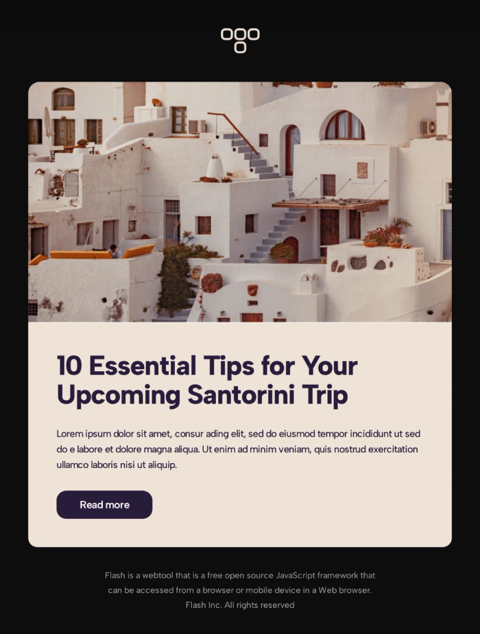
Sometimes, the photo is the message. This template leans heavily on a massive, beautiful hero image to transport the reader instantly. It’s simple, elegant, and lets the visuals do the heavy lifting before getting to the tips.
In email design, we talk about "showing, not telling." This template embodies that. The warm, beige background complements the photography, creating a cohesive aesthetic that feels like a warm breeze.
Why it’s a good template
It inspires desire. The background color reduces eye strain and feels organic, avoiding the sterile look of pure white backgrounds. The headline "10 Essential Tips" promises immediate value, hooking the reader after the image has grabbed their attention.
Strong Sides
- Immersive Visuals: Large image area grabs immediate attention.
- Soft Color Palette: The beige tones feel premium and organic.
- Direct Headline: Promises a listicle format, which is high-converting.
- Short & Sweet: It doesn't ramble; it points directly to the content.
Who can use this template
- Travel agencies and tour operators.
- Lifestyle influencers and bloggers.
- Hospitality brands (hotels, resorts).
- Real estate email marketing.
7. Modern Card Layout Newsletter
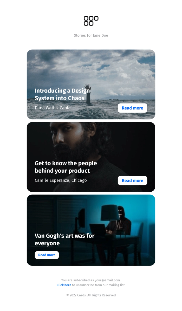
This layout is incredibly trendy right now. It uses a "card" system where each story is its own self-contained module with a background image and text overlay. It feels like scrolling through a high-end digital magazine or a social media feed.
It moves away from the standard "image-top, text-bottom" structure and overlays the text directly on the image. This saves vertical space and looks dramatic.
Why it’s a good template
It’s highly engaging. The text-over-image style is bold. It separates different stories visually, so the reader doesn't get bored. If you want to elevate your design game and move past a basic free newsletter template, this card-based approach is a great way to do it.
Strong Sides
- Modern UI: Mimics app and web design trends.
- Distinct Sections: Each story stands alone clearly.
- High Contrast: White text on dark images guarantees readability (if images are chosen well).
- Storytelling Focus: Puts the headline front and center.
Who can use this template
- Digital publications and magazines.
- Design firms showcasing case studies.
- Design blogs with high image to text ratio.
- Fashion brands featuring lookbooks.
8. Product Launch Newsletter Template
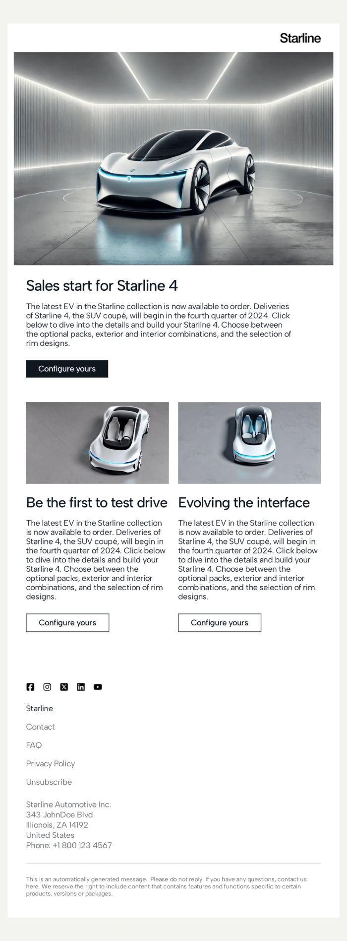
Sleek, futuristic, and clean. This template is all about the hero product. With a white background and precise product photography, it feels like walking into a high-end showroom. The dual-column section at the bottom allows for highlighting specific details without clutter.
This is a masterclass in using "negative space" (white space). By not crowding the product with too much text, the product looks more expensive.
Why it’s a good template
It builds hype. The "Configure yours" button is a strong, specific call to action that invites interaction. This is a prime example of promotional email templates done right—it doesn't just show the product; it invites you to customize and own it.
Strong Sides
- Showroom Feel: Clean whitespace puts the focus on the product.
- Interactive CTA: Encourages the user to take a specific, engaging action.
- Detail Oriented: Secondary images allow for close-ups or feature highlights.
- Scalable: Works for one product or a whole collection.
Who can use this template
- Automotive brands.
- High-end consumer electronics (phones, laptops).
- Luxury goods retailers.
- Furniture designers.
9. Trending Posts Newsletter
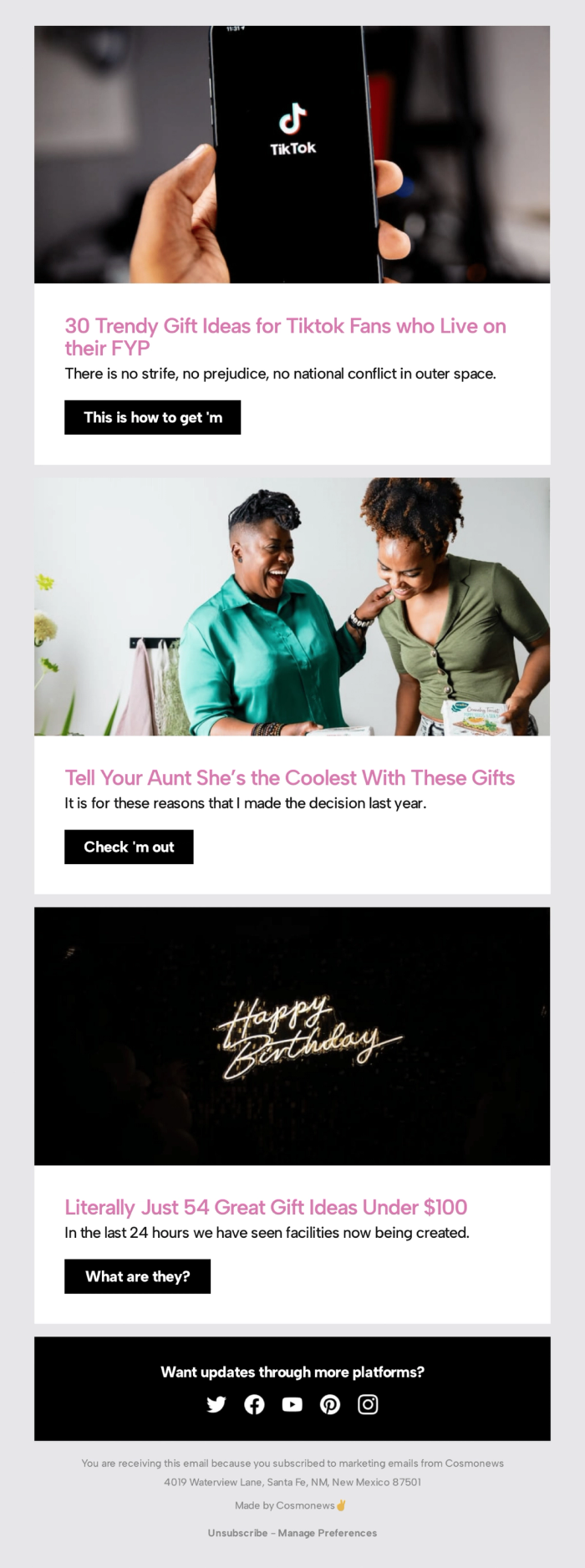
This is a fun, energetic layout perfect for listicles. It uses three distinct colorful sections (pink, light green, black). Each section has a playful headline ("Tell Your Aunt She’s the Coolest") and a casual button prompt ("This is how to get 'm", "Check 'm out", "What are they?").
Why it’s a good template
It’s digestible. Long lists can be boring, but this format breaks them up visually with color blocks. It’s perfect for B2C email marketing where the goal is to entertain while selling. The casual button copy ("Check 'm out") feels authentic to the TikTok generation.
Strong Sides
- Playful Layout: The varied background colors keep it from looking monotonous.
- Casual Tone: The copy on the buttons feels human and fun.
- Clear Segmentation: Easy to categorize different types of gift ideas.
Who can use this template
- Ecommerce stores creating holiday gift guides.
- Lifestyle bloggers recommending products.
- Brands targeting Gen Z.
10. Blog Post Promo Email Newsletter
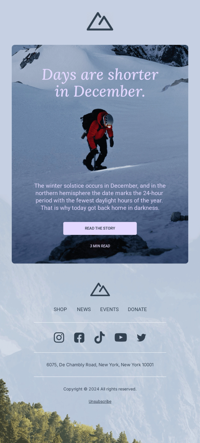
This template breaks the standard "box" rule of email design. Instead of stacking images and text separately, it uses a stunning, full-height background image as the canvas for the entire message. The text ("Days are shorter in December") and the call-to-action button float directly on top of the visual.
Technically, this is a bold move. Many people are afraid to create email newsletter layouts with background images because of coding complexity, but this template handles it perfectly. It turns an email into a digital poster.
Why it’s a good template
It provides total immersion. Because there are no white borders or sidebars, the reader is immediately dropped into the atmosphere of the photo (in this case, a snowy, challenging climb). It grabs attention by looking unlike anything else in the inbox. It’s effective because it uses emotion analysis—setting the mood instantly before the reader even processes the words.
Strong Sides
- Cinematic Feel: The edge-to-edge background image creates a premium, magazine-cover aesthetic.
- Focus: By centering the text on the image, it forces the reader to look exactly where you want them to.
- Simplicity: It avoids clutter. There is just one message and one feeling.
- Versatility: While used here for a nonprofit newsletter, it works for any brand that relies on strong photography.
Who can use this template
- Charities and Nonprofits running emotional appeals.
- Outdoor and Adventure brands.
- Event organizers sending "Save the Date" cards.
- Photographers showcasing a hero shot.
Final Words
You don't need to be a coding wizard to send emails that look like they cost thousands to design. Whether you're running a free newsletter template for your local club or managing a massive corporate list, the layout does half the work for you.
All of these templates are available in Tabular. You can tweak the colors, swap the images, and make them your own in minutes. And since you can export them as HTML, they'll work with whatever email tool you're already using—much better than struggling with a static google newsletter template.
So, which one fits your vibe?