
Elements of a Newsletter: The Complete Guide to What Makes One Work
Table of contents
- Why Newsletter Structure Is More Than a Design Decision
- Part 1: Before the Email Even Opens — Pre-Send Elements
- Part 2: The Visual Anatomy of an Email Newsletter
- Part 3: The Inverted Pyramid — A Framework for Every Section
- Part 4: Design Principles That Hold It All Together
- Part 5: The 3/2/1 Newsletter Format
- Part 6: Accessibility — The Element Most Newsletters Skip
- Part 7: What Makes Content Actually Good
- Part 8: Newsletter Elements at a Glance — Reference Table
- Frequently Asked Questions
- Building It All: Where Tabular Fits In
- Conclusion
Key Takeaways
- A newsletter has two layers: pre-open elements (subject line, preheader, sender name) and in-body elements (header, content, CTAs, footer). Both must be optimized.
- The inverted pyramid model is the most effective structural framework — lead with what matters most, then support it, then close with a single action.
- Strong newsletters follow a 90/10 content-to-promotion ratio: mostly value, minimally commercial.
- Mobile optimization is non-negotiable — more than half of all emails are opened on mobile devices.
- Clear, logical structure doesn't just improve readability — it directly impacts open rates, click-through rates, and long-term subscriber retention.
Why Newsletter Structure Is More Than a Design Decision
Most people think about newsletter design as an aesthetic exercise — pick some colors, drop in a logo, write a headline. But structure is actually a strategic tool. The way you arrange elements of your newsletter determines where eyes land first, what actions readers take, and whether they stay subscribed for the next issue.
Email is one of the few channels where you own the relationship with your audience. Email marketing consistently outperforms social media in both reach and ROI, and newsletters sit at the heart of that — building trust, educating subscribers, and moving people closer to conversion over time.
But that only works when the newsletter itself is built correctly.
This guide breaks down every component of a well-structured newsletter — from the subject line a reader sees before opening, to the unsubscribe link they should always be able to find — and explains what each element does, why it matters, and how to get it right.
Part 1: Before the Email Even Opens — Pre-Send Elements
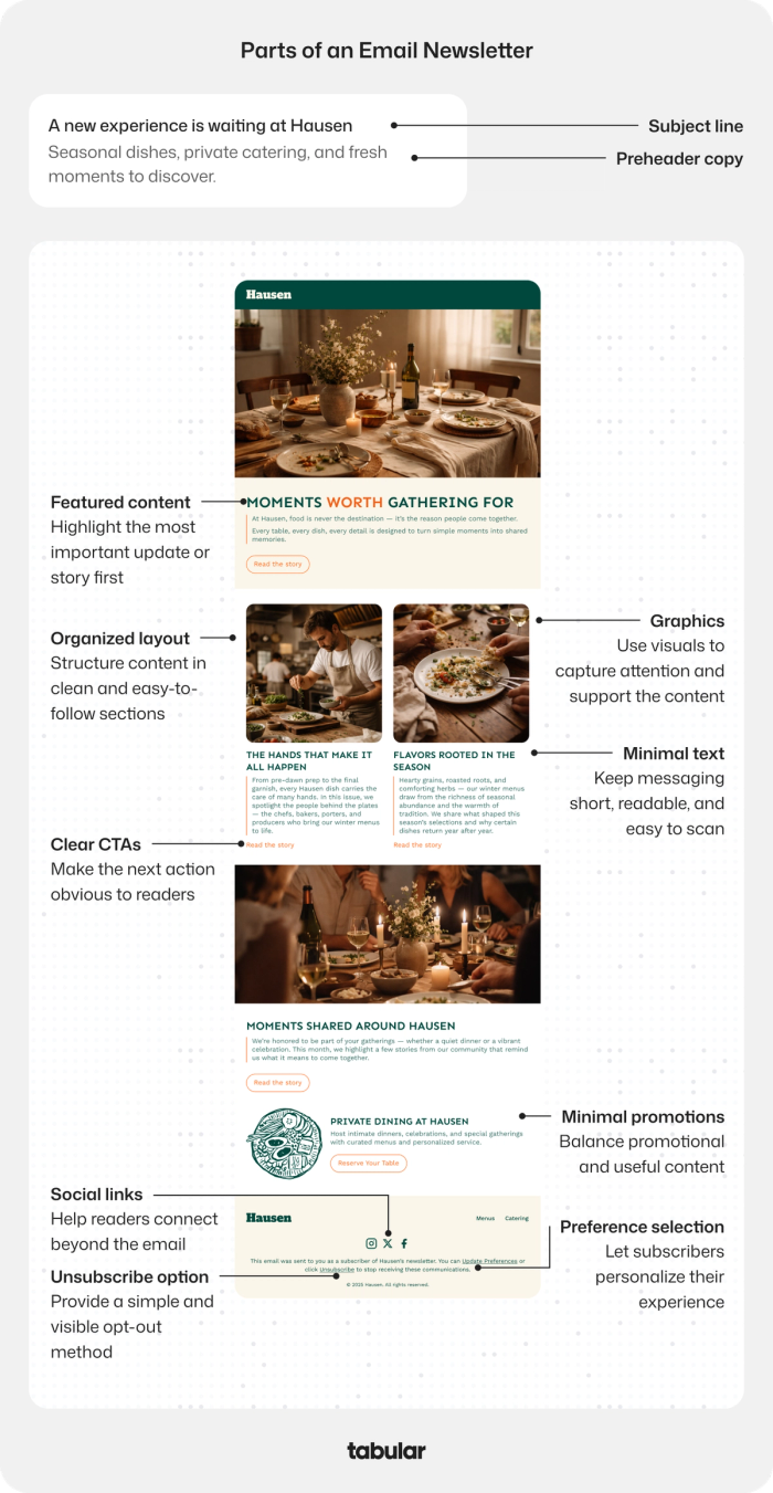
These three elements exist outside the email body, but they determine whether the email gets opened at all. They're the most overlooked newsletter components and often the most consequential.
1. The Sender Name (From Field)
The sender name is the first thing a subscriber sees in their inbox — before the subject line. It establishes trust instantly. A recognizable sender name ("Maria from Tabular" or "The Tabular Team") consistently outperforms a generic company name or a no-reply address.
Keep it human and consistent. If subscribers don't recognize who's writing to them, they'll either ignore the email or report it as spam — neither is good for deliverability.
2. The Subject Line
The subject line is the headline of your newsletter. It's the primary factor in whether someone opens your email or skips past it. A strong subject line does one of several things: it sparks curiosity, makes a specific promise, references something timely and relevant, or poses a question the reader wants answered.
What makes a subject line work:
- Keeps it under 50 characters (so it doesn't get cut off on mobile)
- Speaks to a specific benefit or emotion, not just a topic
- Avoids spam trigger words like "FREE!!!" or excessive punctuation
- Uses the reader's name or situation when relevant (personalization lifts open rates)
- Feels like it was written for a person, not a database
One test: read your subject line out loud. If it sounds like something you'd actually text a colleague, it's probably working.
3. The Preheader Text
The preheader (sometimes called preview text) appears right after the subject line in most email clients. It's the second sentence of your pitch, and it has enormous untapped potential. Many brands leave this blank — which causes email clients to pull random text from the email body instead, often something technical or nonsensical.
Treat the preheader as an extension of your subject line. If the subject line asks the question, the preheader can hint at the answer. If the subject creates intrigue, the preheader can deepen it. Aim for 80–100 characters.
Subject line: "Your Q2 email strategy is missing something" Preheader: "Here's the one section most newsletters skip entirely"
Together, these two lines should create enough pull that skipping the email feels like a mistake.
Part 2: The Visual Anatomy of an Email Newsletter
Once the email is opened, the reader encounters your layout. This is where design and content strategy converge. A well-organized newsletter guides the reader from top to bottom with minimal friction, presenting the most important content first and progressively narrowing toward a single action.
4. The Header and Banner
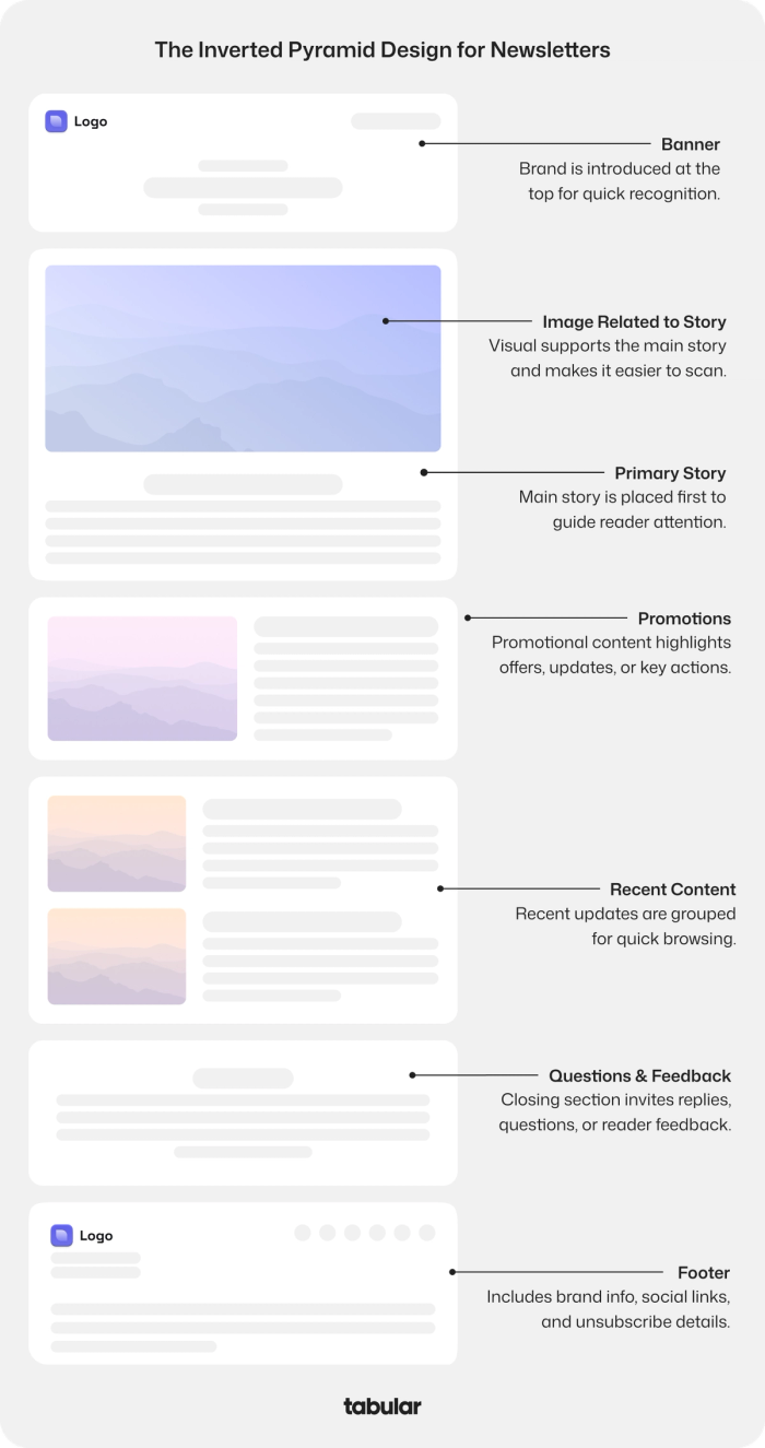
The header is the first visual element inside the email. It typically includes your logo, brand name, and sometimes a navigation strip or issue number. Its primary job is immediate brand recognition — the reader should know exactly who sent this email within a fraction of a second.
Good email header design doesn't need to be elaborate. A clean, on-brand header with enough whitespace is more effective than a cluttered one. It signals professionalism and tells the reader they're in the right place.
Best practices for the header:
- Keep it to 100–150px in height (don't let it dominate the first scroll)
- Use your logo at a consistent size across all sends
- Match your brand colors but leave room for the content below to breathe
- Avoid placing critical information in the header — save that for the body
5. The Hero Image
The large image that typically appears near the top of the newsletter (below or alongside the header) sets the visual tone. It should relate directly to the primary story or theme of that issue — not be a generic stock photo pulled from a library.
Readers process images faster than text, so the hero image is a quick emotional signal: "This issue is about X." A relevant, high-quality image earns the next scroll; a confusing one creates friction.
Keep in mind the image-to-text ratio — if your email is too image-heavy, spam filters may flag it, and subscribers on low bandwidth might see a broken layout. A balanced ratio keeps you both deliverable and accessible.
6. Featured Content (Primary Story)
This is the anchor of the newsletter — the main story, article, announcement, or update you want every subscriber to see and engage with. It goes near the top, immediately after the hero image (or combined with it), because attention is highest in the first screen.
Whatever is most important goes here. If you're announcing a product update, a new feature, or a major piece of content, it lives in this slot. Everything else in the newsletter is secondary to it.
A strong featured content block includes:
- A clear, compelling headline
- 2–3 sentences of context (not the full article)
- One CTA button ("Read the story", "See what's new", "Get early access")
Resist the urge to lead with something modest "just to warm them up." Put your best thing first.
7. Promotional Content
If your newsletter includes offers, discounts, product highlights, or time-sensitive announcements, they live in the promotional section — below the featured editorial content. The order matters. Leading with promotions positions the newsletter as an ad. Leading with value, then introducing a promotion, positions it as a resource that happens to sell.
The standard editorial-to-promotional ratio is roughly 90/10: nine parts informational or educational content, one part commercial. This ratio is what keeps subscribers engaged long-term. The moment a newsletter starts feeling like a sales pitch every week is the moment people start unsubscribing.
8. Secondary Content / Recent Updates
After the hero story and any promotions, many newsletters include a secondary content section — a handful of shorter items grouped together for quick browsing. Think of it like the "also in this issue" section of a magazine.
This section works best with a consistent two-column or three-column layout: a thumbnail image, a short headline, a one-sentence description, and a "read more" link. Readers who weren't drawn in by the featured story often find something in this section that catches their attention.
Modular email templates are particularly useful here — you can swap content blocks in and out without rebuilding the layout for every send.
9. Questions and Feedback Section
Many high-performing newsletters include a dedicated section inviting readers to reply, ask questions, or share their thoughts. This serves two purposes: it creates a two-way relationship (rather than a broadcast model), and it signals to email clients that subscribers are engaging — which improves deliverability.
A simple "Reply and tell us what you think" or "Have a question? We're listening" does more than most marketers expect. It humanizes the brand and turns subscribers into a community.
10. The Footer
The footer is the most legally and logistically important section of the newsletter. It should always include:
- Your company name and mailing address (required by CAN-SPAM and GDPR)
- Social media links so subscribers can find you elsewhere
- Preference center link letting subscribers choose what content they receive
- Unsubscribe option — clear, visible, and working at all times
The unsubscribe link isn't just a legal requirement under regulations like GDPR and CAN-SPAM — it's also a subscriber quality tool. Readers who no longer want your newsletter should be able to leave easily. Making it hard to unsubscribe only leads to spam complaints, which hurt your sender reputation far more than a smaller list would.
For a deeper look at what goes into the structural parts of an email beyond the newsletter format, see our breakdown of the parts of an email.
Part 3: The Inverted Pyramid — A Framework for Every Section
The inverted pyramid isn't just a structural metaphor — it's a practical content hierarchy that works at the newsletter level and within each individual section.
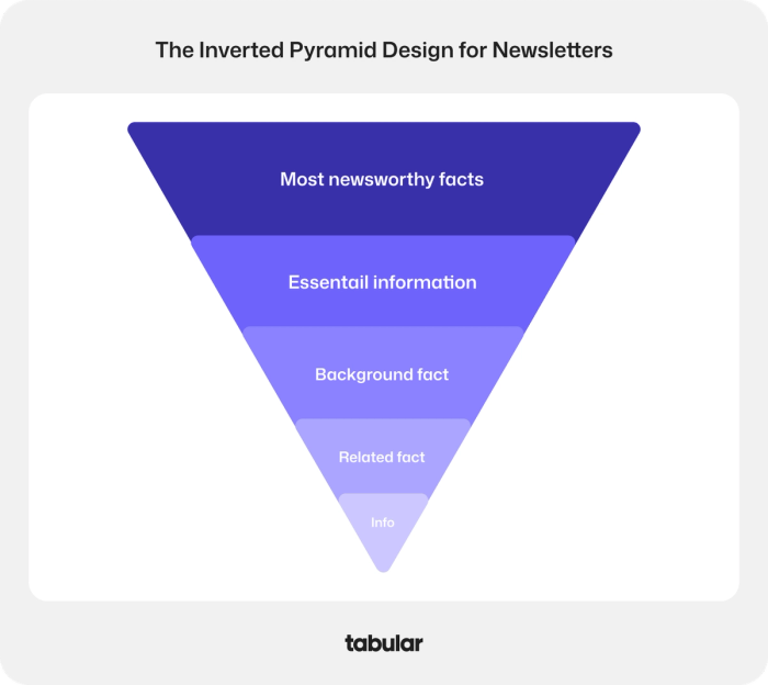
The principle is simple: start with the most newsworthy, attention-grabbing information at the top (the widest part of the pyramid), then layer in essential context, background details, related facts, and finally supplementary information at the tip.
Applied to a newsletter:
- The subject line and preheader are the tip of the spear — your sharpest hook
- The hero content carries the main story at maximum attention
- Secondary sections provide supporting context and related updates
- The footer handles logistics, legal, and subscriptions
Applied within a single content block:
- Lead with the conclusion or the most compelling angle
- Follow with the "why it matters"
- Close with context, attribution, or a CTA
This model is so effective because readers rarely finish everything. The inverted pyramid ensures that even someone who reads only the first third of your newsletter still gets your most important message.
For a detailed walkthrough of this design methodology and how to apply it in your own templates, see our guide to inverted pyramid email design.
Part 4: Design Principles That Hold It All Together
Structure creates the skeleton; design creates the experience. These are the principles that separate newsletters people look forward to from newsletters people barely notice.
Consistent Visual Branding
Every element of your newsletter — fonts, colors, button styles, image treatment, spacing — should feel like it came from the same place. Inconsistency erodes trust, even subconsciously. Readers who receive a newsletter that looks different every week start to wonder if the brand is reliable.
This doesn't mean every newsletter must look identical. But your design system — the set of rules governing how things look — should remain consistent across issues. Using global styles and saved design tokens makes this far easier to maintain, especially in tools built for design-focused email production.
Your email color choices are a critical part of this system. Colors communicate personality, establish hierarchy, and draw attention to CTAs. A well-defined color palette used consistently is one of the fastest ways to make a newsletter feel polished and professional.
Typography and Hierarchy
Typography does more than make text readable — it creates visual hierarchy that tells the eye where to go. A newsletter with good typographic hierarchy has headers that are obviously headers, body text that scans easily, and callouts that stand out without screaming.
General newsletter typography guidelines:
Element Recommended size Weight Pre-header / label 11–12px Regular Section headline 22–28px Bold Body copy 15–16px Regular CTA button text 14–16px Medium or Bold Footer text 11–12px Regular
Use no more than two typefaces per newsletter — one for headings, one for body text. More than that creates visual noise. For more context on how font decisions shape perception, our typography anatomy guide covers the full breakdown.
Whitespace and Negative Space
One of the most common mistakes in newsletter design is overcrowding. When every pixel is filled, the eye doesn't know where to look — and the result is that nothing stands out.
Whitespace (also called negative space) is not wasted space. It's what makes content breathable, scannable, and easier to process. Generous padding around sections, between content blocks, and inside buttons dramatically improves the reading experience.
Readers are more likely to engage with a newsletter that feels open and unhurried than one that feels like it's trying to fit everything in. For a deeper understanding of how negative space works in visual design, our piece on positive and negative space in email is worth exploring.
Mobile Optimization
More than half of email opens happen on mobile devices. A newsletter that looks clean on desktop but breaks or wraps strangely on a phone will lose a significant portion of its audience at every send.
Mobile-first newsletter checklist:
- Single-column layout (or stacked columns on mobile)
- Minimum font size of 14px for body text, 22px+ for headlines
- Touch-friendly buttons — at least 44px tall, full-width preferred on mobile
- Images that scale and don't overflow the viewport
- Adequate padding so content doesn't feel cramped at the edges
- Preview and test on multiple devices before sending
Fluid design principles — where elements resize proportionally rather than breaking — are becoming the standard. Our guide on what fluid design is explains the approach in detail.
Clear, Action-Oriented CTAs
Every newsletter section should know what it wants the reader to do next. A CTA (call-to-action) isn't just a button — it's a clear directive that removes all ambiguity about the next step.
Effective CTAs:
- Use action-oriented language ("Read the full guide", "Get your free template", "See the update")
- Stand out visually through color contrast and button styling
- Appear in logical places — after the reader has enough context to act
- Are limited in number — too many CTAs create decision fatigue
The default assumption should be one primary CTA per section. If you have multiple sections, each can have its own CTA, but the newsletter as a whole should have a primary action that everything points toward.
For a full breakdown of what makes these work, see our piece on email CTA best practices.
Personalization
Personalization in newsletters has evolved far beyond first-name tokens. Modern newsletter personalization includes:
- Dynamic content blocks that change based on subscriber segment (industry, location, purchase history)
- Behavioral triggers that adjust what a subscriber sees based on past opens or clicks
- Preference-based content that lets subscribers opt into specific topics
- Send-time optimization that delivers the newsletter when each subscriber is most likely to open it
Even modest personalization has measurable impact. Segmented email campaigns consistently show higher open rates and click-through rates than blanket sends. If your email platform supports segmentation, use it.
Part 5: The 3/2/1 Newsletter Format
One of the most popular structural frameworks for content newsletters is the 3/2/1 format, popularized by writers and newsletter creators who needed a simple, repeatable structure.
The format works as follows:
- 3 short content items (articles, insights, or resources worth reading)
- 2 tools, products, or recommendations (practical picks for the audience)
- 1 idea, question, or prompt to leave the reader thinking
This structure works because it's predictable without being boring. Subscribers learn what to expect from each issue, which builds the habit of opening. It also naturally enforces the editorial-to-promotional ratio — two promotional picks in a newsletter of six total items is 33%, which is higher than the strict 90/10 rule, but works in short curation newsletters because the "picks" are framed as recommendations, not ads.
The 3/2/1 format is especially well-suited for industry newsletters, curated roundups, and weekly digests. It's less applicable to brand newsletters that need to feature products and announcements prominently.
Part 6: Accessibility — The Element Most Newsletters Skip
Accessibility is rarely top of mind when newsletters are being designed, but it affects a meaningful portion of every subscriber list — people with visual impairments, cognitive differences, or those using assistive technologies.
What accessible newsletters include:
- Alt text on every image — describes the image for screen readers and also appears when images don't load
- Sufficient color contrast — especially between text and background (WCAG recommends a minimum 4.5:1 ratio for normal text)
- Logical reading order — content should make sense when read top-to-bottom without visual cues
- Linked text that describes the destination — "Read the full guide" rather than "Click here"
- Avoiding information conveyed only through color — colorblind readers shouldn't miss key content
Accessible design is also better design. Alt text improves deliverability (text content signals to spam filters that the email has substance). Logical reading order improves scanability for everyone. Color contrast helps all readers in low-light or high-glare conditions.
For a full guide to this topic, see our resource on accessibility best practices in email design.
Part 7: What Makes Content Actually Good
Layout and design create the container. Content is what fills it — and what readers actually remember.
The qualities that make newsletter content work:
Relevance over volume. A newsletter that covers too many topics tries to appeal to everyone and ends up resonating with no one. Knowing exactly who your subscriber is — and what they care about — is what makes content feel like it was written specifically for them.
Specificity over generality. Vague insights ("AI is changing marketing") get scrolled past. Specific, actionable ones ("Here's how one e-commerce brand reduced cart abandonment by 18% using a three-email flow") get clicked. The more concrete, the more valuable.
Narrative over announcements. Even in a product-focused newsletter, a story structure holds attention better than a list of updates. Lead with context, build toward the insight, land on the action.
Consistency over occasional excellence. A newsletter that shows up every Tuesday with reliably good content builds a stronger relationship than one that's brilliant twice a year and erratic in between. Cadence is a trust signal.
For writers and marketers building newsletter content, email copywriting principles apply directly — the skills that make promotional copy persuasive are the same ones that make newsletter content compelling.
Part 8: Newsletter Elements at a Glance — Reference Table
Element Location Primary Function Common Mistake Sender name Pre-send Trust and recognition Using no-reply or company code Subject line Pre-send Open rate Generic or vague copy Preheader text Pre-send Reinforces subject line Left blank or auto-populated Header / banner Top of body Brand identity Too large, eats first scroll Hero image Top of body Visual tone-setting Irrelevant stock imagery Featured content Above fold Drives primary engagement Burying the best story CTA button Per section Drives clicks Too many, unclear language Promotions Middle section Revenue / conversion Leading with promotion Secondary content Middle section Engagement breadth Too long, no images Social links Footer Omnichannel connection Hidden or missing Preference center Footer Subscriber retention Not offered at all Unsubscribe link Footer Legal compliance Hidden or broken Alt text On images Accessibility & deliverability Often skipped entirely
Frequently Asked Questions
What are 5 elements of an effective newsletter?
The five that matter most are: a compelling subject line (which determines whether the email is opened at all), a clearly featured primary piece of content (so readers know immediately what the newsletter is about), a strong call-to-action (so the next step is obvious), a clean and mobile-responsive layout (so the reading experience works across devices), and consistent branding (so the newsletter feels like part of a coherent identity). Everything else supports these five.
What are the 8 basic parts of a newsletter?
The eight structural parts that appear in virtually every newsletter are: the subject line and preheader (pre-send), the header/banner, the hero image or featured content block, the body content sections, the CTA elements, any promotional content, the footer with legal information, and the unsubscribe option. Some newsletters also include a questions/feedback section and a preference center link, which rounds out a complete anatomy.
What are the components of a newsletter?
A newsletter's components span two categories. Pre-send components include the sender name, subject line, and preheader text — these determine open rates. In-body components include the header, hero image, featured story, secondary content, promotional blocks, CTAs, social links, and footer. Strong newsletters treat all of these as connected parts of a single reader journey, not isolated elements assembled at random.
What is the 3/2/1 newsletter?
The 3/2/1 newsletter is a popular structural format used by content curators and media newsletters. It typically features 3 curated articles or insights, 2 product or tool recommendations, and 1 thought-provoking question or idea. The format's appeal is its predictability — subscribers know what they're getting, which builds the habit of opening. It's best suited for educational, industry, or creator newsletters rather than brand marketing sends.
What should a newsletter always contain?
At minimum, every newsletter should contain: a subject line crafted for the specific issue (not a template phrase), at least one piece of substantive value for the reader (educational content, useful insight, relevant news), a clear next action, and a compliant footer with your address, social links, and unsubscribe option. Anything less and you're either missing the reader's expectations or running into legal risk.
What makes a good newsletter?
A good newsletter arrives consistently, delivers on what it promises in the subject line, prioritizes the reader's interests over the sender's commercial agenda, and makes the most important content immediately visible. Design-wise, it's scannable, mobile-friendly, and on-brand. Content-wise, it's specific, relevant, and written in a voice the subscriber has come to recognize. The best newsletters feel less like marketing and more like hearing from someone who knows what you need before you've asked.
Building It All: Where Tabular Fits In
Understanding what a newsletter should contain is one thing. Building it consistently, beautifully, and efficiently is another challenge entirely — especially as teams grow and brands scale their email programs.
Tabular is an email builder designed to handle the full range of newsletter production needs. For designers, it offers a Figma-like interface with advanced design controls, reusable component blocks, and the precision to implement the typographic and visual systems that great newsletters require. For marketers, it integrates directly with all major ESP platforms — so the email you build in Tabular exports cleanly into your sending tool of choice, without reformatting or rebuilding. For organizations working across teams, Tabular's collaboration features let designers, writers, and approvers work in the same environment — with commenting, teamspaces, and version control built in.
Tabular also offers a library of free email newsletter templates that apply many of the structural principles covered in this guide — a practical starting point for anyone building their first newsletter or rethinking an existing one.
Whether you're a solo creator sending weekly insights or a marketing team managing multiple newsletter products for different audience segments, the building blocks are the same. The elements covered in this guide — the subject line, the structure, the visual hierarchy, the footer — are what give a newsletter its staying power.
Get those right, and the rest is execution.
Conclusion
A newsletter is not a single piece of content — it's a system. Every element plays a defined role, from the sender name that earns the open to the unsubscribe link that keeps your list healthy. Understanding the function of each component is what lets you make intentional decisions rather than guessing what works.
The most effective newsletters aren't necessarily the most elaborate. They're the ones that have internalized a structure, stuck to it consistently, and kept the reader's needs at the center of every send. That's the combination that builds an audience — and keeps it.
For further reading on the design side of this practice, our guide to newsletter design best practices covers the visual layer in depth, and our piece on how to create marketing emails bridges the gap between structure and campaign strategy.